Chapter 4 Univariate Graphs
The first step in any comprehensive data analysis is to explore each import variable in turn. Univariate graphs plot the distribution of data from a single variable. The variable can be categorical (e.g., race, sex, political affiliation) or quantitative (e.g., age, weight, income).
The dataset Marriage contains the marriage records of 98 individuals in Mobile County, Alabama (see Appendix A.5). We’ll explore the distribution of three variables from this dataset - the age and race of the wedding participants, and the occupation of the wedding officials.
4.1 Categorical
The race of the participants and the occupation of the officials are both categorical variables.The distribution of a single categorical variable is typically plotted with a bar chart, a pie chart, or (less commonly) a tree map or waffle chart.
4.1.1 Bar chart
In Figure 4.1, a bar chart is used to display the distribution of wedding participants by race.
# simple bar chart
library(ggplot2)
data(Marriage, package = "mosaicData")

# plot the distribution of race
ggplot(Marriage, aes(x = race)) +
  geom_bar()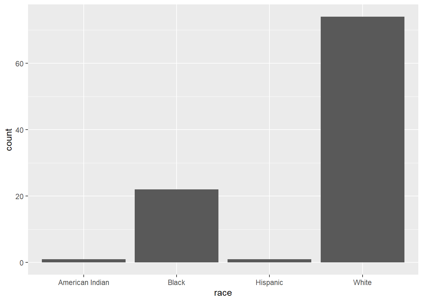
Figure 4.1: Simple barchart
The majority of participants are white, followed by black, with very few Hispanics or American Indians.
You can modify the bar fill and border colors, plot labels, and title by adding options to the geom_bar function. In ggplot2, the fill parameter is used to specify the color of areas such as bars, rectangles, and polygons. The color parameter specifies the color objects that technically do not have an area, such as points, lines, and borders.
# plot the distribution of race with modified colors and labels
ggplot(Marriage, aes(x=race)) +
  geom_bar(fill = "cornflowerblue",
           color="black") +
  labs(x = "Race",
       y = "Frequency",
       title = "Participants by race")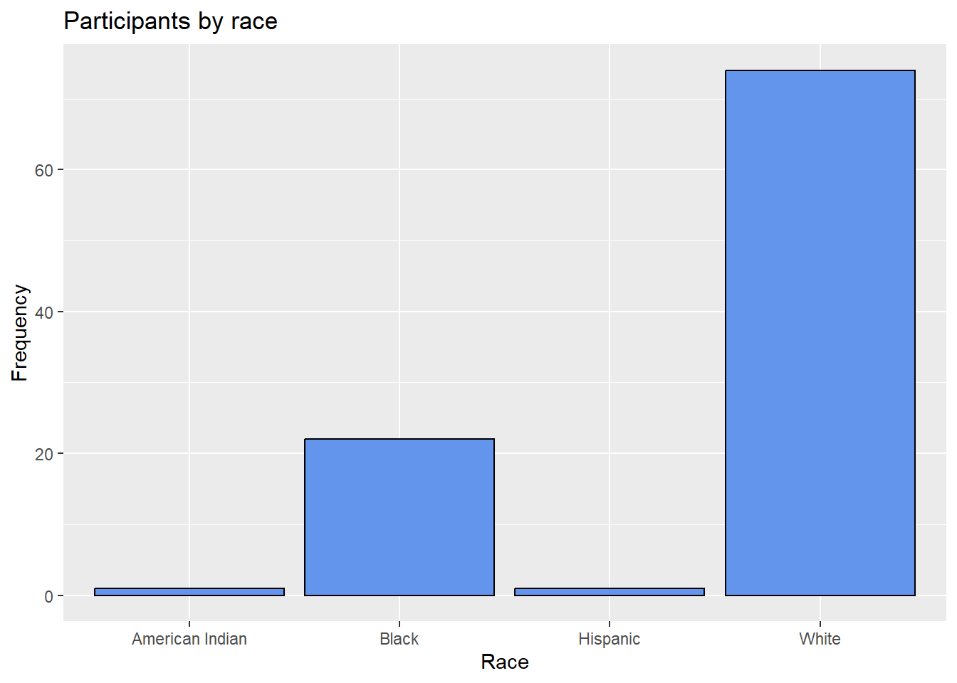
Figure 4.2: Barchart with modified colors, labels, and title
4.1.1.1 Percents
Bars can represent percents rather than counts. For bar charts, the code aes(x=race) is actually a shortcut for aes(x = race, y = after_stat(count)), where count is a special variable representing the frequency within each category. You can use this to calculate percentages, by specifying y variable explicitly.
# plot the distribution as percentages
ggplot(Marriage,
       aes(x = race, y = after_stat(count/sum(count)))) +
  geom_bar() +
  labs(x = "Race",
       y = "Percent",
       title  = "Participants by race") +
  scale_y_continuous(labels = scales::percent)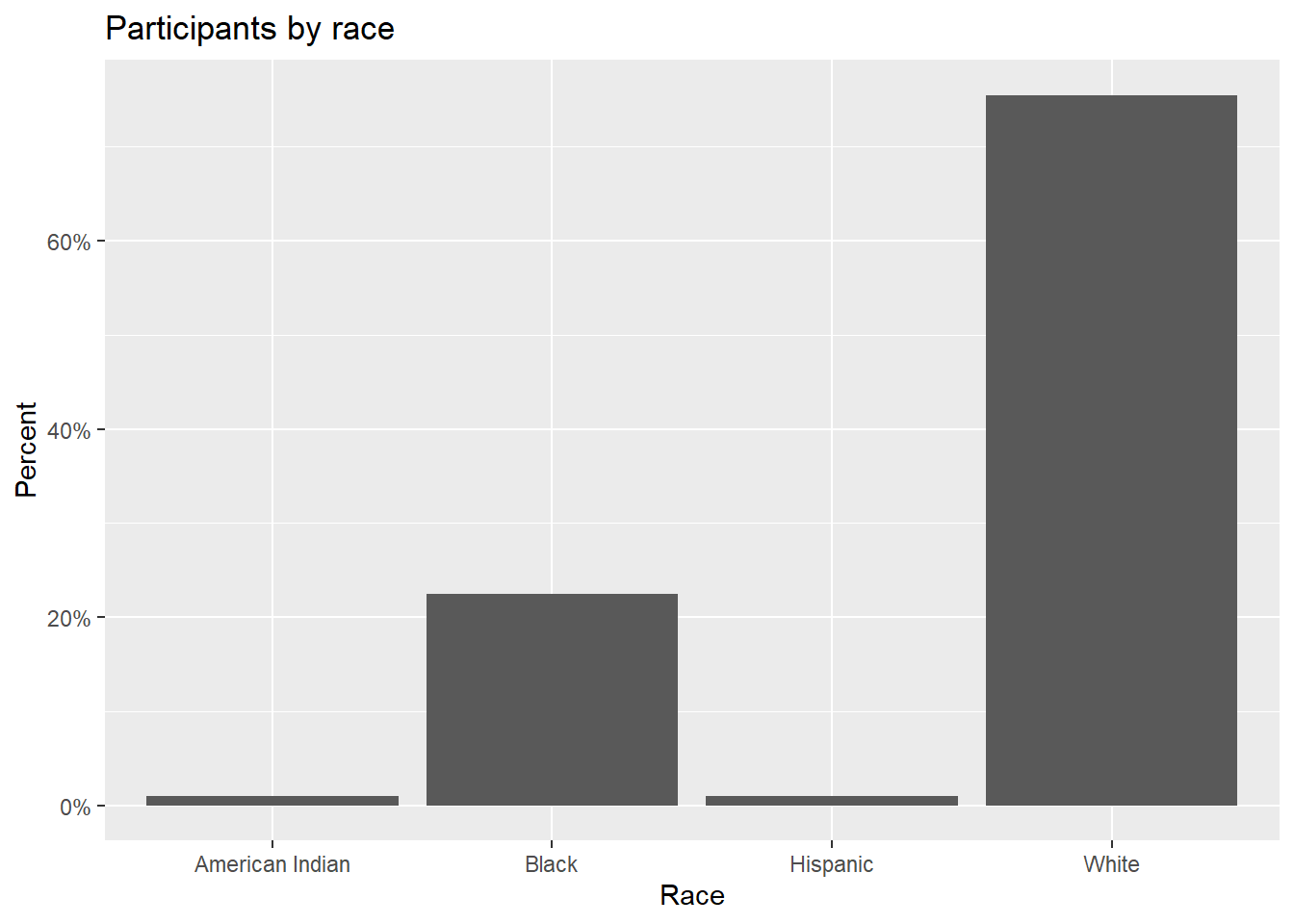
Figure 4.3: Barchart with percentages
In the code above, the scales package is used to add % symbols to the y-axis labels.
4.1.1.2 Sorting categories
It is often helpful to sort the bars by frequency. In the code below, the frequencies are calculated explicitly. Then the reorder function is used to sort the categories by the frequency. The option stat="identity" tells the plotting function not to calculate counts, because they are supplied directly.
# calculate number of participants in each race category
library(dplyr)
plotdata <- Marriage %>%
 count(race)
The resulting dataset is give below.
| race | n |
|---|---|
| American Indian | 1 |
| Black | 22 |
| Hispanic | 1 |
| White | 74 |
This new dataset is then used to create the graph.
# plot the bars in ascending order
ggplot(plotdata,
       aes(x = reorder(race, n), y = n)) +
  geom_bar(stat="identity") +
  labs(x = "Race",
       y = "Frequency",
       title  = "Participants by race")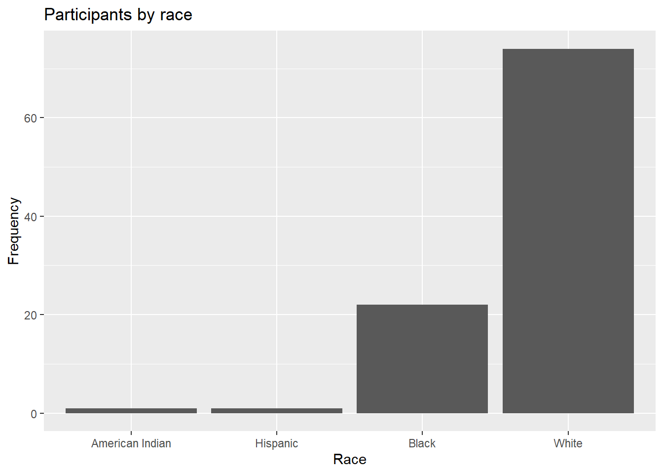
Figure 4.4: Sorted bar chart
The graph bars are sorted in ascending order. Use reorder(race, -n) to sort in descending order.
4.1.1.3 Labeling bars
Finally, you may want to label each bar with its numerical value.
# plot the bars with numeric labels
ggplot(plotdata,
       aes(x = race, y = n)) +
  geom_bar(stat="identity") +
  geom_text(aes(label = n), vjust=-0.5) +
  labs(x = "Race",
       y = "Frequency",
       title  = "Participants by race")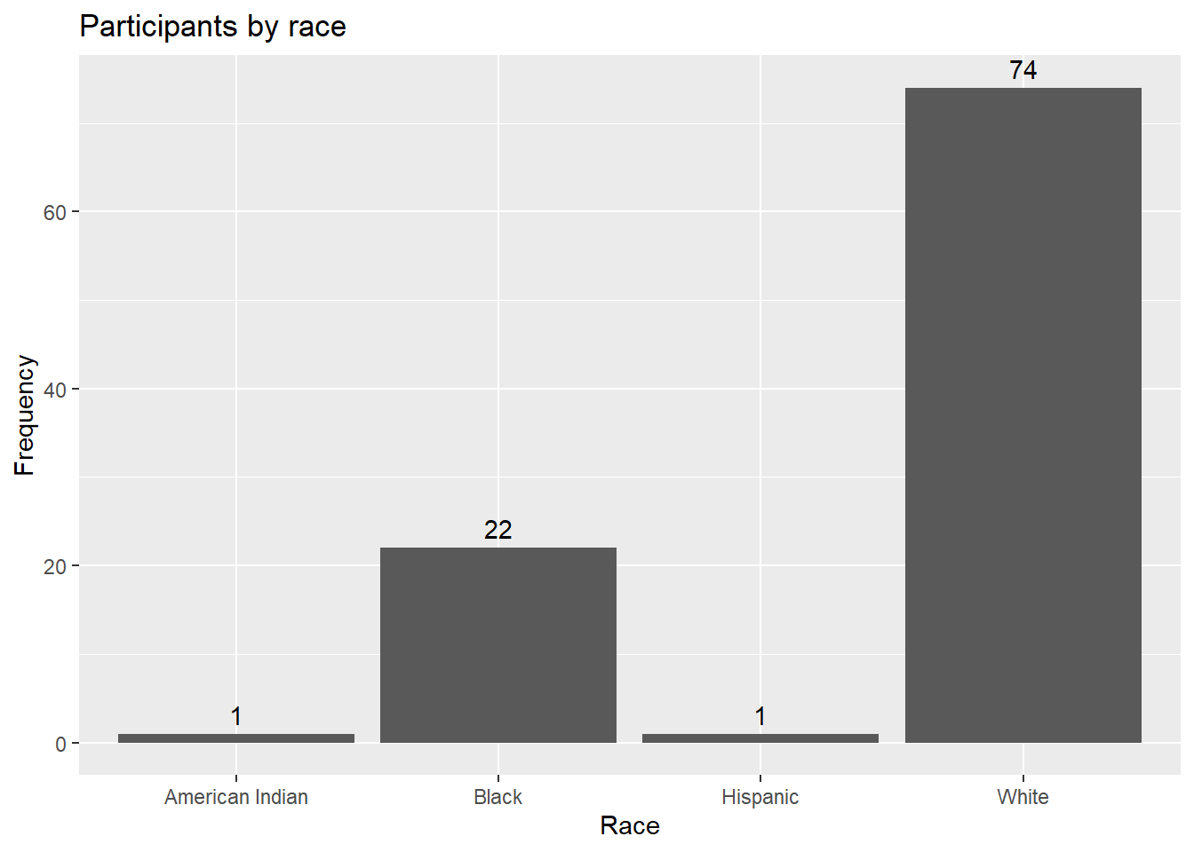
Figure 4.5: Bar chart with numeric labels
Here geom_text adds the labels, and vjust controls vertical justification. See Annotations (Section 11.7) for more details.
Putting these ideas together, you can create a graph like the one below. The minus sign in reorder(race, -pct) is used to order the bars in descending order.
library(dplyr)
library(scales)
plotdata <- Marriage %>%
  count(race) %>%
  mutate(pct = n / sum(n),
         pctlabel = paste0(round(pct*100), "%"))

# plot the bars as percentages,
# in decending order with bar labels
ggplot(plotdata,
       aes(x = reorder(race, -pct), y = pct)) +
  geom_bar(stat="identity", fill="indianred3", color="black") +
  geom_text(aes(label = pctlabel), vjust=-0.25) +
  scale_y_continuous(labels = percent) +
  labs(x = "Race",
       y = "Percent",
       title  = "Participants by race")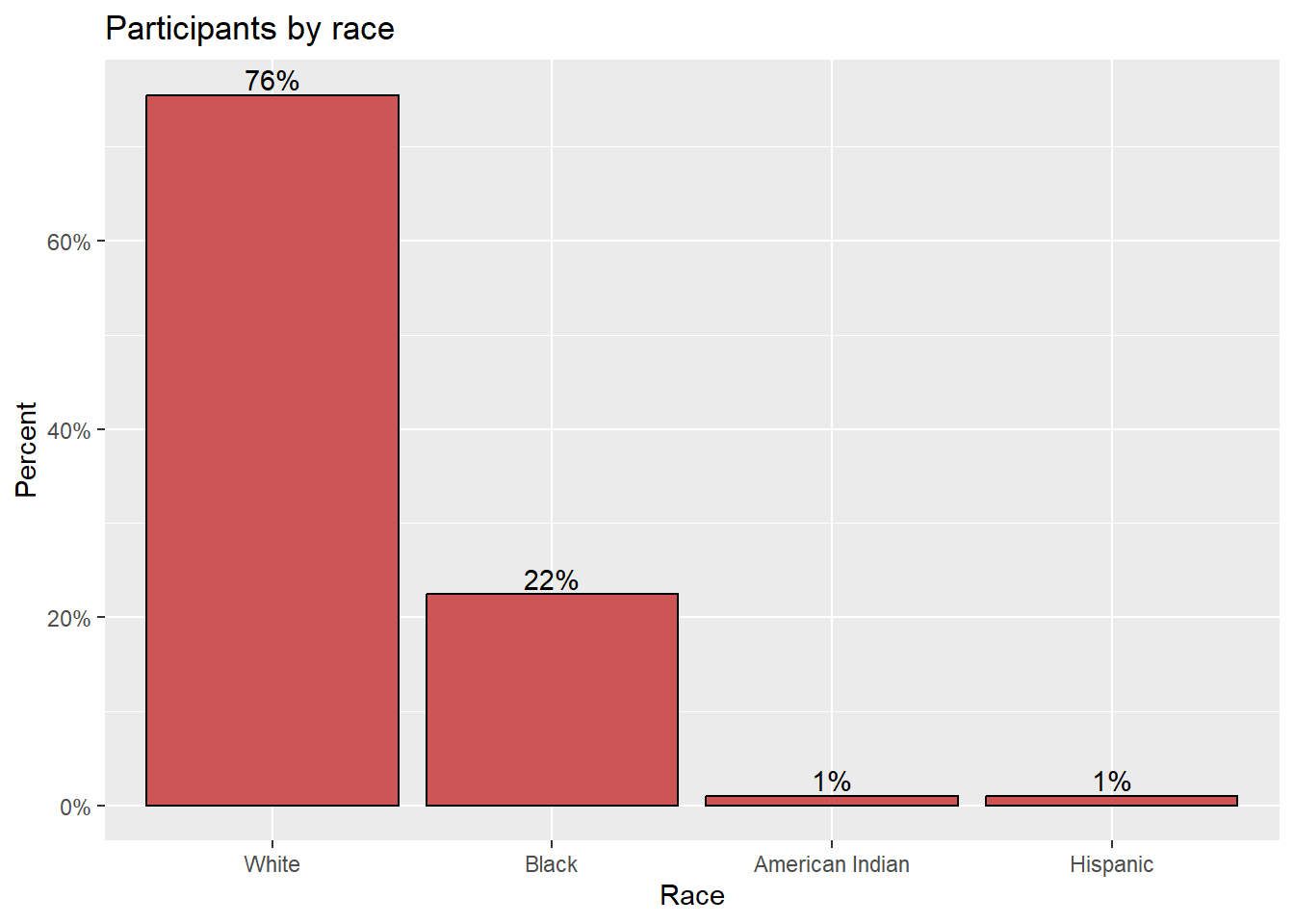
Figure 4.6: Sorted bar chart with percent labels
4.1.1.4 Overlapping labels
Category labels may overlap if (1) there are many categories or (2) the labels are long. Consider the distribution of marriage officials.
# basic bar chart with overlapping labels
ggplot(Marriage, aes(x=officialTitle)) +
  geom_bar() +
  labs(x = "Officiate",
       y = "Frequency",
       title = "Marriages by officiate")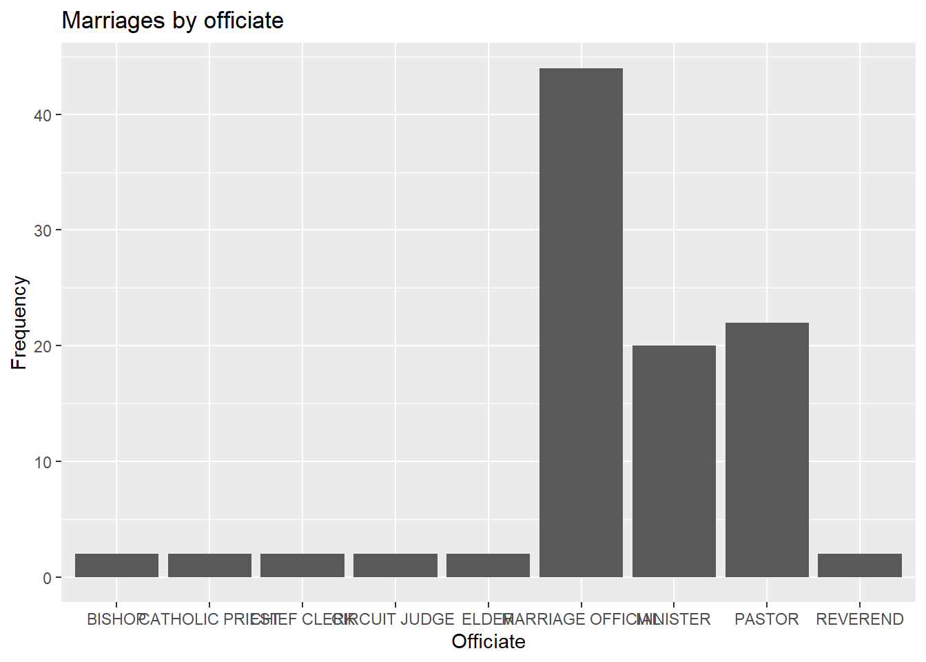
Figure 4.7: Barchart with problematic labels
In this case, you can flip the x and y axes with the coord_flip function.
# horizontal bar chart
ggplot(Marriage, aes(x = officialTitle)) +
  geom_bar() +
  labs(x = "",
       y = "Frequency",
       title = "Marriages by officiate") +
  coord_flip()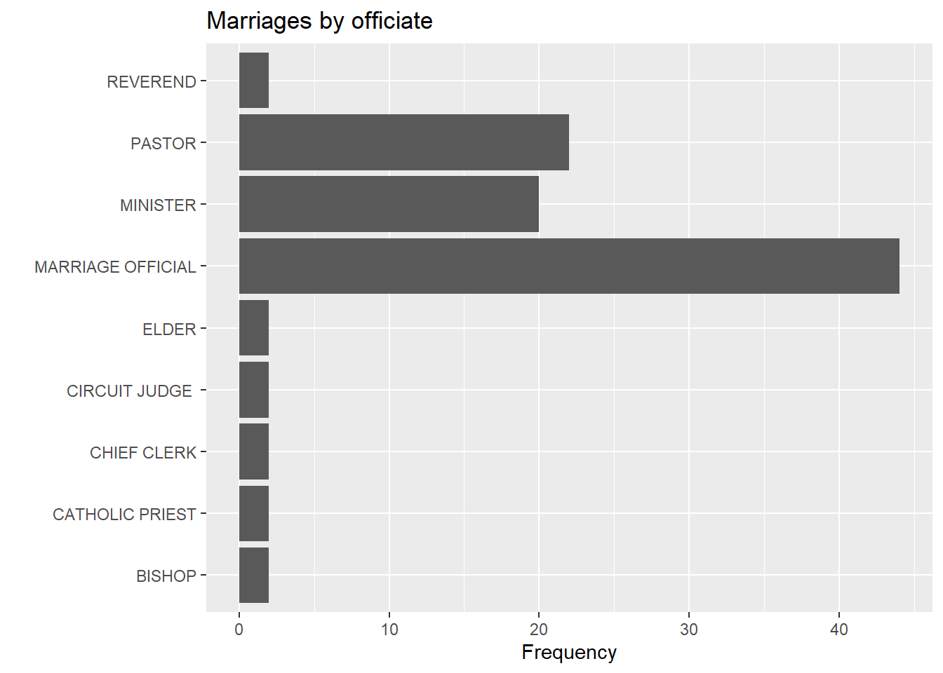
Figure 4.8: Horizontal barchart
Alternatively, you can rotate the axis labels.
# bar chart with rotated labels
ggplot(Marriage, aes(x=officialTitle)) +
  geom_bar() +
  labs(x = "",
       y = "Frequency",
       title = "Marriages by officiate") +
  theme(axis.text.x = element_text(angle = 45,
                                   hjust = 1))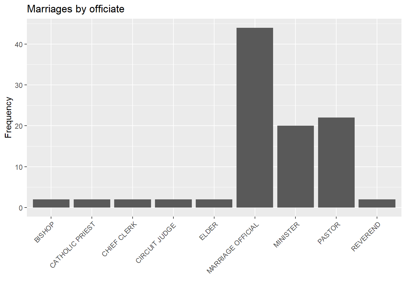
Figure 4.9: Barchart with rotated labels
Finally, you can try staggering the labels. The trick is to add a newline \n to every other label.
# bar chart with staggered labels
lbls <- paste0(c("","\n"), levels(Marriage$officialTitle))
ggplot(Marriage,
       aes(x=factor(officialTitle,
                    labels = lbls))) +
  geom_bar() +
  labs(x = "",
       y = "Frequency",
       title = "Marriages by officiate")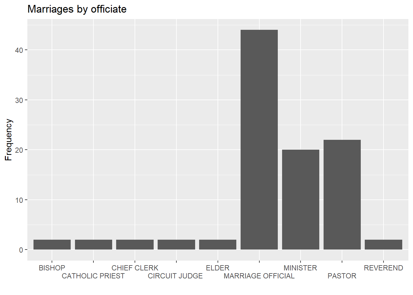
Figure 4.10: Barchart with staggered labels
In general, I recommend trying not to rotate axis labels. It places a greater cognitive demand on the end user (i.e., it is harder to read!).
4.1.2 Pie chart
Pie charts are controversial in statistics. If your goal is to compare the frequency of categories, you are better off with bar charts (humans are better at judging the length of bars than the volume of pie slices). If your goal is compare each category with the the whole (e.g., what portion of participants are Hispanic compared to all participants), and the number of categories is small, then pie charts may work for you.
Pie charts are easily created with ggpie function in the ggpie package. The format is ggpie(data, variable), where data is a data frame, and variable is the categorical variable to be plotted.
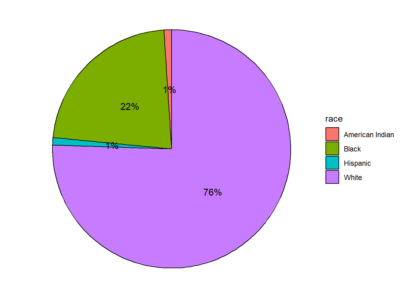
Figure 4.11: Basic pie chart with legend
The ggpie function has many option, as described in package homepage (http://rkabacoff.github.io/ggpie). For example to place the labels within the pie, set legend = FALSE. A title can be added with the title option.
# create a pie chart with slice labels within figure
ggpie(Marriage, race, legend = FALSE, title = "Participants by race")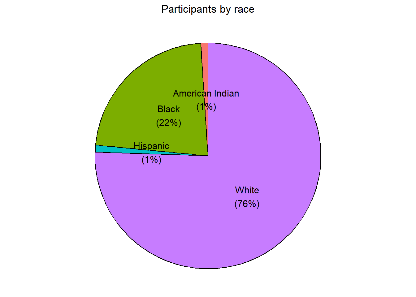
Figure 4.12: Pie chart with percent labels
The pie chart makes it easy to compare each slice with the whole. For example, roughly a quarter of the total participants are Black.
4.1.3 Tree map
An alternative to a pie chart is a tree map. Unlike pie charts, it can handle categorical variables that have many levels.
library(treemapify)

# create a treemap of marriage officials
plotdata <- Marriage %>%
  count(officialTitle)

ggplot(plotdata,
       aes(fill = officialTitle, area = n)) +
  geom_treemap() +
  labs(title = "Marriages by officiate")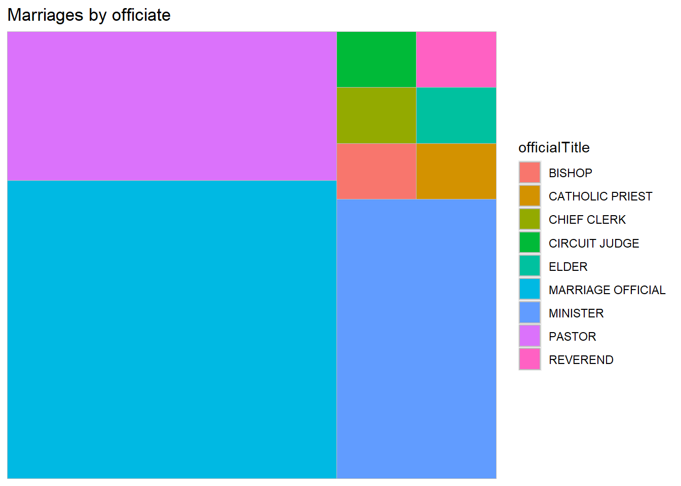
Figure 4.13: Basic treemap
Here is a more useful version with labels.
# create a treemap with tile labels
ggplot(plotdata,
       aes(fill = officialTitle,
           area = n,
           label = officialTitle)) +
  geom_treemap() +
  geom_treemap_text(colour = "white",
                    place = "centre") +
  labs(title = "Marriages by officiate") +
  theme(legend.position = "none")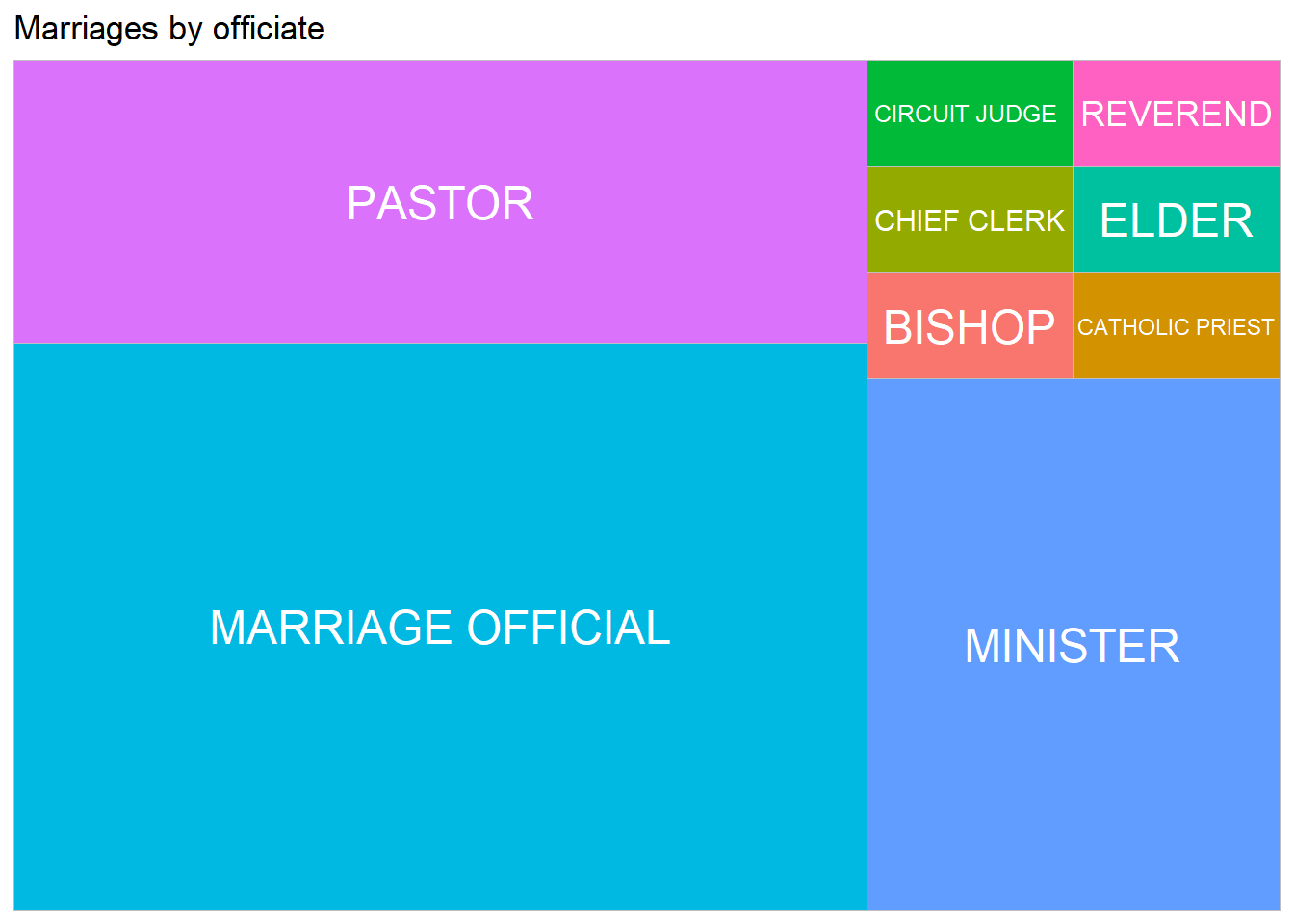
Figure 4.14: Treemap with labels
The treemapify package offers many options for customization. See https://wilkox.org/treemapify/ for details.
4.1.4 Waffle chart
A waffle chart, also known as a gridplot or square pie chart, represents observations as squares in a rectangular grid, where each cell represents a percentage of the whole. You can create a ggplot2 waffle chart using the geom_waffle function in the waffle package.
Let’s create a waffle chart for the professions of wedding officiates. As with tree maps, start by summarizing the data into groups and counts.
Next create the ggplot2 graph. Set fill to the grouping variable and values to the counts. Don’t specify an x and y.
Note: The na.rm parameter in the geom_waffle function indicates whether missing values should be deleted. At time of this writing, there is a bug in the function. The default for the na.rm parameter is NA, but it actually must be either TRUE or FALSE. Specifying one or the other eliminates the error.
The following code produces the default waffle plot.
# create a basic waffle chart
library(waffle)
ggplot(plotdata, aes(fill = officialTitle, values=n)) +
  geom_waffle(na.rm=TRUE)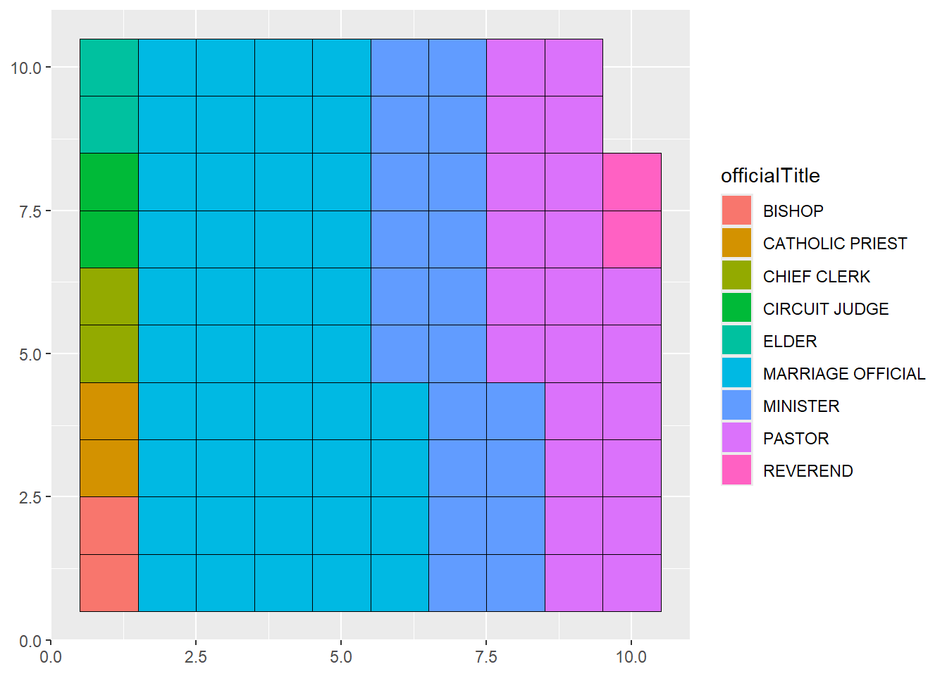
Figure 4.15: Basic waffle chart
Next, we’ll customize the graph by
- specifying the number of rows and cell sizes and setting borders around the cells to “white” (
geom_waffle) - change the color scheme to “Spectral” (
scale_fill_brewer) - assure that the cells are squares and not rectangles (
coord_equal) - simplify the theme (the
themefunctions) - modify the title and add a caption with the scale (
labs)
# Create a customized caption
cap <- paste0("1 square = ", ceiling(sum(plotdata$n)/100),
              " case(s).")
library(waffle)
ggplot(plotdata, aes(fill = officialTitle, values=n)) +
  geom_waffle(na.rm=TRUE,
              n_rows = 10,
              size = .4,
              color = "white") +
  scale_fill_brewer(palette = "Spectral") +
  coord_equal() +
  theme_minimal() +
  theme_enhance_waffle() +
  theme(legend.title = element_blank()) +
  labs(title = "Proportion of Wedding Officials",
       caption = cap)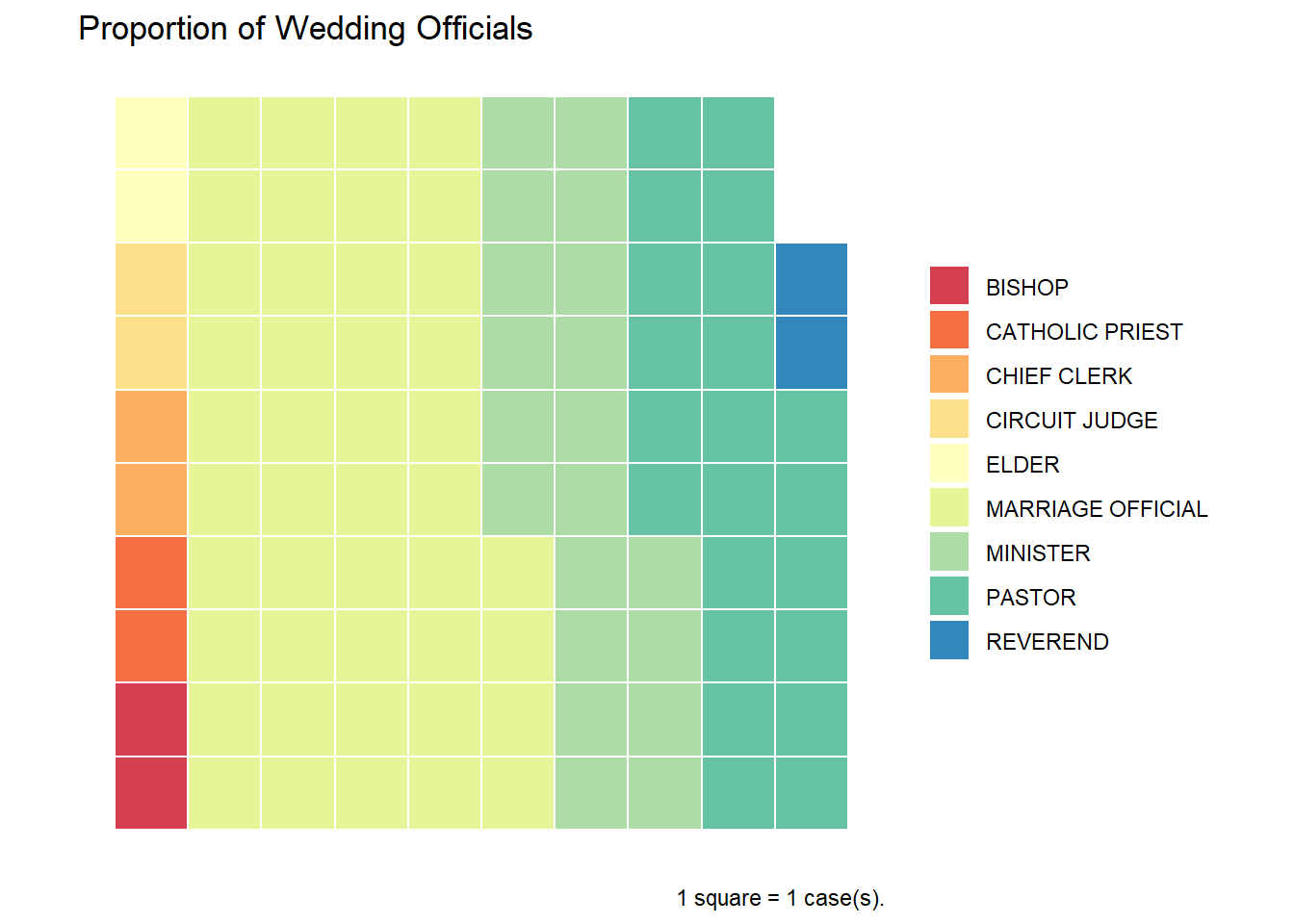
Figure 4.16: Customized waffle chart
While new to R, waffle charts are becoming increasingly popular.
4.2 Quantitative
In the Marriage dataset, age is quantitative variable. The distribution of a single quantitative variable is typically plotted with a histogram, kernel density plot, or dot plot.
4.2.1 Histogram
Histograms are the most common approach to visualizing a quantitative variable. In a histogram, the values of a variable are typically divided up into adjacent, equal width ranges (called bins), and the number of observations in each bin is plotted with a vertical bar.
library(ggplot2)

# plot the age distribution using a histogram
ggplot(Marriage, aes(x = age)) +
  geom_histogram() +
  labs(title = "Participants by age",
       x = "Age")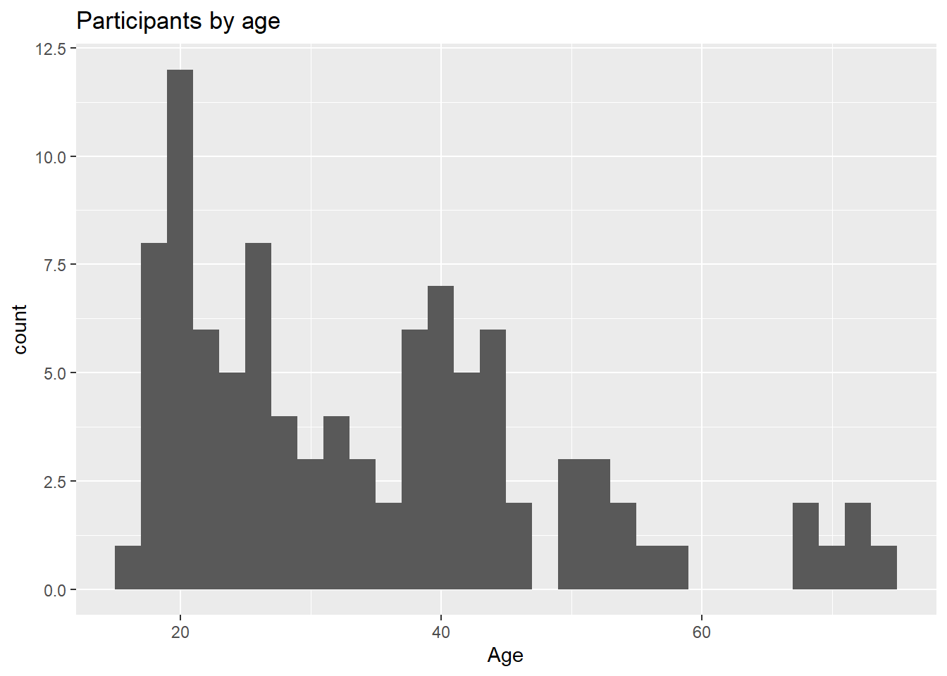
Figure 4.17: Basic histogram
Most participants appear to be in their early 20’s with another group in their 40’s, and a much smaller group in their late sixties and early seventies. This would be a multimodal distribution.
Histogram colors can be modified using two options
fill- fill color for the barscolor- border color around the bars
# plot the histogram with blue bars and white borders
ggplot(Marriage, aes(x = age)) +
  geom_histogram(fill = "cornflowerblue",
                 color = "white") +
  labs(title="Participants by age",
       x = "Age")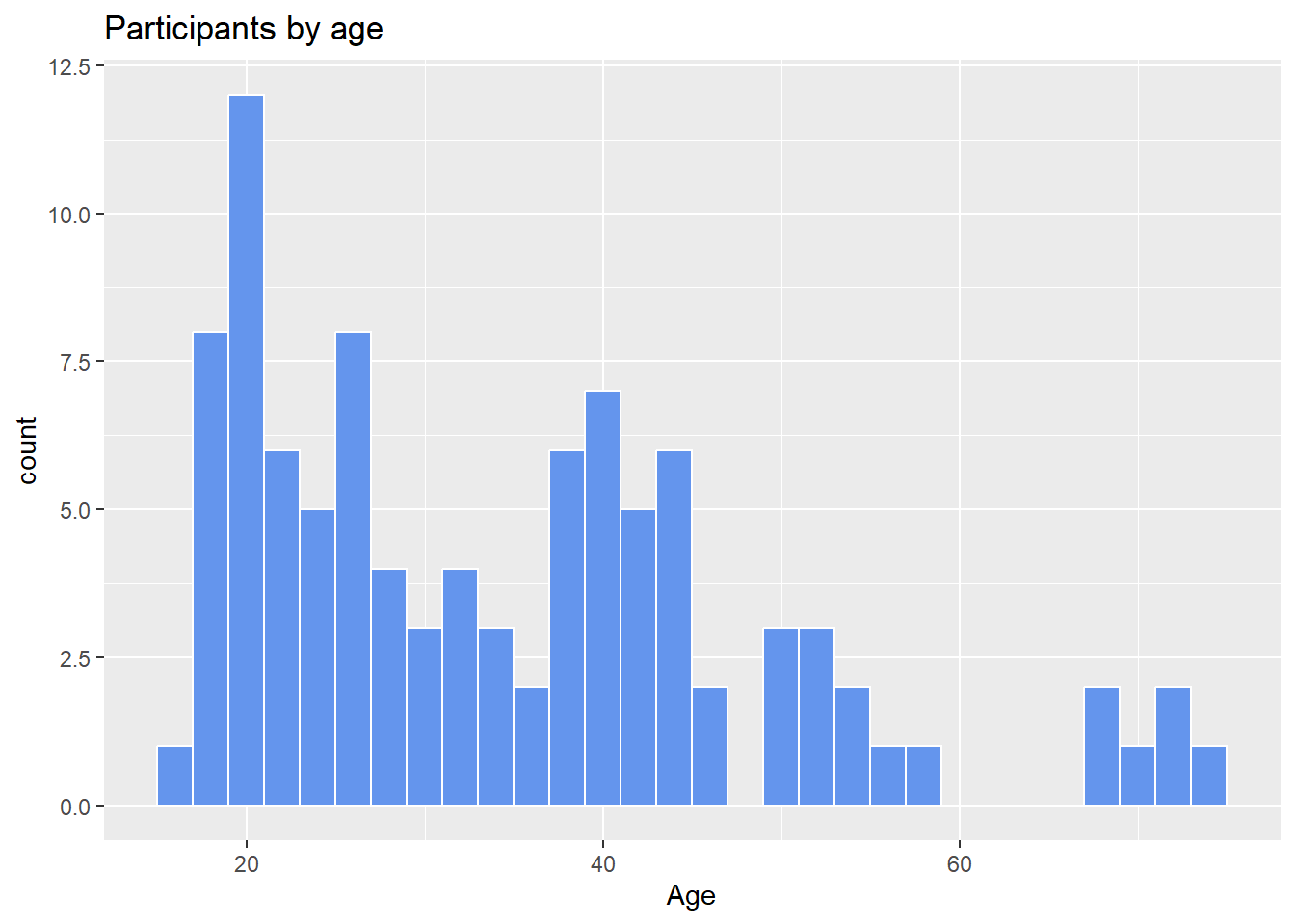
Figure 4.18: Histogram with specified fill and border colors
4.2.1.1 Bins and bandwidths
One of the most important histogram options is bins, which controls the number of bins into which the numeric variable is divided (i.e., the number of bars in the plot). The default is 30, but it is helpful to try smaller and larger numbers to get a better impression of the shape of the distribution.
# plot the histogram with 20 bins
ggplot(Marriage, aes(x = age)) +
  geom_histogram(fill = "cornflowerblue",
                 color = "white",
                 bins = 20) +
  labs(title="Participants by age",
       subtitle = "number of bins = 20",
       x = "Age")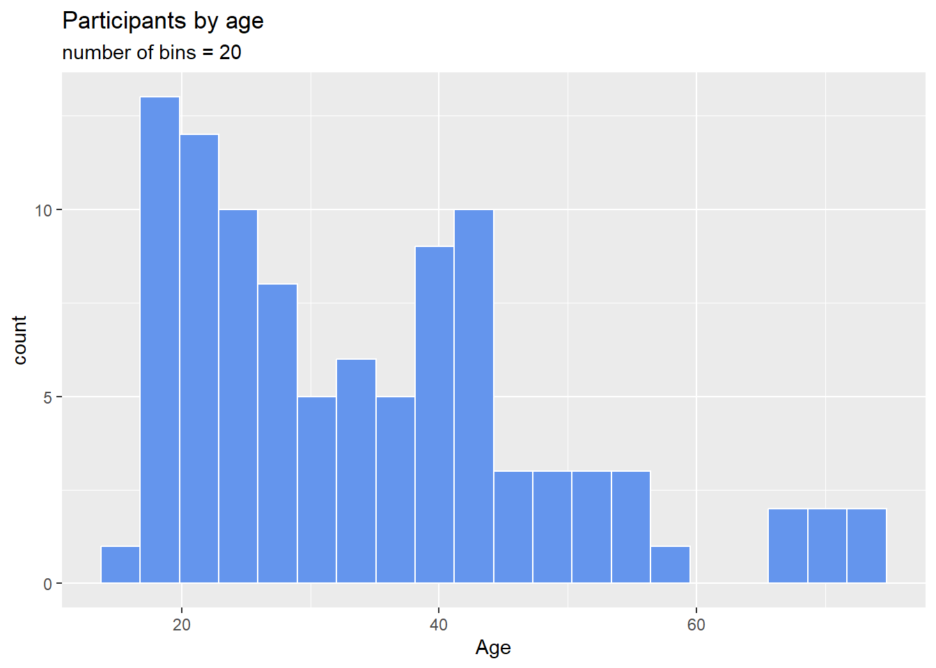
Figure 4.19: Histogram with a specified number of bins
Alternatively, you can specify the binwidth, the width of the bins represented by the bars.
# plot the histogram with a binwidth of 5
ggplot(Marriage, aes(x = age)) +
  geom_histogram(fill = "cornflowerblue",
                 color = "white",
                 binwidth = 5) +
  labs(title="Participants by age",
       subtitle = "binwidth = 5 years",
       x = "Age")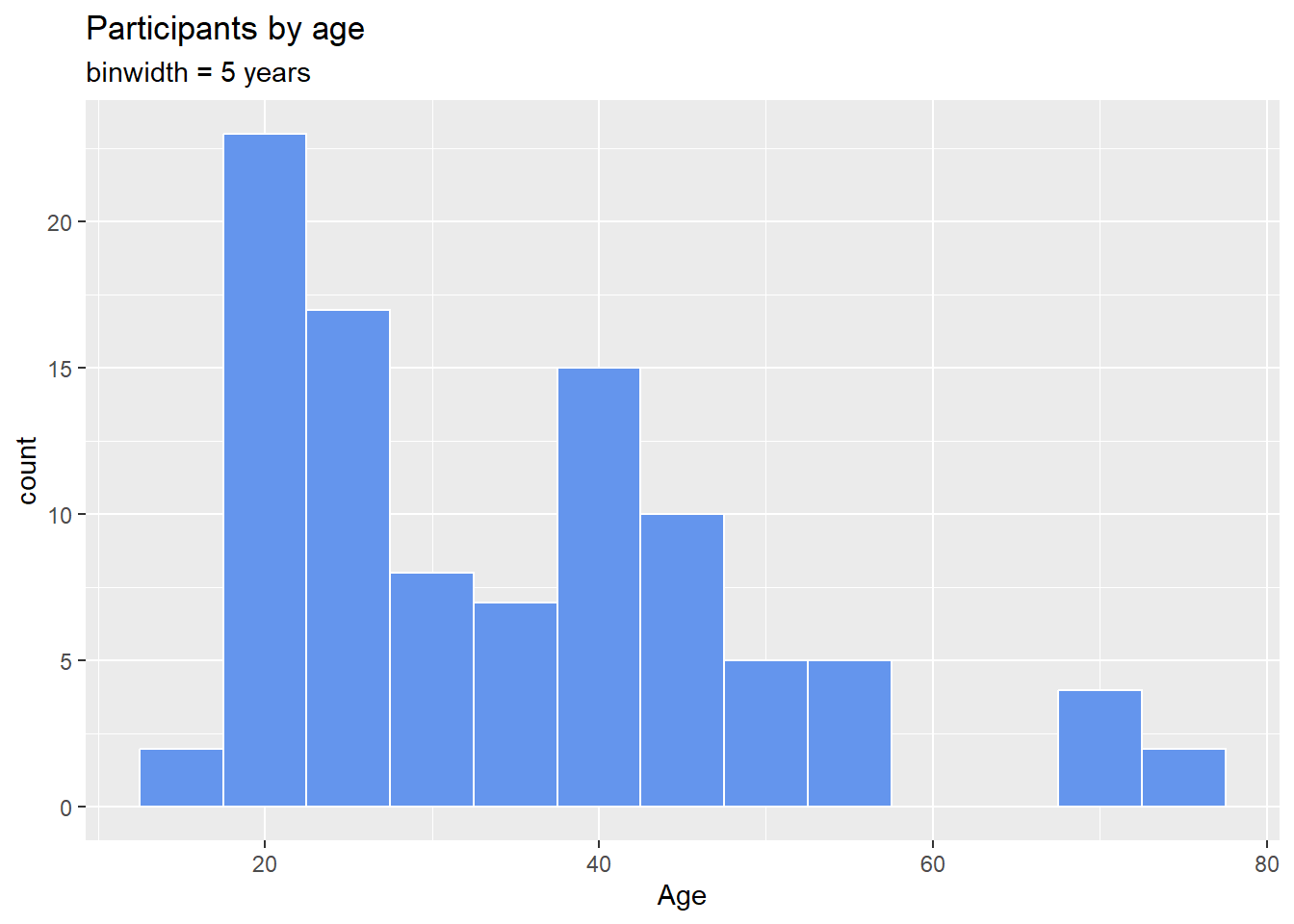
Figure 4.20: Histogram with specified a bin width
As with bar charts, the y-axis can represent counts or percent of the total.
# plot the histogram with percentages on the y-axis
library(scales)
ggplot(Marriage,
       aes(x = age, y= after_stat(count/sum(count)))) +
  geom_histogram(fill = "cornflowerblue",
                 color = "white",
                 binwidth = 5) +
  labs(title="Participants by age",
       y = "Percent",
       x = "Age") +
  scale_y_continuous(labels = percent)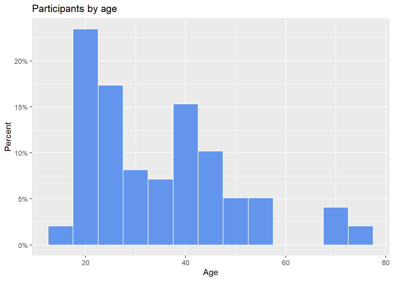
Figure 4.21: Histogram with percentages on the y-axis
4.2.2 Kernel Density plot
An alternative to a histogram is the kernel density plot. Technically, kernel density estimation is a nonparametric method for estimating the probability density function of a continuous random variable (what??). Basically, we are trying to draw a smoothed histogram, where the area under the curve equals one.
# Create a kernel density plot of age
ggplot(Marriage, aes(x = age)) +
  geom_density() +
  labs(title = "Participants by age")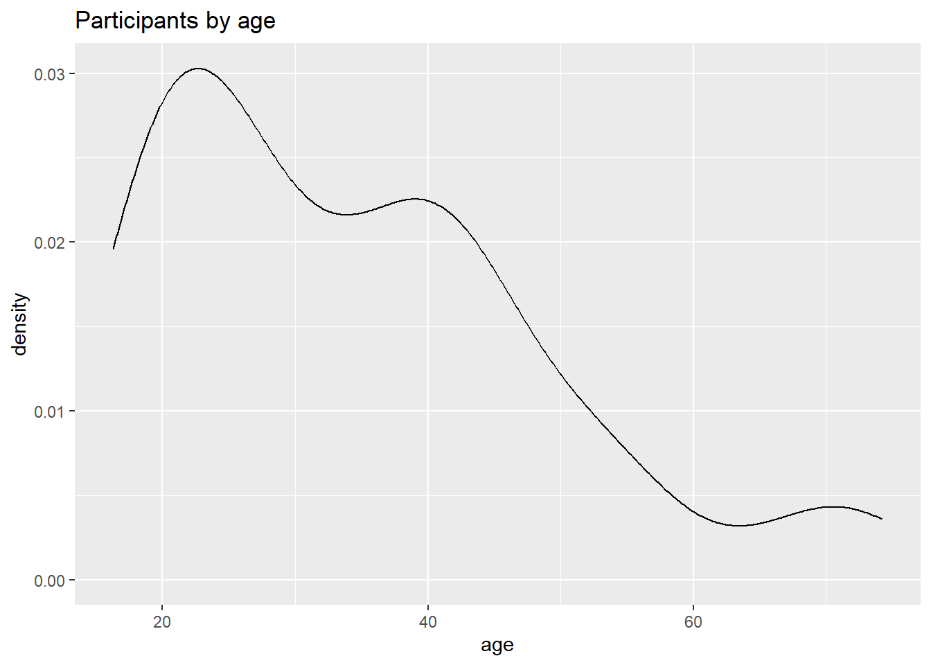
Figure 4.22: Basic kernel density plot
The graph shows the distribution of scores. For example, the proportion of cases between 20 and 40 years old would be represented by the area under the curve between 20 and 40 on the x-axis.
As with previous charts, we can use fill and color to specify the fill and border colors.
# Create a kernel density plot of age
ggplot(Marriage, aes(x = age)) +
  geom_density(fill = "indianred3") +
  labs(title = "Participants by age")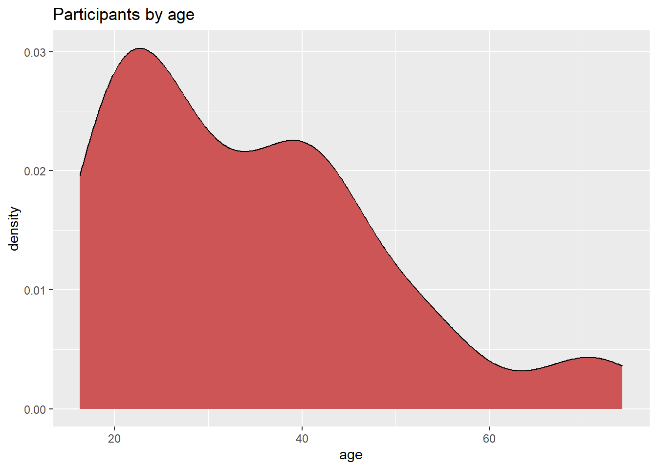
Figure 4.23: Kernel density plot with fill
4.2.2.1 Smoothing parameter
The degree of smoothness is controlled by the bandwidth parameter bw. To find the default value for a particular variable, use the bw.nrd0 function. Values that are larger will result in more smoothing, while values that are smaller will produce less smoothing.
## [1] 5.181946# Create a kernel density plot of age
ggplot(Marriage, aes(x = age)) +
geom_density(fill = "deepskyblue",
bw = 1) +
labs(title = "Participants by age",
subtitle = "bandwidth = 1")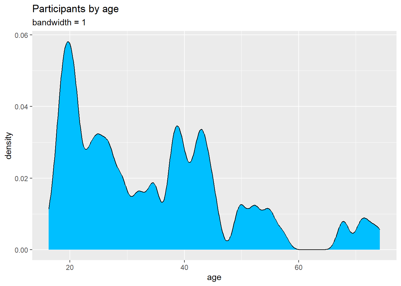
Figure 4.24: Kernel density plot with a specified bandwidth
In this example, the default bandwidth for age is 5.18. Choosing a value of 1 resulted in less smoothing and more detail.
Kernel density plots allow you to easily see which scores are most frequent and which are relatively rare. However it can be difficult to explain the meaning of the y-axis means to a non-statistician. (But it will make you look really smart at parties!)
4.2.3 Dot Chart
Another alternative to the histogram is the dot chart. Again, the quantitative variable is divided into bins, but rather than summary bars, each observation is represented by a dot. By default, the width of a dot corresponds to the bin width, and dots are stacked, with each dot representing one observation. This works best when the number of observations is small (say, less than 150).
# plot the age distribution using a dotplot
ggplot(Marriage, aes(x = age)) +
  geom_dotplot() +
  labs(title = "Participants by age",
       y = "Proportion",
       x = "Age")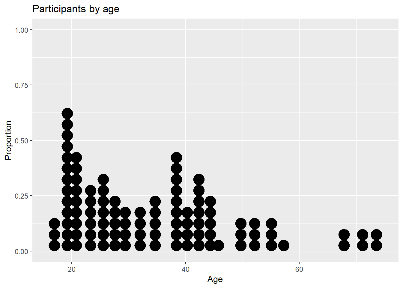
Figure 4.25: Basic dotplot
The fill and color options can be used to specify the fill and border color of each dot respectively.
# Plot ages as a dot plot using
# gold dots with black borders
ggplot(Marriage, aes(x = age)) +
  geom_dotplot(fill = "gold",
               color="black") +
  labs(title = "Participants by age",
       y = "Proportion",
       x = "Age")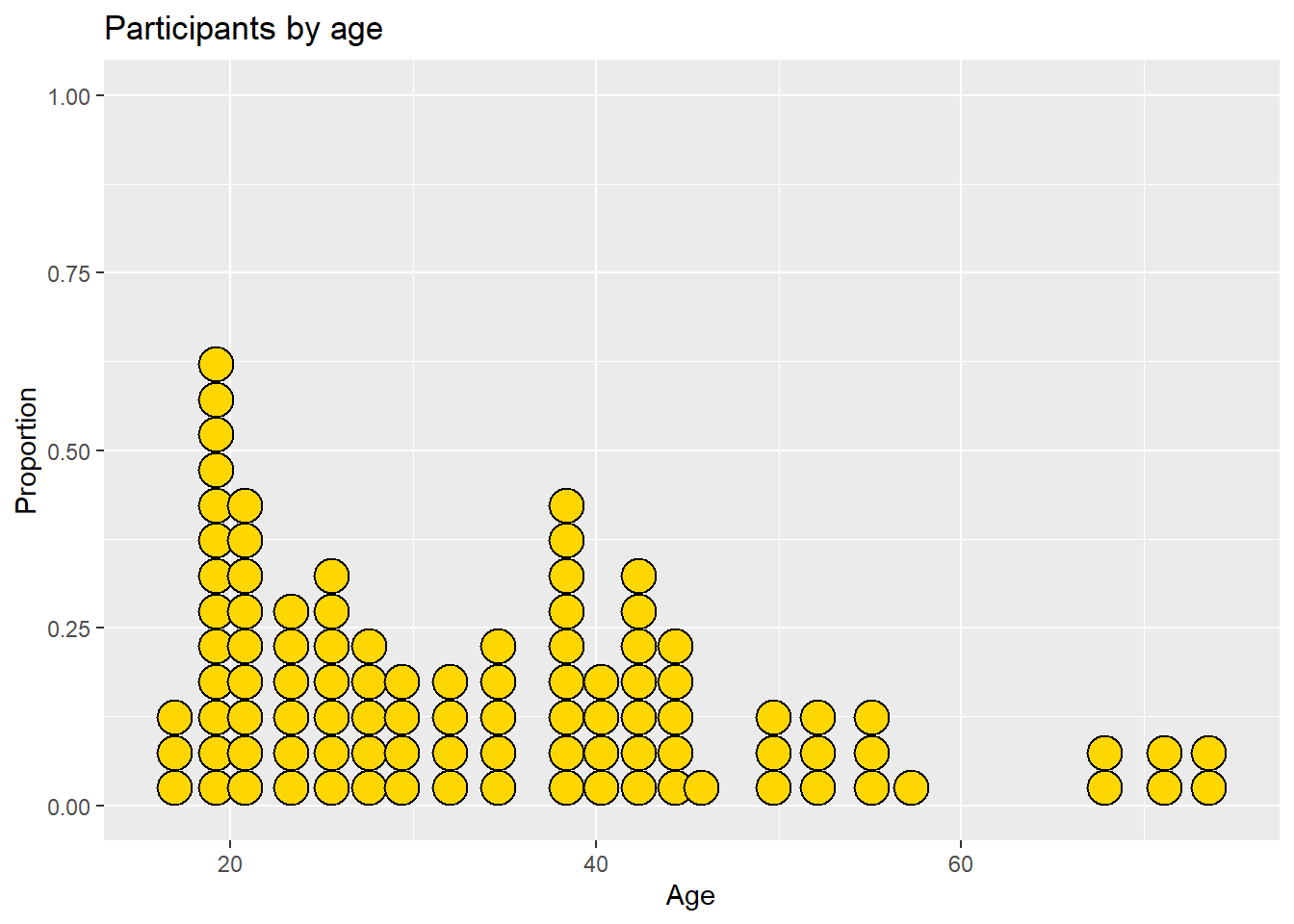
Figure 4.26: Dotplot with a specified color scheme
There are many more options available. See ?geom_dotplot for details and examples.