Chapter 3 Introduction to ggplot2
This chapter provides an brief overview of how the ggplot2 package works. It introduces the central concepts used to develop an informative graph by exploring the relationships contained in insurance dataset.
3.1 A worked example
The functions in the ggplot2 package build up a graph in layers. We’ll build a a complex graph by starting with a simple graph and adding additional elements, one at a time.
The example explores the relationship between smoking, obesity, age, and medical costs using data from the Medical Insurance Costs dataset (Appendix A.4).
First, lets import the data.
Next, we’ll add a variable indicating if the patient is obese or not. Obesity will be defined as a body mass index greater than or equal to 30.
In building a ggplot2 graph, only the first two functions described below are required. The others are optional and can appear in any order.
3.1.1 ggplot
The first function in building a graph is the ggplot function. It specifies the data frame to be used and the mapping of the variables to the visual properties of the graph. The mappings are placed within the aes function, which stands for aesthetics. Let’s start by looking at the relationship between age and medical expenses.
# specify dataset and mapping
library(ggplot2)
ggplot(data = insurance,
       mapping = aes(x = age, y = expenses))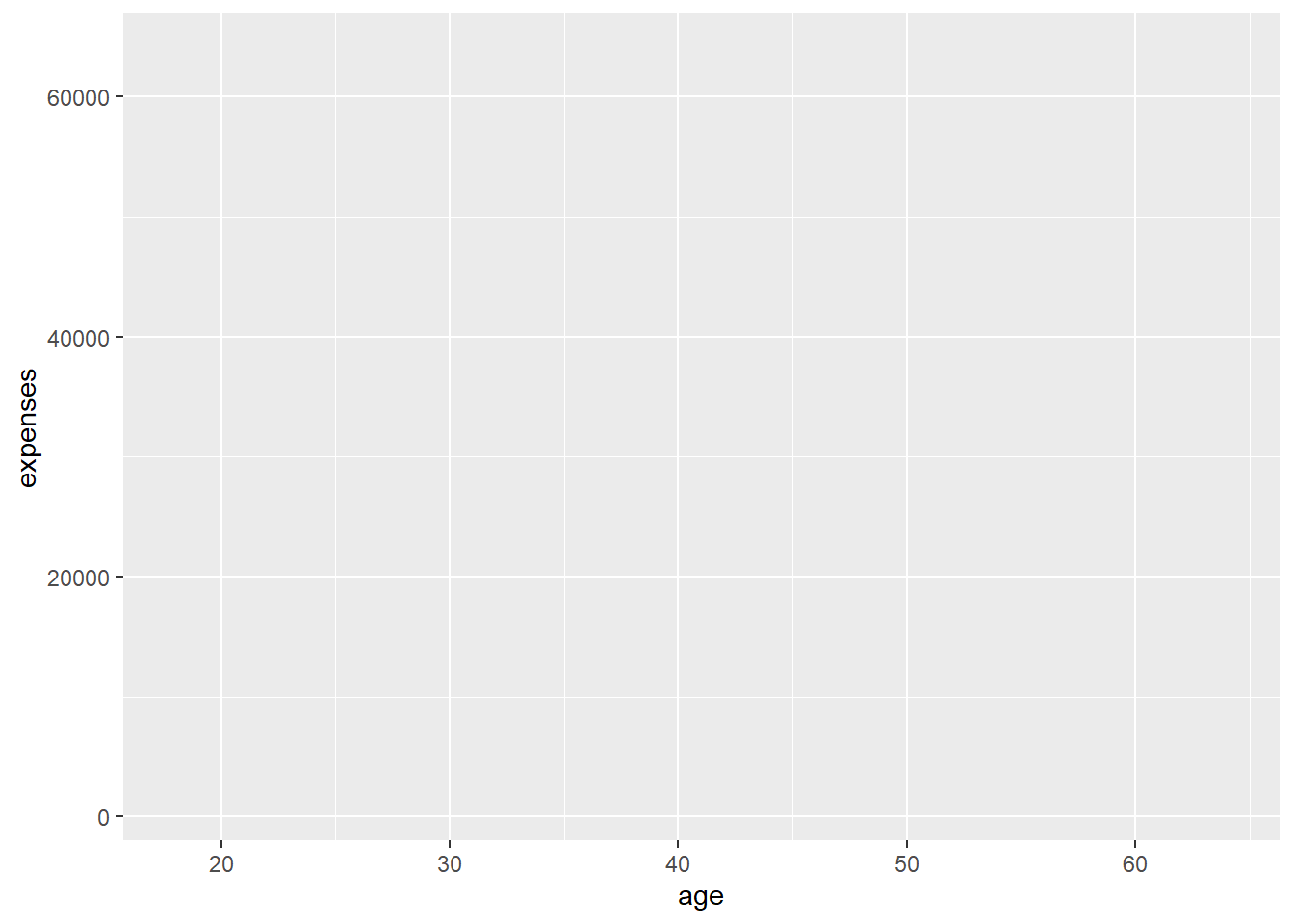
Figure 3.1: Map variables
Why is the graph empty? We specified that the age variable should be mapped to the x-axis and that the expenses should be mapped to the y-axis, but we haven’t yet specified what we wanted placed on the graph.
3.1.2 geoms
Geoms are the geometric objects (points, lines, bars, etc.) that can be placed on a graph. They are added using functions that start with geom_. In this example, we’ll add points using the geom_point function, creating a scatterplot.
In ggplot2 graphs, functions are chained together using the + sign to build a final plot.
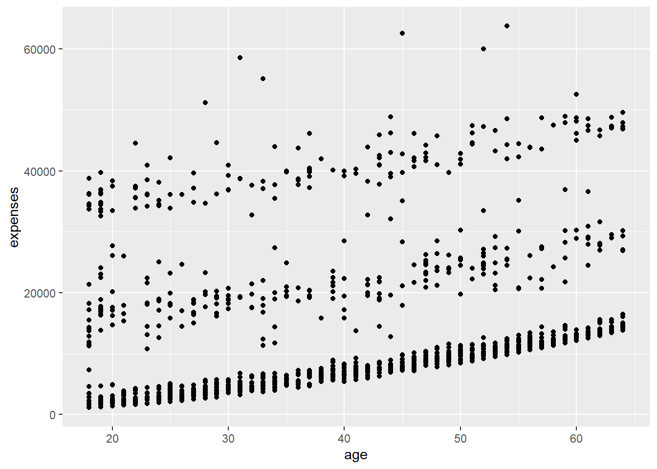
Figure 3.2: Add points
Figure 3.2 indicates that expenses rise with age in a fairly linear fashion.
A number of parameters (options) can be specified in a geom_ function. Options for the geom_point function include color, size, and alpha. These control the point color, size, and transparency, respectively. Transparency ranges from 0 (completely transparent) to 1 (completely opaque). Adding a degree of transparency can help visualize overlapping points.
# make points blue, larger, and semi-transparent
ggplot(data = insurance,
       mapping = aes(x = age, y = expenses)) +
  geom_point(color = "cornflowerblue",
             alpha = .7,
             size = 2)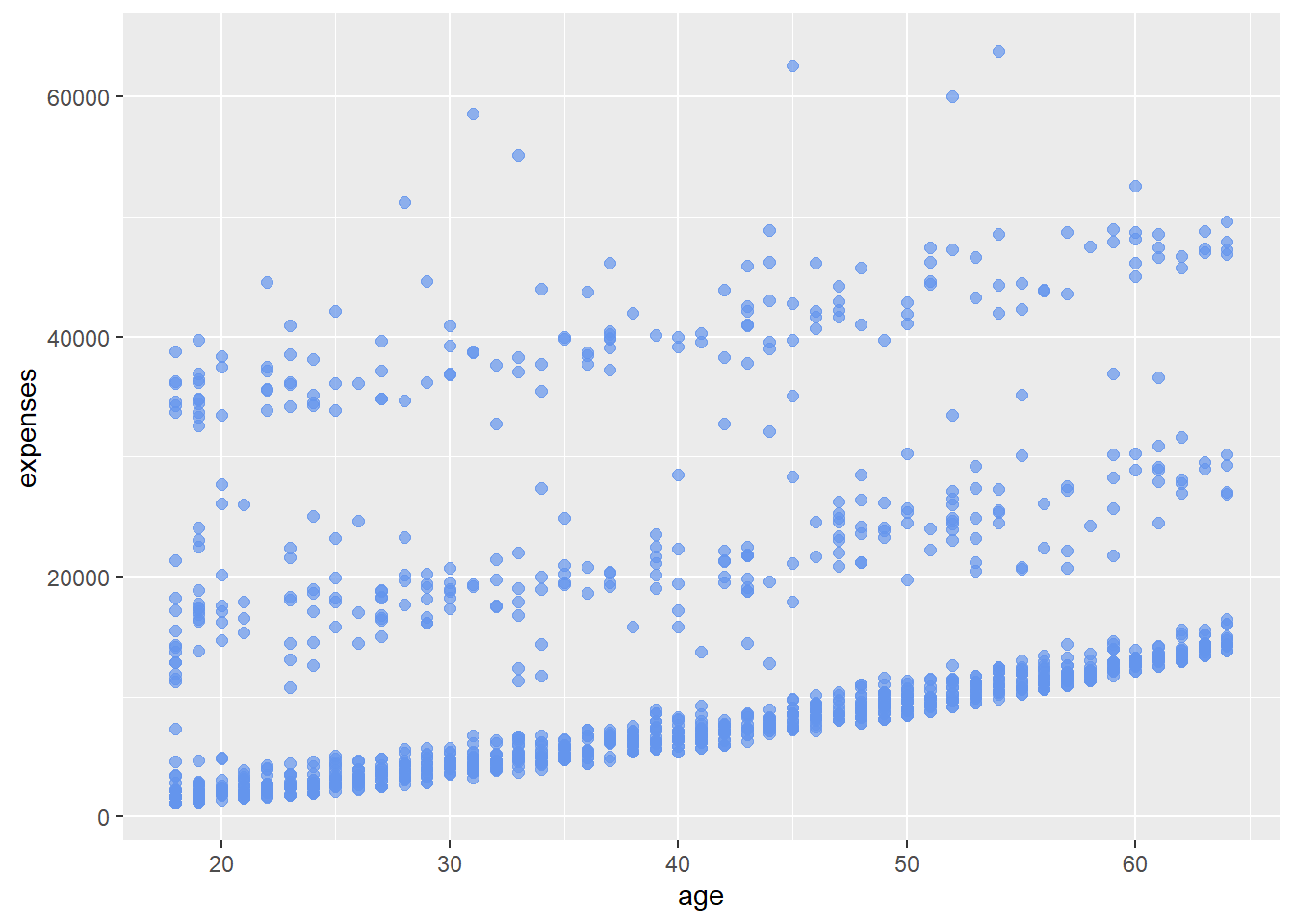
Figure 3.3: Modify point color, transparency, and size
Next, let’s add a line of best fit. We can do this with the geom_smooth function. Options control the type of line (linear, quadratic, nonparametric), the thickness of the line, the line’s color, and the presence or absence of a confidence interval. Here we request a linear regression (method = lm) line (where lm stands for linear model).
# add a line of best fit.
ggplot(data = insurance,
       mapping = aes(x = age, y = expenses)) +
  geom_point(color = "cornflowerblue",
             alpha = .5,
             size = 2) +
  geom_smooth(method = "lm")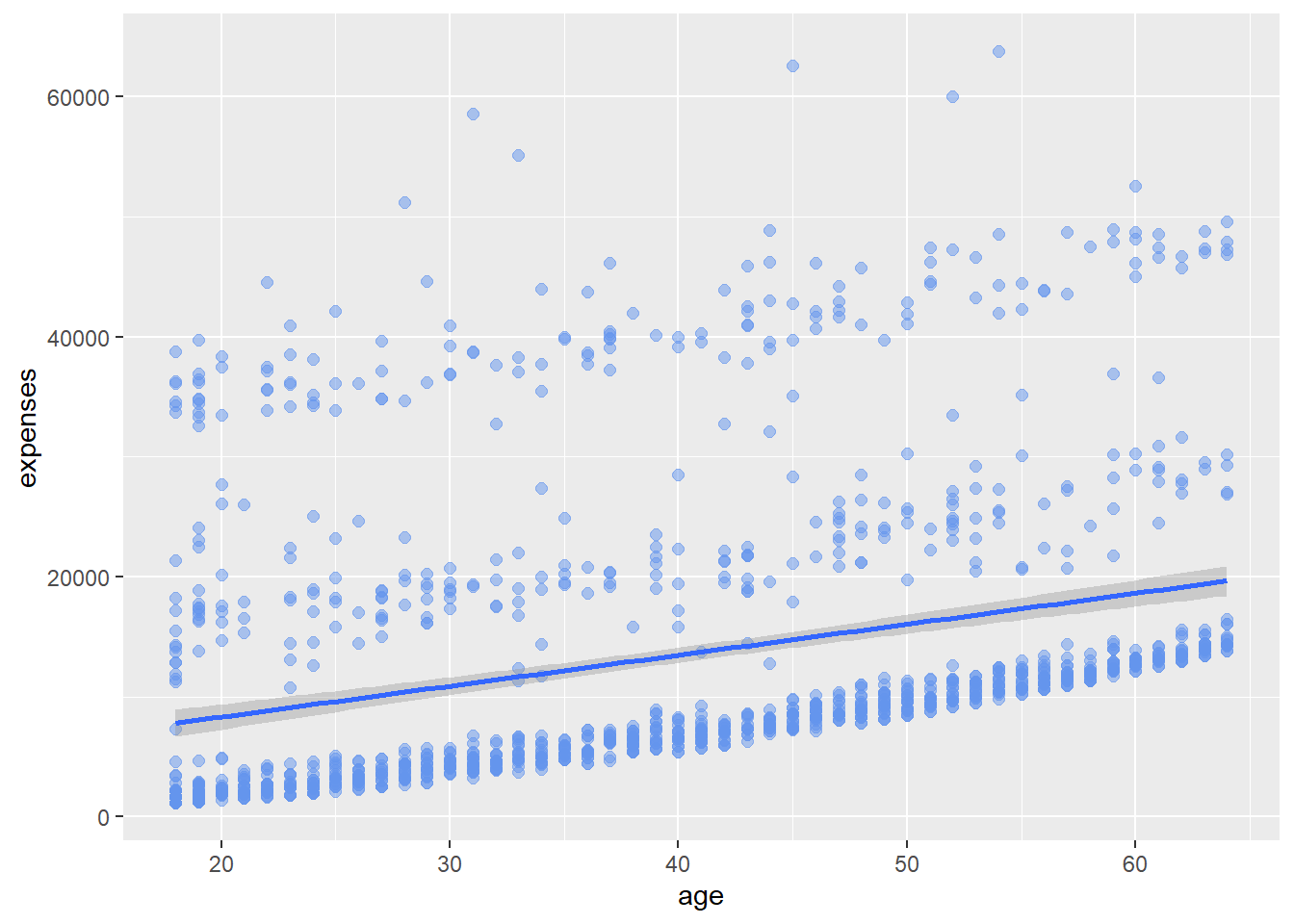
Figure 3.4: Add line of best fit
Expenses appears to increase with age, but there is an unusual clustering of the point. We will find out why as we delve deeper into the data.
3.1.3 grouping
In addition to mapping variables to the x and y axes, variables can be mapped to the color, shape, size, transparency, and other visual characteristics of geometric objects. This allows groups of observations to be superimposed in a single graph.
Let’s add smoker status to the plot and represent it by color.
# indicate sex using color
ggplot(data = insurance,
       mapping = aes(x = age,
                     y = expenses,
                     color = smoker)) +
  geom_point(alpha = .5,
             size = 2) +
  geom_smooth(method = "lm",
              se = FALSE,
              size = 1.5)
Figure 3.5: Include sex, using color
The color = smoker option is place in the aes function, because we are mapping a variable to an aesthetic (a visual characteristic of the graph). The geom_smooth option (se = FALSE) was added to suppresses the confidence intervals.
It appears that smokers tend to incur greater expenses than non-smokers (not a surprise).
3.1.4 scales
Scales control how variables are mapped to the visual characteristics of the plot. Scale functions (which start with scale_) allow you to modify this mapping. In the next plot, we’ll change the x and y axis scaling, and the colors employed.
# modify the x and y axes and specify the colors to be used
ggplot(data = insurance,
       mapping = aes(x = age,
                     y = expenses,
                     color = smoker)) +
  geom_point(alpha = .5,
             size = 2) +
  geom_smooth(method = "lm",
              se = FALSE,
              size = 1.5) +
  scale_x_continuous(breaks = seq(0, 70, 10)) +
  scale_y_continuous(breaks = seq(0, 60000, 20000),
                     label = scales::dollar) +
  scale_color_manual(values = c("indianred3",
                                "cornflowerblue"))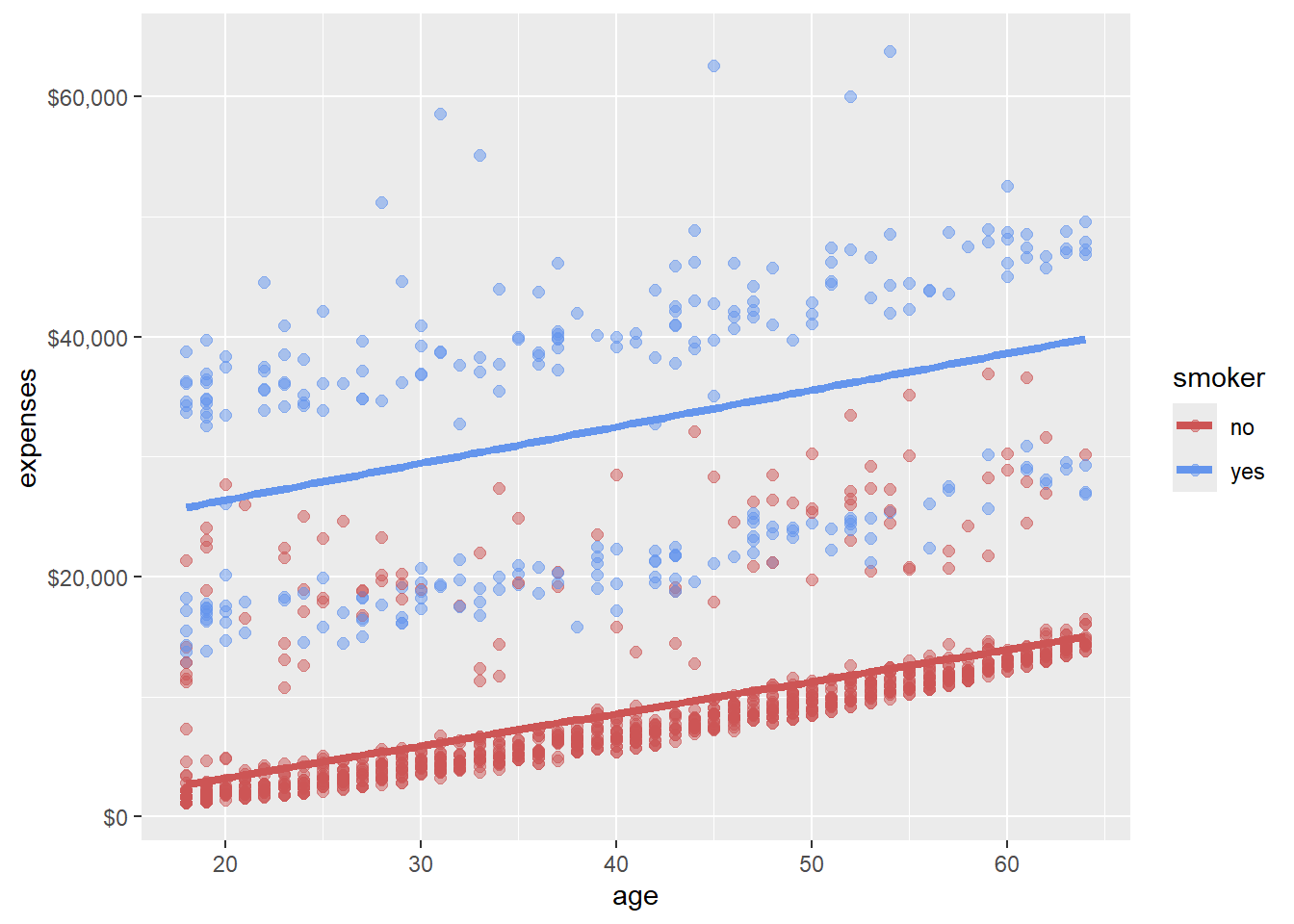
Figure 3.6: Change colors and axis labels
We’re getting there. Here is a question. Is the relationship between age, expenses and smoking the same for obese and non-obese patients? Let’s repeat this graph once for each weight status in order to explore this.
3.1.5 facets
Facets reproduce a graph for each level a given variable (or pair of variables). Facets are created using functions that start with facet_. Here, facets will be defined by the two levels of the obese variable.
# reproduce plot for each obsese and non-obese individuals
ggplot(data = insurance,
       mapping = aes(x = age,
                     y = expenses,
                     color = smoker)) +
  geom_point(alpha = .5) +
  geom_smooth(method = "lm",
              se = FALSE) +
  scale_x_continuous(breaks = seq(0, 70, 10)) +
  scale_y_continuous(breaks = seq(0, 60000, 20000),
                     label = scales::dollar) +
  scale_color_manual(values = c("indianred3",
                                "cornflowerblue")) +
  facet_wrap(~obese)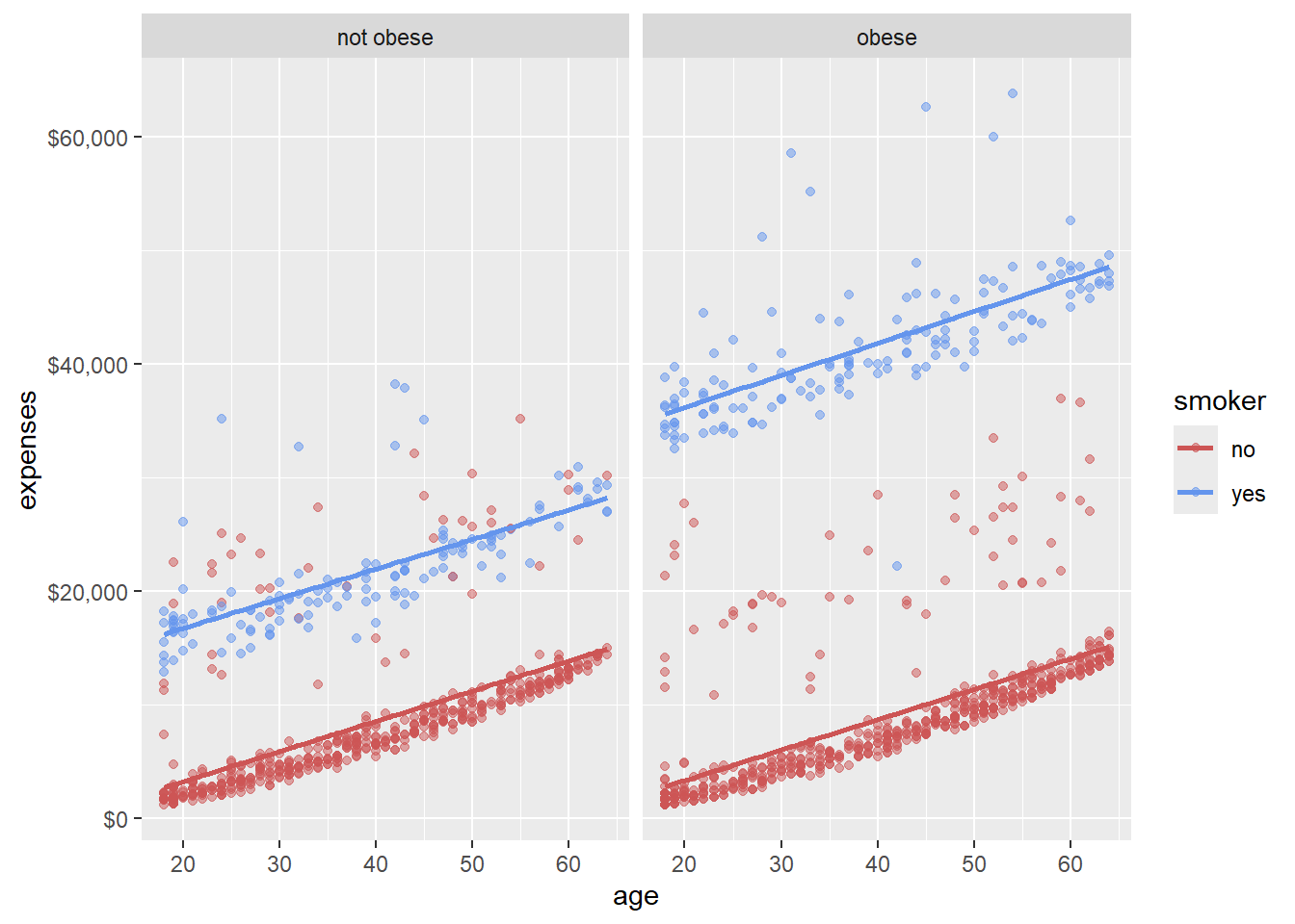
Figure 3.7: Add job sector, using faceting
From Figure 3.7 we can simultaneously visualize the relationships among age, smoking status, obesity, and annual medical expenses.
3.1.6 labels
Graphs should be easy to interpret and informative labels are a key element in achieving this goal. The labs function provides customized labels for the axes and legends. Additionally, a custom title, subtitle, and caption can be added.
# add informative labels
ggplot(data = insurance,
       mapping = aes(x = age,
                     y = expenses,
                     color = smoker)) +
  geom_point(alpha = .5) +
  geom_smooth(method = "lm",
              se = FALSE) +
  scale_x_continuous(breaks = seq(0, 70, 10)) +
  scale_y_continuous(breaks = seq(0, 60000, 20000),
                     label = scales::dollar) +
  scale_color_manual(values = c("indianred3",
                                "cornflowerblue")) +
  facet_wrap(~obese) +
  labs(title = "Relationship between patient demographics and medical costs",
       subtitle = "US Census Bureau 2013",
       caption = "source: http://mosaic-web.org/",
       x = " Age (years)",
       y = "Annual expenses",
       color = "Smoker?")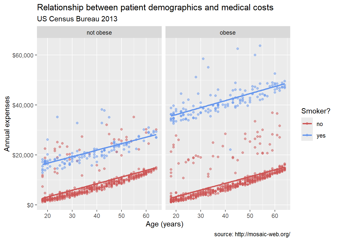
Figure 3.8: Add informative titles and labels
Now a viewer doesn’t need to guess what the labels expenses and age mean, or where the data come from.
3.1.7 themes
Finally, we can fine tune the appearance of the graph using themes. Theme functions (which start with theme_) control background colors, fonts, grid-lines, legend placement, and other non-data related features of the graph. Let’s use a cleaner theme.
# use a minimalist theme
ggplot(data = insurance,
       mapping = aes(x = age,
                     y = expenses,
                     color = smoker)) +
  geom_point(alpha = .5) +
  geom_smooth(method = "lm",
              se = FALSE) +
  scale_x_continuous(breaks = seq(0, 70, 10)) +
  scale_y_continuous(breaks = seq(0, 60000, 20000),
                     label = scales::dollar) +
  scale_color_manual(values = c("indianred3",
                                "cornflowerblue")) +
  facet_wrap(~obese) +
  labs(title = "Relationship between age and medical expenses",
       subtitle = "US Census Data 2013",
       caption = "source: https://github.com/dataspelunking/MLwR",
       x = " Age (years)",
       y = "Medical Expenses",
       color = "Smoker?") +
  theme_minimal()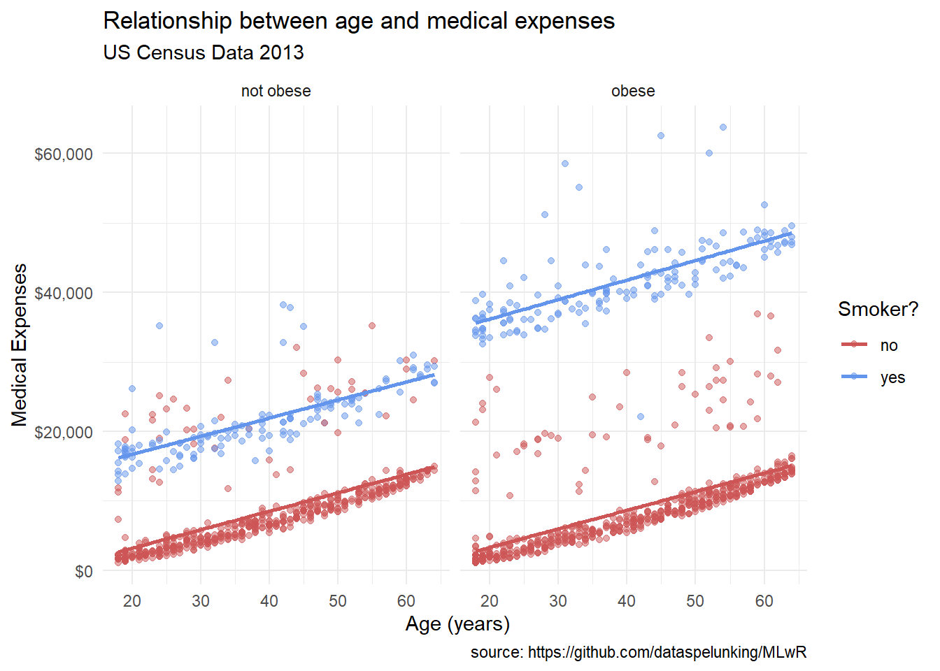
Figure 3.9: Use a simpler theme
Now we have something. From Figure 3.9 it appears that:
- There is a positive linear relationship between age and expenses. The relationship is constant across smoking and obesity status (i.e., the slope doesn’t change).
- Smokers and obese patients have higher medical expenses.
- There is an interaction between smoking and obesity. Non-smokers look fairly similar across obesity groups. However, for smokers, obese patients have much higher expenses.
- There are some very high outliers (large expenses) among the obese smoker group.
These findings are tentative. They are based on a limited sample size and do not involve statistical testing to assess whether differences may be due to chance variation.
3.2 Placing the data and mapping options
Plots created with ggplot2 always start with the ggplot function. In the examples above, the data and mapping options were placed in this function. In this case they apply to each geom_ function that follows. You can also place these options directly within a geom. In that case, they only apply only to that specific geom.
Consider the following graph.
# placing color mapping in the ggplot function
ggplot(insurance,
       aes(x = age,
           y = expenses,
           color = smoker)) +
  geom_point(alpha = .5,
             size = 2) +
  geom_smooth(method = "lm",
              se = FALSE,
              size = 1.5)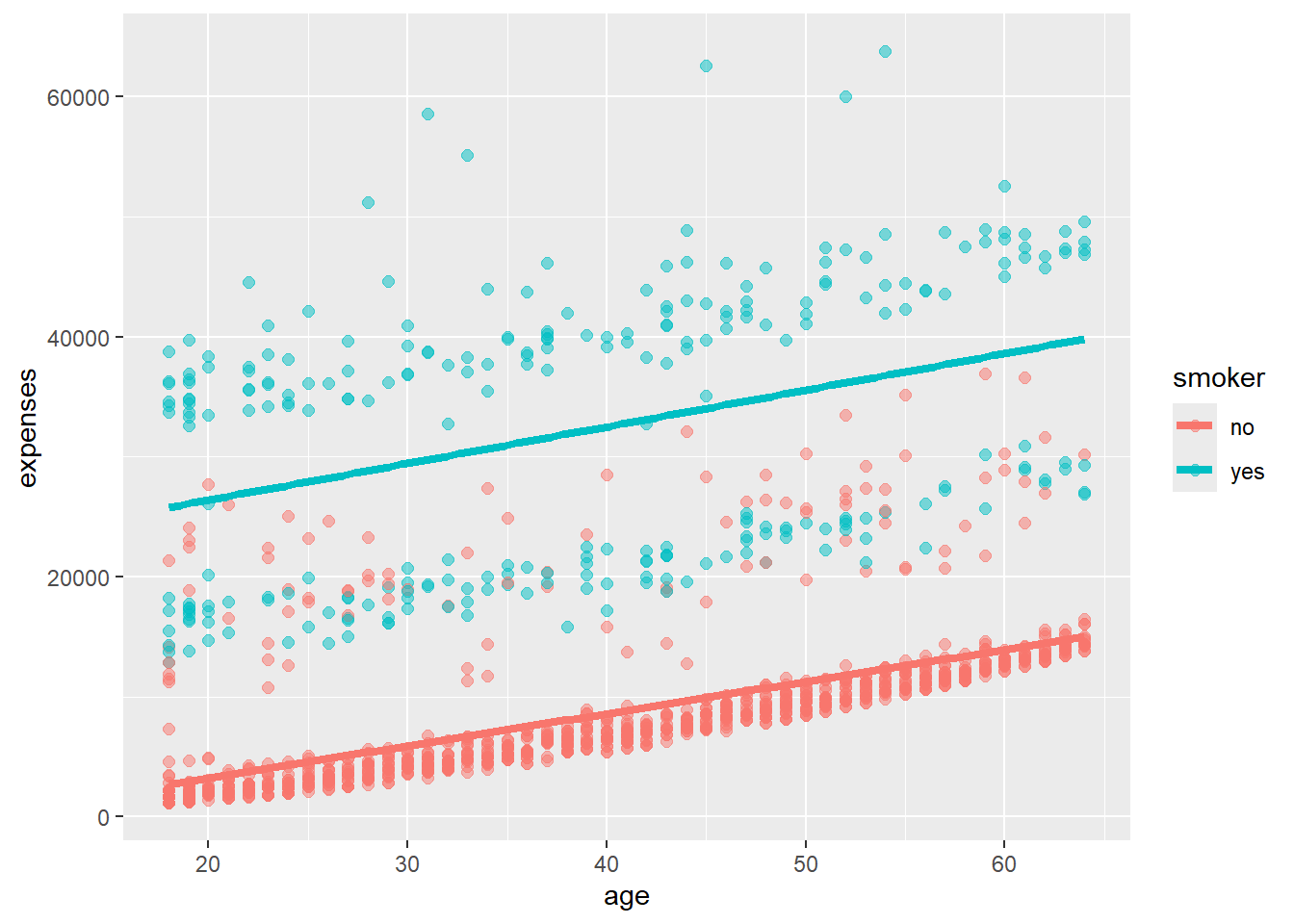
Figure 3.10: Color mapping in ggplot function
Since the mapping of the variable smoker to color appears in the ggplot function, it applies to both geom_point and geom_smooth. The point color indicates the smoker status, and a separate colored trend line is produced for smokers and non-smokers. Compare this to
# placing color mapping in the geom_point function
ggplot(insurance,
       aes(x = age,
           y = expenses)) +
  geom_point(aes(color = smoker),
             alpha = .5,
             size = 2) +
  geom_smooth(method = "lm",
              se = FALSE,
              size = 1.5)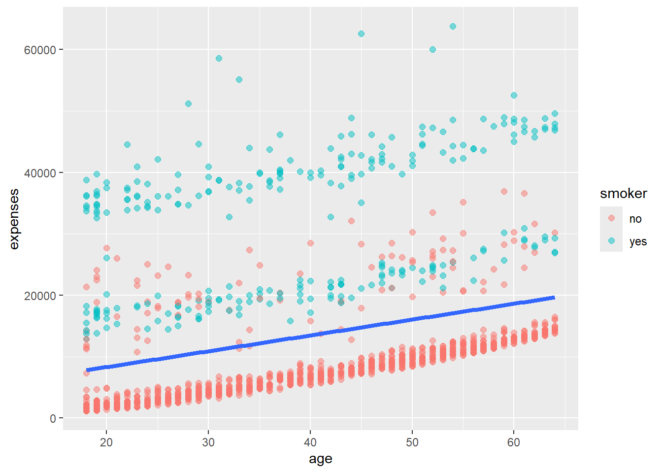
Figure 3.11: Color mapping in ggplot function
Since the smoker to color mapping only appears in the geom_point function, it is only used there. A single trend line is created for all observations.
Most of the examples in this book place the data and mapping options in the ggplot function. Additionally, the phrases data= and mapping= are omitted since the first option always refers to data and the second option always refers to mapping.
3.3 Graphs as objects
A ggplot2 graph can be saved as a named R object (like a data frame), manipulated further, and then printed or saved to disk.
# create scatterplot and save it
myplot <- ggplot(data = insurance,
                  aes(x = age, y = expenses)) +
             geom_point()

# plot the graph
myplot

# make the points larger and blue
# then print the graph
myplot <- myplot + geom_point(size = 2, color = "blue")
myplot

# print the graph with a title and line of best fit
# but don't save those changes
myplot + geom_smooth(method = "lm") +
  labs(title = "Mildly interesting graph")

# print the graph with a black and white theme
# but don't save those changes
myplot + theme_bw()
This can be a real time saver (and help you avoid carpal tunnel syndrome). It is also handy when saving graphs programmatically.
Now it’s time to apply what we’ve learned.