Chapter 14 Advice / Best Practices
This section contains some thoughts on what makes a good data visualization. Most come from books and posts that others have written, but I’ll take responsibility for putting them here.
14.1 Labeling
Everything on your graph should be clearly labeled. Typically this will include a
- title - a clear short title letting the reader know what they’re looking at
- Relationship between experience and wages by gender
- Relationship between experience and wages by gender
- subtitle - an optional second (smaller font) title giving additional information
- Years 2016-2018
- caption - source attribution for the data
- source: US Department of Labor - www.bls.gov/bls/blswage.htm
- axis labels - clear labels for the x and y axes
- short but descriptive
- include units of measurement
- Engine displacement (cu. in.)
- Survival time (days)
- Patient age (years)
- legend - short informative title and labels
- Male and Female - not 0 and 1 !!
- lines and bars - label any trend lines, annotation lines, and error bars
Basically, the reader should be able to understand your graph without having to wade through paragraphs of text. When in doubt, show your data visualization to someone who has not read your article or poster and ask them if anything is unclear.
14.2 Signal to noise ratio
In data science, the goal of data visualization is to communicate information. Anything that doesn’t support this goal should be reduced or eliminated.
Chart Junk - visual elements of charts that aren’t necessary to comprehend the information represented by the chart or that distract from this information. (Wikipedia (https://en.wikipedia.org/wiki/Chartjunk))
Consider the following graph. The goal is to compare the calories in bacon to the other four foods. The data come from http://blog.cheapism.com. I increased the serving size for bacon from 1 slice to 3 slices (let’s be real, its BACON!).
Disclaimer: I got the idea for this graph from one I saw on the internet years ago, but I can’t remember where. If you know, let me know so that I can give proper credit.
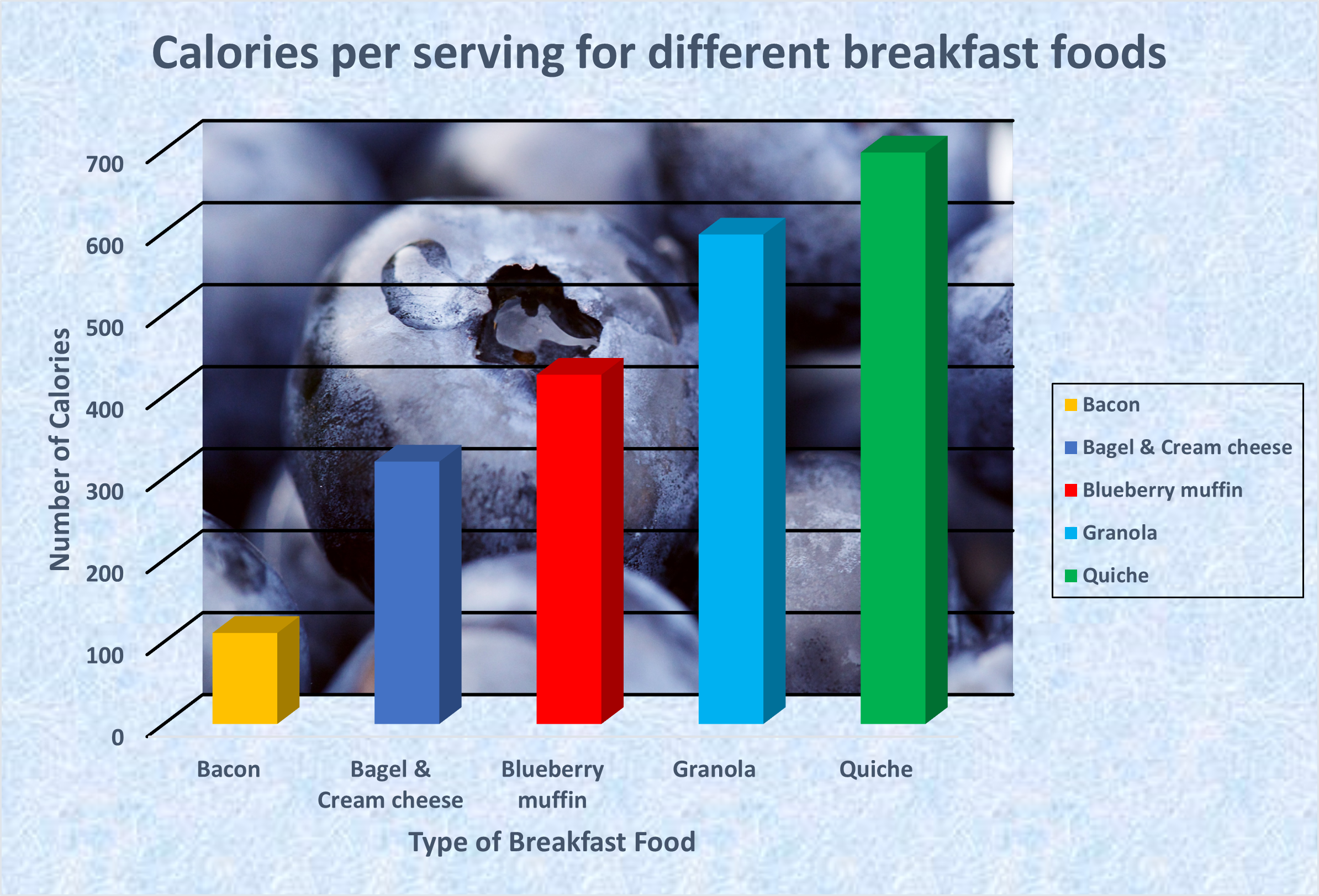
Figure 14.1: Graph with chart junk
If the goal is to compare the calories in bacon to other breakfast foods, much of this visualization is unnecessary and distracts from the task.
Think of all the things that are superfluous:
- the speckled blue background border
- the blueberries photo image
- the 3-D effect on the bars
- the legend (it doesn’t add anything, the bars are already labeled)
- the colors of bars (they don’t signify anything)
Here is an alternative.
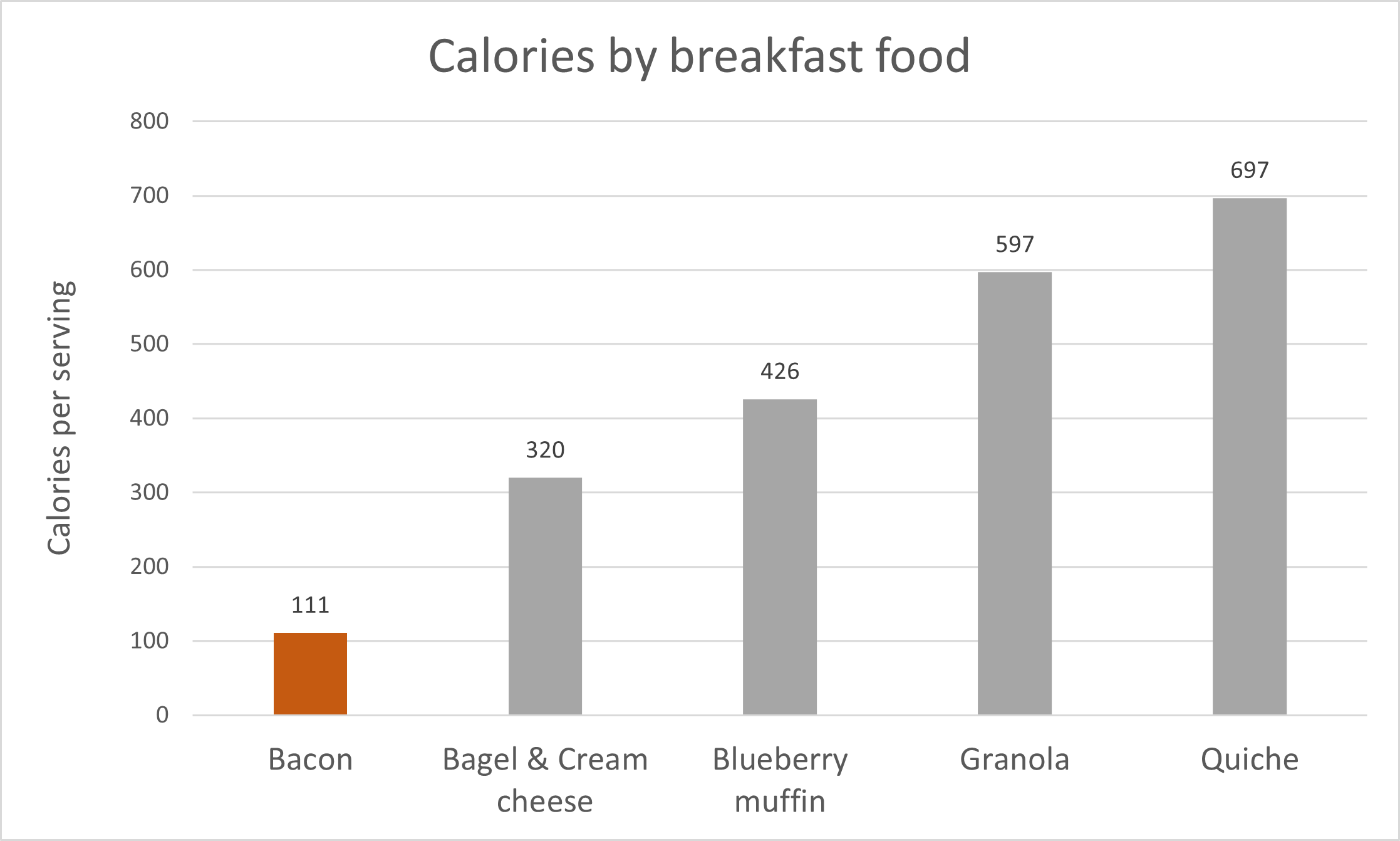
Figure 14.2: Graph with chart junk removed
The chart junk has been removed. In addition
- the x-axis label isn’t needed - these are obviously foods
- the y-axis is given a better label
- the title has been simplified (the word different is redundant)
- the bacon bar is the only colored bar - it makes comparisons easier
- the grid lines have been made lighter (gray rather than black) so they don’t distract
- calorie values have been added to each bar so that the reader doesn’t have to keep refering to the y-axis.
I may have gone a bit far leaving out the x-axis label. It’s a fine line, knowing when to stop simplifying.
In general, you want to reduce chart junk to a minimum. In other words, more signal, less noise.
14.3 Color choice
Color choice is about more than aesthetics. Choose colors that help convey the information contained in the plot.
The article How to Choose Colors for Data Visualizations by Mike Yi (https://chartio.com/learn/charts/how-to-choose-colors-data-visualization) is a great place to start.
Basically, think about selecting among sequential, diverging, and qualitative color schemes:
- sequential - for plotting a quantitative variable that goes from low to high
- diverging - for contrasting the extremes (low, medium, and high) of a quantitative variable
- qualitative - for distinguishing among the levels of a categorical variable
The article above can help you to choose among these schemes. Additionally, the RColorBrewer package (Section 11.2.2.1) provides palettes categorized in this way. The YlOrRd to Blues palettes are sequential, Set3 to Accent are qualitative, and Spectral to BrBg are diverging.
Other things to keep in mind:
- Make sure that text is legible - avoid dark text on dark backgrounds, light text on light backgrounds, and colors that clash in a discordant fashion (i.e. they hurt to look at!)
- Avoid combinations of red and green - it can be difficult for a colorblind audience to distinguish these colors
Other helpful resources are Stephen Few’s Practical Rules for Using Color in Charts (http://www.perceptualedge.com/articles/visual_business_intelligence/rules_for_using_color.pdf) and Maureen Stone’s Expert Color Choices for Presenting Data (https://courses.washington.edu/info424/2007/documents/Stone-Color%20Choices.pdf).
14.4 y-Axis scaling
OK, this is a big one. You can make an effect seem massive or insignificant depending on how you scale a numeric y-axis.
Consider the following the example comparing the 9-month salaries of male and female assistant professors. The data come from the Academic Salaries dataset.
# load data
data(Salaries, package="carData")

# get means, standard deviations, and
# 95% confidence intervals for
# assistant professor salary by sex
library(dplyr)
df <- Salaries %>%
  filter(rank == "AsstProf") %>%
  group_by(sex) %>%
  summarize(n = n(),
            mean = mean(salary),
            sd = sd(salary),
            se = sd / sqrt(n),
            ci = qt(0.975, df = n - 1) * se)

df
## # A tibble: 2 × 6
## sex n mean sd se ci
## <fct> <int> <dbl> <dbl> <dbl> <dbl>
## 1 Female 11 78050. 9372. 2826. 6296.
## 2 Male 56 81311. 7901. 1056. 2116.# create and save the plot
library(ggplot2)
p <- ggplot(df,
aes(x = sex, y = mean, group=1)) +
geom_point(size = 4) +
geom_line() +
scale_y_continuous(limits = c(77000, 82000),
label = scales::dollar) +
labs(title = "Mean salary differences by gender",
subtitle = "9-mo academic salary in 2007-2008",
caption = paste("source: Fox J. and Weisberg, S. (2011)",
"An R Companion to Applied Regression,",
"Second Edition Sage"),
x = "Gender",
y = "Salary") +
scale_y_continuous(labels = scales::dollar)First, let’s plot this with a y-axis going from 77,000 to 82,000.
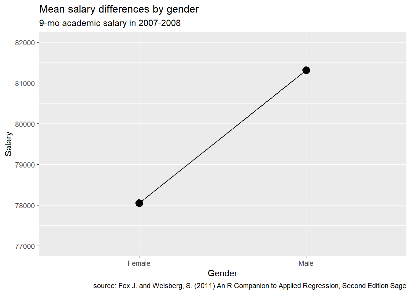
Figure 14.3: Plot with limited range of Y
There appears to be a very large gender difference.
Next, let’s plot the same data with the y-axis going from 0 to 125,000.
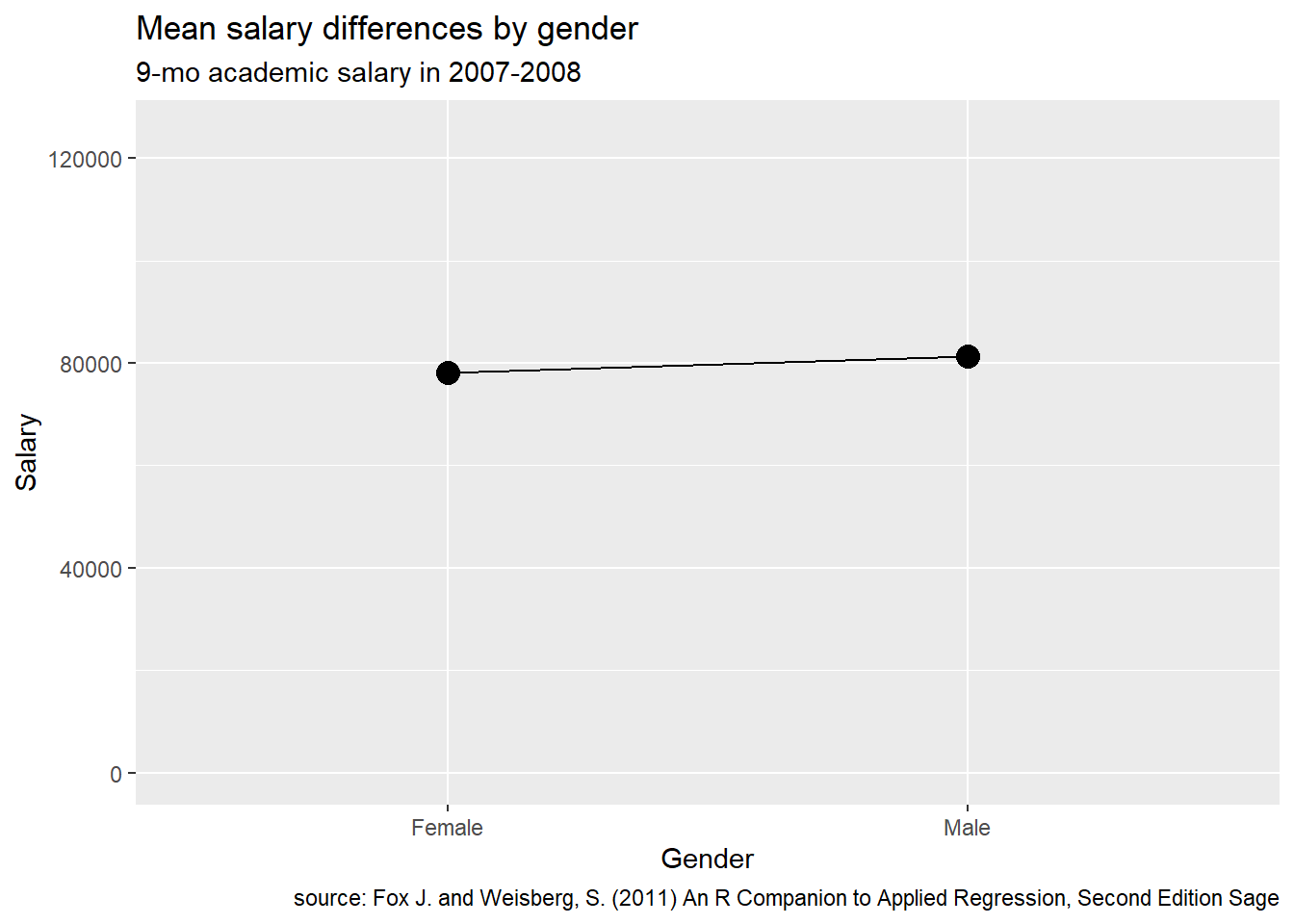
Figure 14.4: Plot with limited range of Y
There doesn’t appear to be any gender difference!
The goal of ethical data visualization is to represent findings with as little distortion as possible. This means choosing an appropriate range for the y-axis. Bar charts should almost always start at y = 0. For other charts, the limits really depends on a subject matter knowledge of the expected range of values.
We can also improve the graph by adding in an indicator of the uncertainty (see the section on Mean/SE plots).
# plot with confidence limits
p +  geom_errorbar(aes(ymin = mean - ci,
                       ymax = mean + ci),
                       width = .1) +
  ggplot2::annotate("text",
           label = "I-bars are 95% \nconfidence intervals",
           x=2,
           y=73500,
           fontface = "italic",
           size = 3)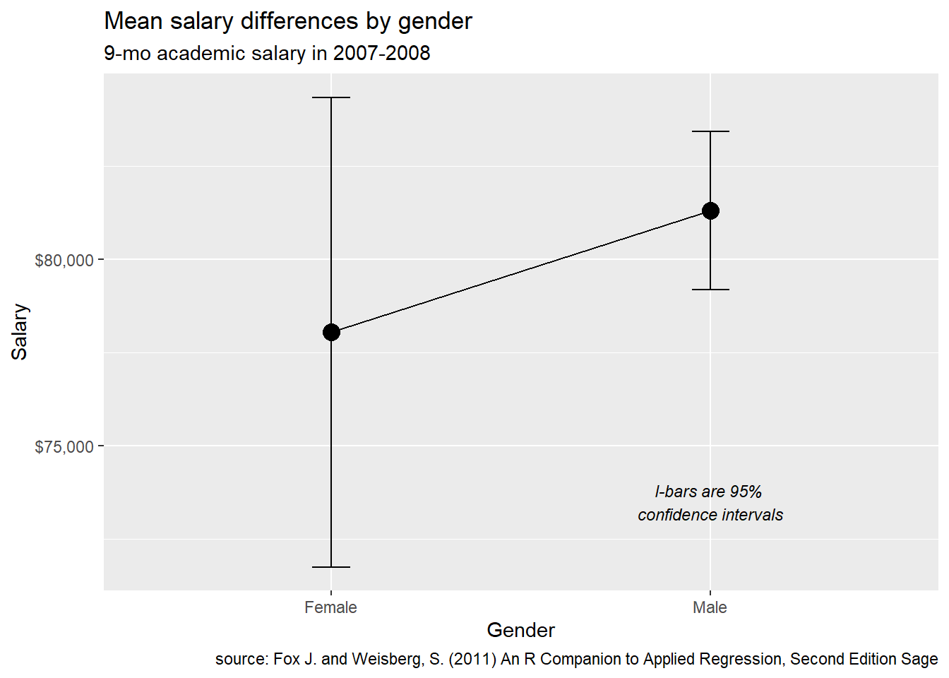
Figure 14.5: Plot with error bars
The difference doesn’t appear to exceeds chance variation.
14.5 Attribution
Unless it’s your data, each graphic should come with an attribution - a note directing the reader to the source of the data. This will usually appear in the caption for the graph.
14.6 Going further
If you would like to learn more about ggplot2 there are several good sources, including
- the
ggplot2homepage (https://ggplot2.tidyverse.org) - ggplot2: Elegant graphics for data anaysis (2nd ed.) (Wickham 2016). A draft of the third edition is available at https://ggplot2-book.org.
- chapter 3 in R for data science (Wickham and Grolemund 2017). An online version is available at https://r4ds.had.co.nz/data-visualisation.html.
- the
ggplot2cheatsheet (https://posit.co/resources/cheatsheets/)
If you would like to learn more about data visualization in general, here are some useful resources:
- Scott Berinato’s Harvard Business Review article Visualizations that really work (https://hbr.org/2016/06/visualizations-that-really-work)
- Wall Street Journal’s guide to information graphics: The dos and don’ts of presenting data, facts and figures (Wong 2010)
- A practical guide to graphics reporting : Information graphics for print, web & broadcast (George-Palilonis 2017)
- Beautiful data: The stories behind elegant data solutions (Hammerbacher and Jeff 2009)
- The truthful art: Data, charts, and maps for communication (Cairo 2016)
- the Information is beautiful website (https://informationisbeautiful.net)
The best graphs are rarely created on the first attempt. Experiment until you have a visualization that clarifies the data and helps communicates a meaning story. And have fun!