Chapter 6 Multivariate Graphs
In the last two chapters, you looked at ways to display the distribution of a single variable, or the relationship between two variables. We are usually interested in understanding the relations among several variables. Multivariate graphs display the relationships among three or more variables. There are two common methods for accommodating multiple variables: grouping and faceting.
6.1 Grouping
In grouping, the values of the first two variables are mapped to the x and y axes. Then additional variables are mapped to other visual characteristics such as color, shape, size, line type, and transparency. Grouping allows you to plot the data for multiple groups in a single graph.
Using the Salaries dataset, let’s display the relationship between yrs.since.phd and salary.
library(ggplot2)
data(Salaries, package="carData")

# plot experience vs. salary
ggplot(Salaries,
       aes(x = yrs.since.phd, y = salary)) +
  geom_point() +
  labs(title = "Academic salary by years since degree")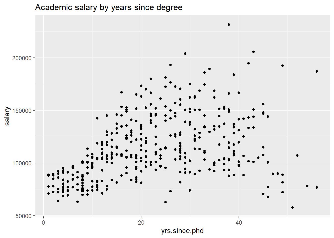
Figure 6.1: Simple scatterplot
Next, let’s include the rank of the professor, using color.
# plot experience vs. salary (color represents rank)
ggplot(Salaries, aes(x = yrs.since.phd,
                     y = salary,
                     color=rank)) +
  geom_point() +
  labs(title = "Academic salary by rank and years since degree")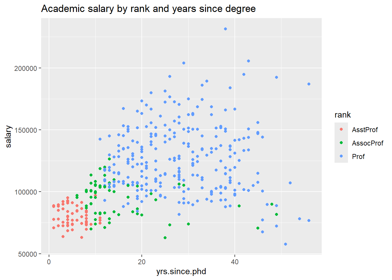
Figure 6.2: Scatterplot with color mapping
Finally, let’s add the gender of professor, using shape of the points to indicate sex. We’ll increase the point size and transparency to make the individual points clearer.
# plot experience vs. salary
# (color represents rank, shape represents sex)
ggplot(Salaries, aes(x = yrs.since.phd,
                     y = salary,
                     color = rank,
                     shape = sex)) +
  geom_point(size = 3, alpha = .6) +
  labs(title = "Academic salary by rank, sex, and years since degree")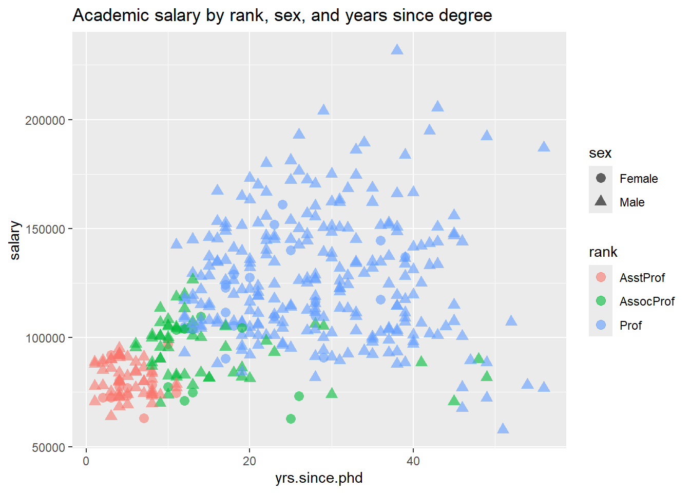
Figure 6.3: Scatterplot with color and shape mapping
Notice the difference between specifying a constant value (such as size = 3) and a mapping of a variable to a visual characteristic (e.g., color = rank). Mappings are always placed within the aes function, while the assignment of a constant value always appear outside of the aes function.
Here is another example. We’ll graph the relationship between years since Ph.D. and salary using the size of the points to indicate years of service. This is called a bubble plot.
library(ggplot2)
data(Salaries, package="carData")

# plot experience vs. salary
# (color represents rank and size represents service)
ggplot(Salaries, aes(x = yrs.since.phd,
                     y = salary,
                     color = rank,
                     size = yrs.service)) +
  geom_point(alpha = .6) +
  labs(title = paste0("Academic salary by rank, years of service, ",
                      "and years since degree"))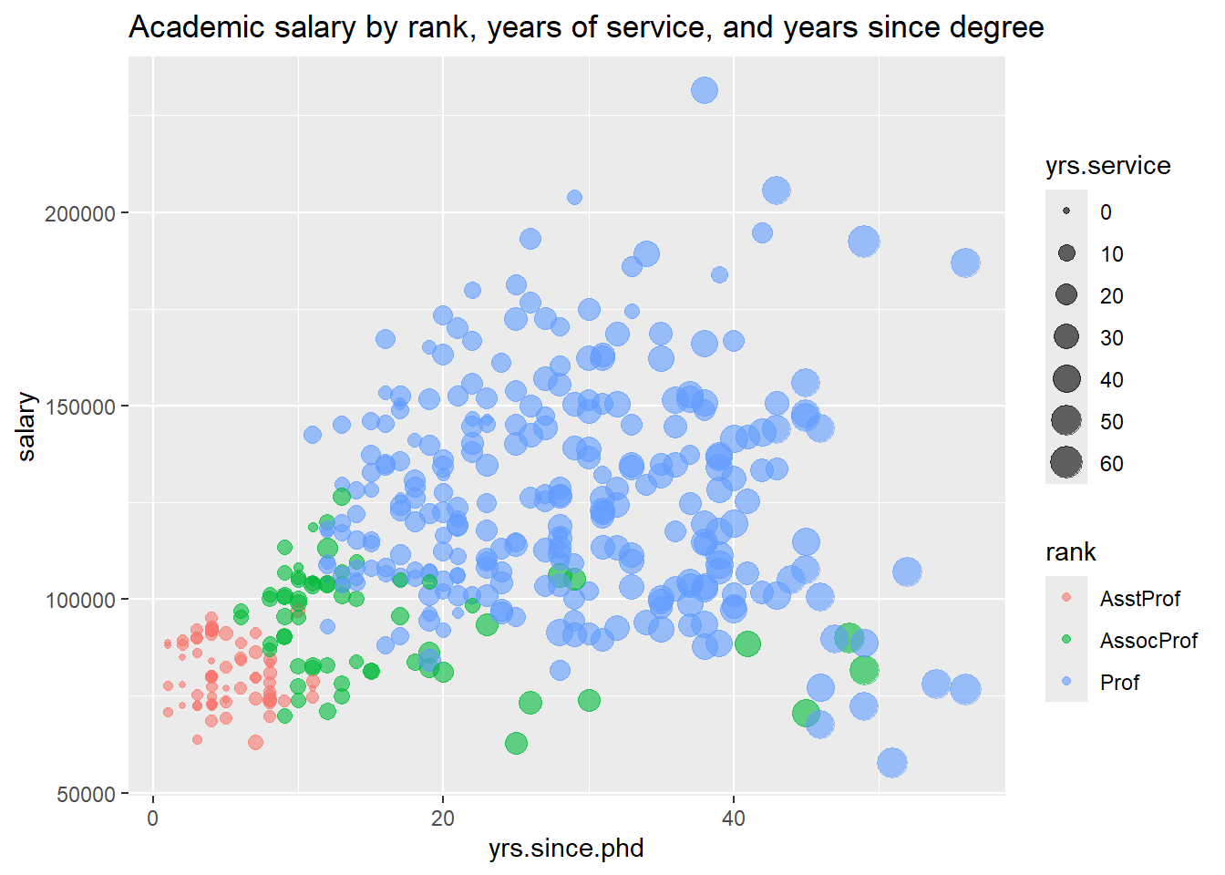
Figure 6.4: Scatterplot with size and color mapping
Bubble plots are described in more detail in a later chapter.
As a final example, let’s look at the yrs.since.phd vs salary and add sex using color and quadratic best fit lines.
# plot experience vs. salary with
# fit lines (color represents sex)
ggplot(Salaries,
       aes(x = yrs.since.phd,
           y = salary,
           color = sex)) +
  geom_point(alpha = .4,
             size=3) +
  geom_smooth(se=FALSE,
              method="lm",
              formula=y~poly(x,2),
              size = 1.5) +
  labs(x = "Years Since Ph.D.",
       title = "Academic Salary by Sex and Years Experience",
       subtitle = "9-month salary for 2008-2009",
       y = "",
       color = "Sex") +
  scale_y_continuous(label = scales::dollar) +
  scale_color_brewer(palette="Set1") +
  theme_minimal()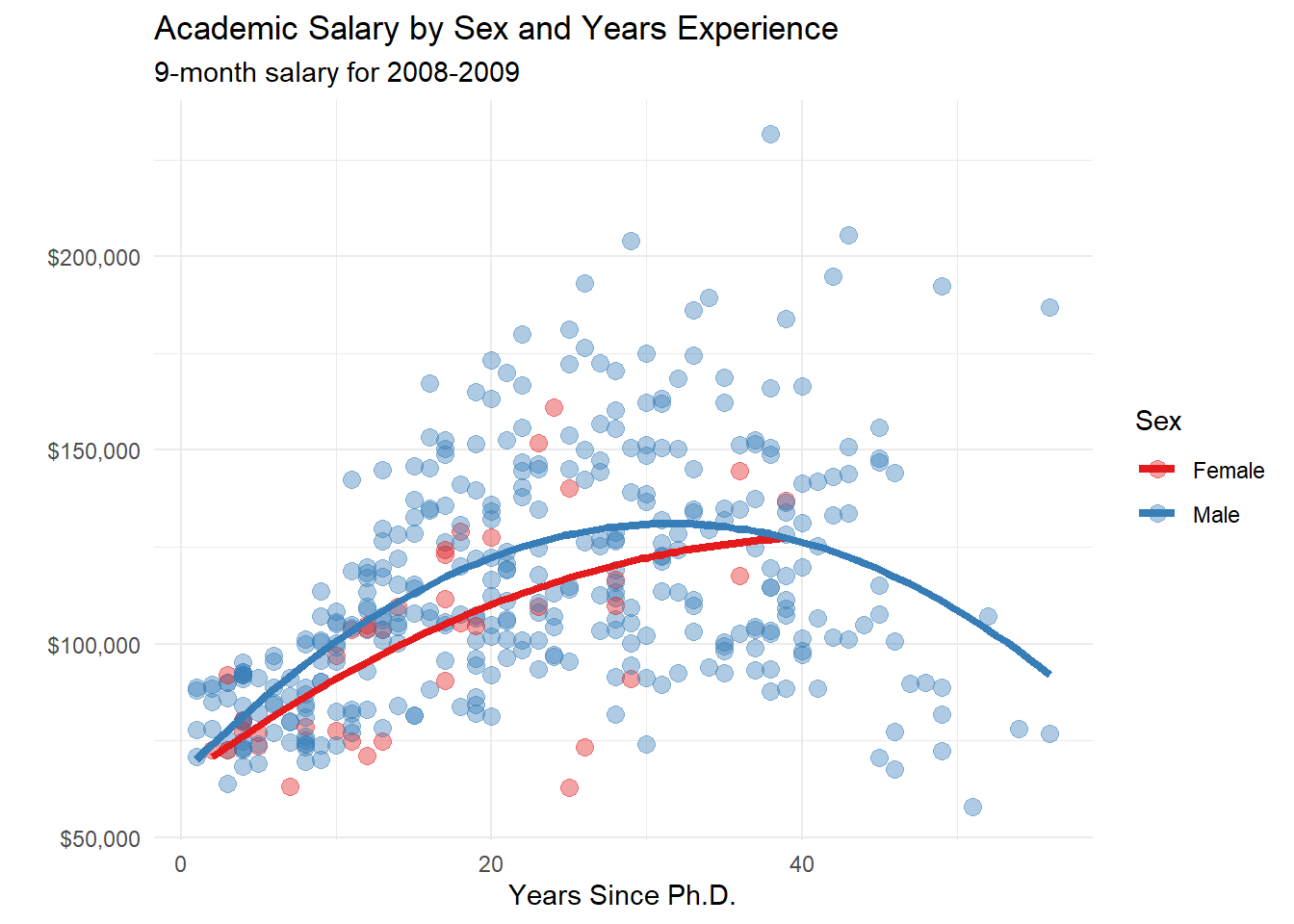
Figure 6.5: Scatterplot with color mapping and quadratic fit lines
6.2 Faceting
Grouping allows you to plot multiple variables in a single graph, using visual characteristics such as color, shape, and size. In faceting, a graph consists of several separate plots or small multiples, one for each level of a third variable, or combination of two variables. It is easiest to understand this with an example.
# plot salary histograms by rank
ggplot(Salaries, aes(x = salary)) +
  geom_histogram() +
  facet_wrap(~rank, ncol = 1) +
  labs(title = "Salary histograms by rank")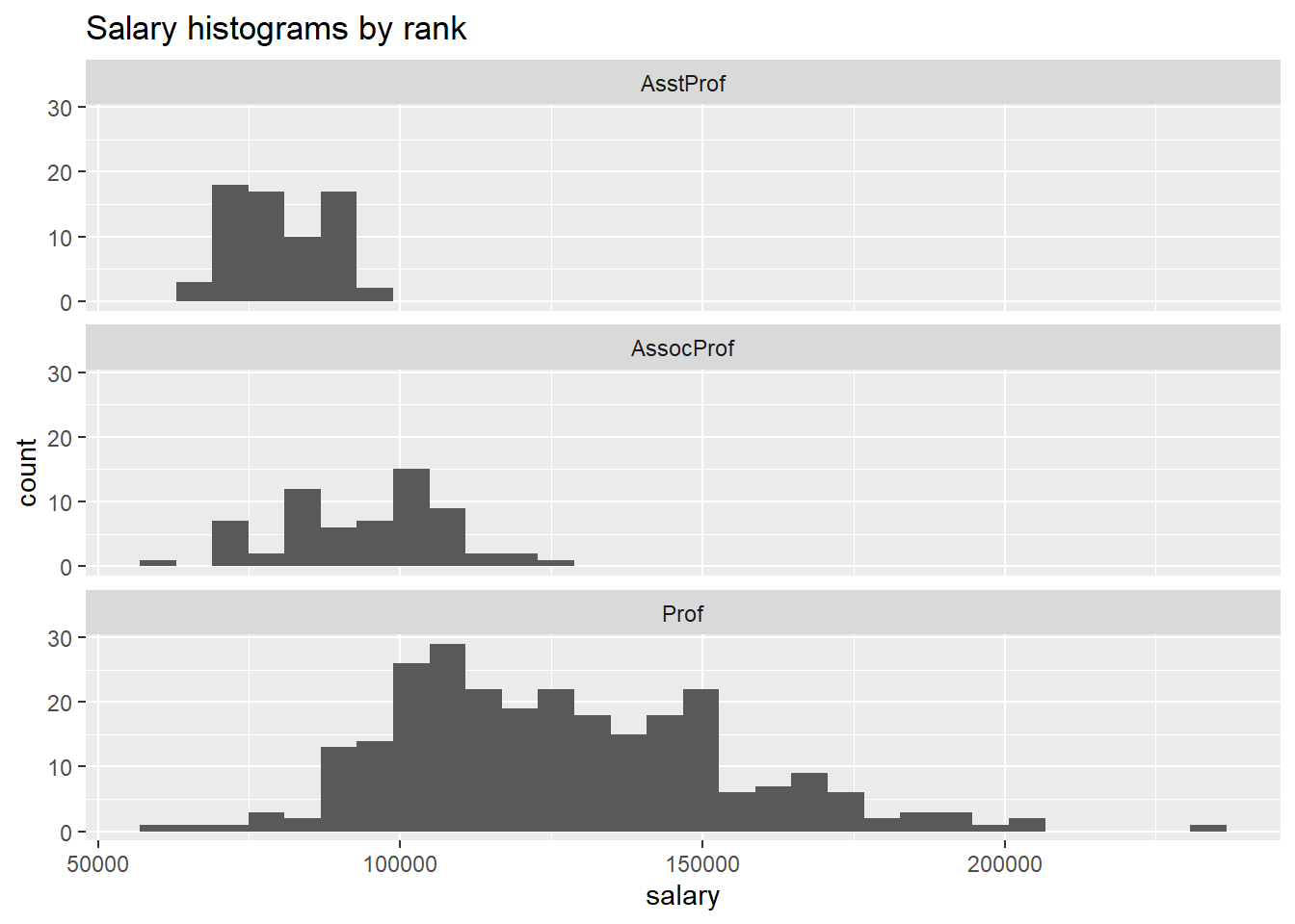
Figure 6.6: Salary distribution by rank
The facet_wrap function creates a separate graph for each level of rank. The ncol option controls the number of columns.
In the next example, two variables are used to define the facets.
# plot salary histograms by rank and sex
ggplot(Salaries, aes(x = salary/1000)) +
  geom_histogram() +
  facet_grid(sex ~ rank) +
  labs(title = "Salary histograms by sex and rank",
       x = "Salary ($1000)")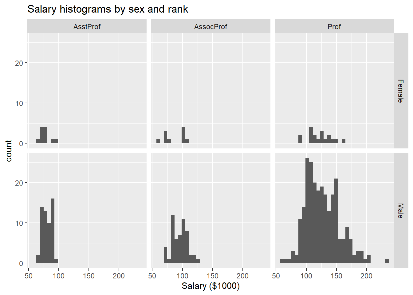
Figure 6.7: Salary distribution by rank and sex
Here, the facet_grid function defines the rows (sex) and columns (rank) that separate the data into 6 plots in one graph.
We can also combine grouping and faceting.
# plot salary by years of experience by sex and discipline
ggplot(Salaries,
       aes(x=yrs.since.phd, y = salary, color=sex)) +
  geom_point() +
  geom_smooth(method="lm",
              se=FALSE) +
  facet_wrap(~discipline,
ncol = 1) 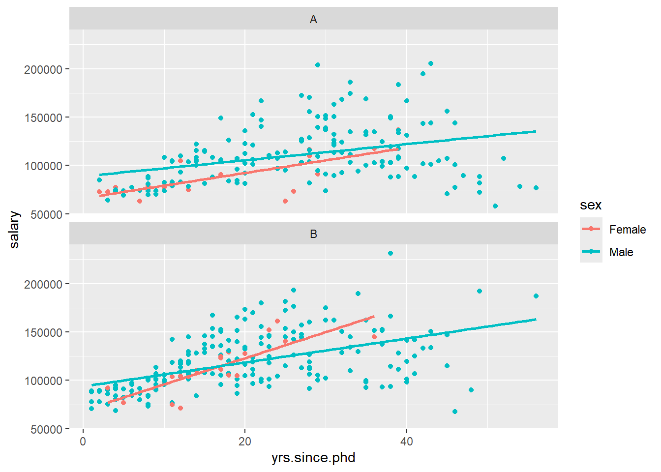
Figure 6.8: Salary by experience, rank, and sex
Let’s make this last plot more attractive.
# plot salary by years of experience by sex and discipline
ggplot(Salaries, aes(x=yrs.since.phd,
                     y = salary,
                     color=sex)) +
  geom_point(size = 2,
             alpha=.5) +
  geom_smooth(method="lm",
              se=FALSE,
              size = 1.5) +
  facet_wrap(~factor(discipline,
                     labels = c("Theoretical", "Applied")),
             ncol = 1) +
  scale_y_continuous(labels = scales::dollar) +
  theme_minimal() +
  scale_color_brewer(palette="Set1") +
  labs(title = paste0("Relationship of salary and years ",
                      "since degree by sex and discipline"),
       subtitle = "9-month salary for 2008-2009",
       color = "Gender",
       x = "Years since Ph.D.",
       y = "Academic Salary")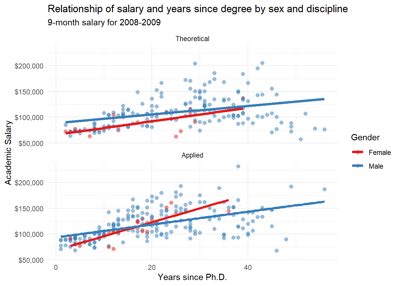
Figure 6.9: Salary by experience, rank, and sex (better labeled)
See the Customizing section to learn more about customizing the appearance of a graph.
As a final example, we’ll shift to a new dataset and plot the change in life expectancy over time for countries in the “Americas”. The data comes from the gapminder dataset in the gapminder package. Each country appears in its own facet. The theme functions are used to simplify the background color, rotate the x-axis text, and make the font size smaller.
# plot life expectancy by year separately
# for each country in the Americas
data(gapminder, package = "gapminder")

# Select the Americas data
plotdata <- dplyr::filter(gapminder,
                          continent == "Americas")

# plot life expectancy by year, for each country
ggplot(plotdata, aes(x=year, y = lifeExp)) +
  geom_line(color="grey") +
  geom_point(color="blue") +
  facet_wrap(~country) +
  theme_minimal(base_size = 9) +
  theme(axis.text.x = element_text(angle = 45,
                                   hjust = 1)) +
  labs(title = "Changes in Life Expectancy",
       x = "Year",
y = "Life Expectancy") 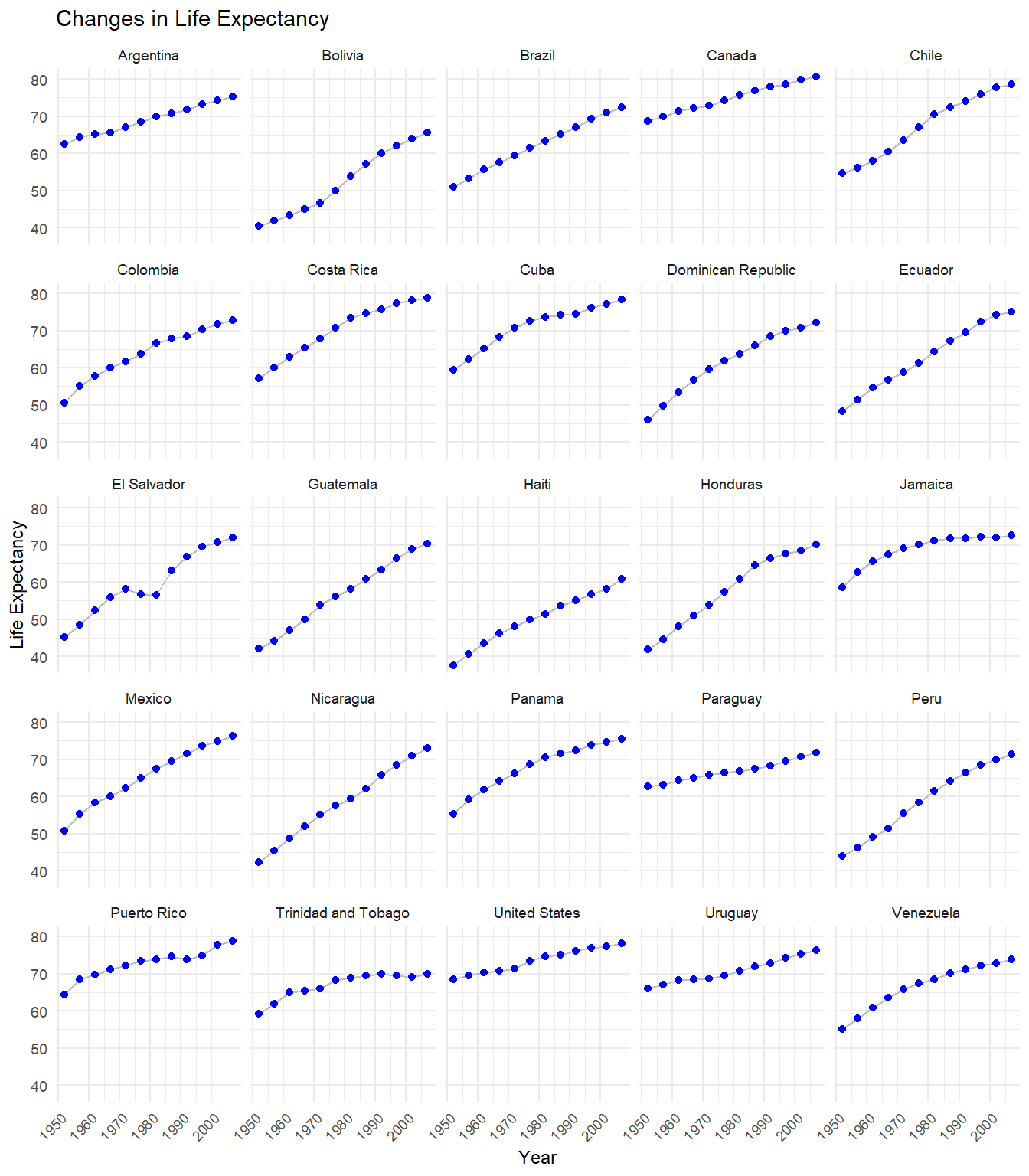
Figure 6.10: Changes in life expectancy by country
We can see that life expectancy is increasing in each country, but that Haiti is lagging behind.
Combining grouping and faceting with graphs for one (Chapter 4) or two (Chapter 5) variables allows you to create a wide range of visualizations for exploring data! You are limited only by your imagination and the over-riding goal of communicating information clearly.