Chapter 8 Time-dependent graphs
A graph can be a powerful vehicle for displaying change over time. The most common time-dependent graph is the time series line graph. Other options include the dumbbell charts and the slope graph.
8.1 Time series
A time series is a set of quantitative values obtained at successive time points. The intervals between time points (e.g., hours, days, weeks, months, or years) are usually equal.
Consider the Economics time series that come with the ggplot2 package. It contains US monthly economic data collected from January 1967 thru January 2015. Let’s plot the personal savings rate (psavert) over time. We can do this with a simple line plot.
library(ggplot2)
ggplot(economics, aes(x = date, y = psavert)) +
  geom_line() +
  labs(title = "Personal Savings Rate",
       x = "Date",
       y = "Personal Savings Rate")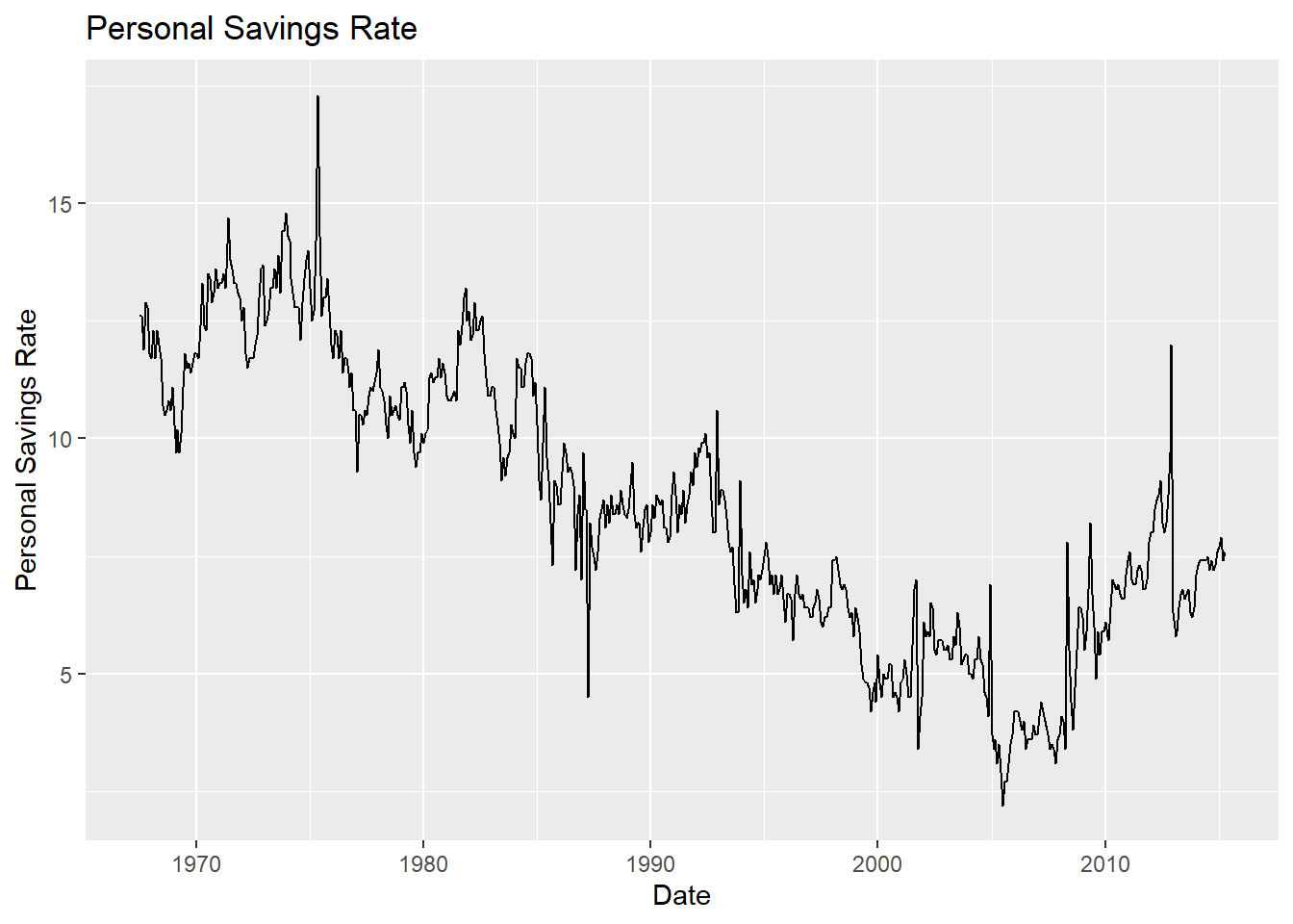
Figure 8.1: Simple time series
The scale_x_date function can be used to reformat dates (see Section 2.2.6). In the graph below, tick marks appear every 5 years and dates are presented in MMM-YY format. Additionally, the time series line is given an off-red color and made thicker, a nonparametric trend line (loess, Section 5.2.1.1) and titles are added, and the theme is simplified.
library(ggplot2)
library(scales)
ggplot(economics, aes(x = date, y = psavert)) +
  geom_line(color = "indianred3",
            size=1 ) +
  geom_smooth() +
  scale_x_date(date_breaks = '5 years',
               labels = date_format("%b-%y")) +
  labs(title = "Personal Savings Rate",
       subtitle = "1967 to 2015",
       x = "",
       y = "Personal Savings Rate") +
  theme_minimal()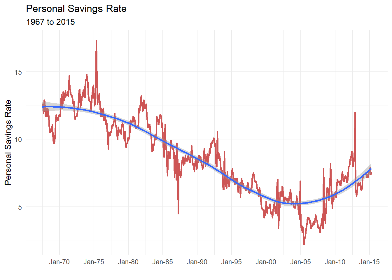
Figure 8.2: Simple time series with modified date axis
When plotting time series, be sure that the date variable is class Date and not class character. See Section 2.2.6 for details.
Let’s close this section with a multivariate time series (more than one series). We’ll compare closing prices for Apple and Meta from Jan 1, 2018 to July 31, 2023. The getSymbols function in the quantmod package is used to obtain the stock data from Yahoo Finance.
# multivariate time series

# one time install
# install.packages("quantmod")

library(quantmod)
library(dplyr)

# get apple (AAPL) closing prices
apple <- getSymbols("AAPL",
                    return.class = "data.frame",
                    from="2023-01-01")

apple <- AAPL %>%
  mutate(Date = as.Date(row.names(.))) %>%
  select(Date, AAPL.Close) %>%
  rename(Close = AAPL.Close) %>%
  mutate(Company = "Apple")

# get Meta (META) closing prices
meta <- getSymbols("META",
                   return.class = "data.frame",
                   from="2023-01-01")

meta <- META %>%
  mutate(Date = as.Date(row.names(.))) %>%
  select(Date, META.Close) %>%
  rename(Close = META.Close) %>%
  mutate(Company = "Meta")

# combine data for both companies
mseries <- rbind(apple, meta)

# plot data
library(ggplot2)
ggplot(mseries,
       aes(x=Date, y= Close, color=Company)) +
  geom_line(size=1) +
  scale_x_date(date_breaks = '1 month',
               labels = scales::date_format("%b")) +
  scale_y_continuous(limits = c(120, 280),
                     breaks = seq(120, 280, 20),
                     labels = scales::dollar) +
  labs(title = "NASDAQ Closing Prices",
       subtitle = "Jan - June 2023",
       caption = "source: Yahoo Finance",
       y = "Closing Price") +
  theme_minimal() +
  scale_color_brewer(palette = "Dark2")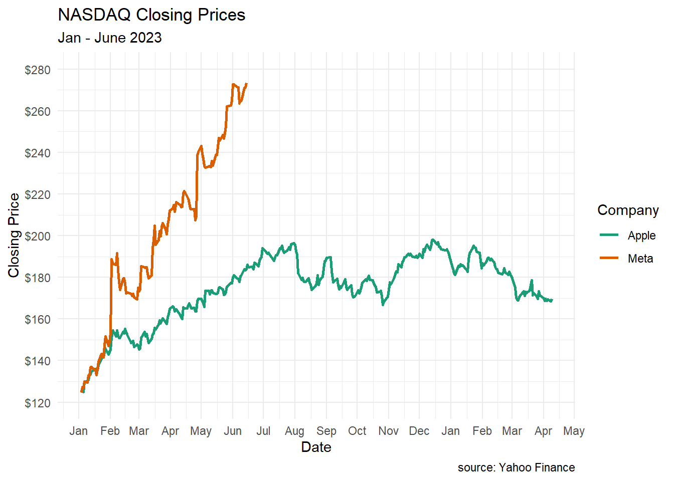
Figure 8.3: Multivariate time series
You can see the how the two stocks diverge after February.
8.2 Dummbbell charts
Dumbbell charts are useful for displaying change between two time points for several groups or observations. The geom_dumbbell function from the ggalt package is used.
Using the gapminder dataset let’s plot the change in life expectancy from 1952 to 2007 in the Americas. The dataset is in long format (Section 2.2.7). We will need to convert it to wide format in order to create the dumbbell plot
library(ggalt)
library(tidyr)
library(dplyr)

# load data
data(gapminder, package = "gapminder")

# subset data
plotdata_long <- filter(gapminder,
                        continent == "Americas" &
                        year %in% c(1952, 2007)) %>%
  select(country, year, lifeExp)

# convert data to wide format
plotdata_wide <- pivot_wider(plotdata_long,
                             names_from = year,
                             values_from = lifeExp)
names(plotdata_wide) <- c("country", "y1952", "y2007")

# create dumbbell plot
ggplot(plotdata_wide, aes(y = country,
                          x = y1952,
                          xend = y2007)) +
  geom_dumbbell()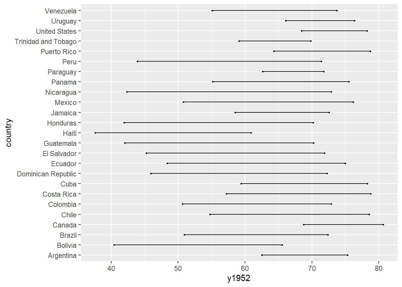
Figure 8.4: Simple dumbbell chart
The graph will be easier to read if the countries are sorted and the points are sized and colored. In the next graph, we’ll sort by 1952 life expectancy, and modify the line and point size, color the points, add titles and labels, and simplify the theme.
# create dumbbell plot
ggplot(plotdata_wide,
       aes(y = reorder(country, y1952),
           x = y1952,
           xend = y2007)) +
  geom_dumbbell(size = 1.2,
                size_x = 3,
                size_xend = 3,
                colour = "grey",
                colour_x = "red",
                colour_xend = "blue") +
  theme_minimal() +
  labs(title = "Change in Life Expectancy",
       subtitle = "1952 to 2007",
       x = "Life Expectancy (years)",
       y = "")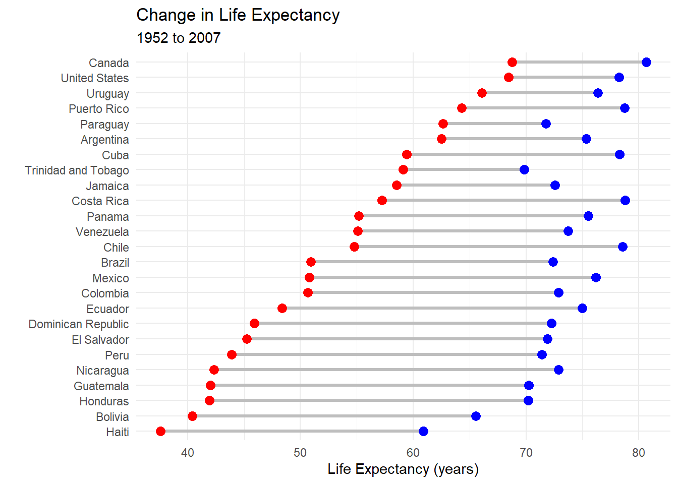
Figure 8.5: Sorted, colored dumbbell chart
It is easier to discern patterns here. For example Haiti started with the lowest life expectancy in 1952 and still has the lowest in 2007. Paraguay started relatively high by has made few gains.
8.3 Slope graphs
When there are several groups and several time points, a slope graph can be helpful. Let’s plot life expectancy for six Central American countries in 1992, 1997, 2002, and 2007. Again we’ll use the gapminder data.
To create a slope graph, we’ll use the newggslopegraph function from the CGPfunctions package.
The newggslopegraph function parameters are (in order)
- data frame
- time variable (which must be a factor)
- numeric variable to be plotted
- and grouping variable (creating one line per group).
library(CGPfunctions)

# Select Central American countries data
# for 1992, 1997, 2002, and 2007

df <- gapminder %>%
  filter(year %in% c(1992, 1997, 2002, 2007) &
           country %in% c("Panama", "Costa Rica",
                          "Nicaragua", "Honduras",
                          "El Salvador", "Guatemala",
                          "Belize")) %>%
  mutate(year = factor(year),
         lifeExp = round(lifeExp))

# create slope graph

newggslopegraph(df, year, lifeExp, country) +
  labs(title="Life Expectancy by Country",
       subtitle="Central America",
       caption="source: gapminder")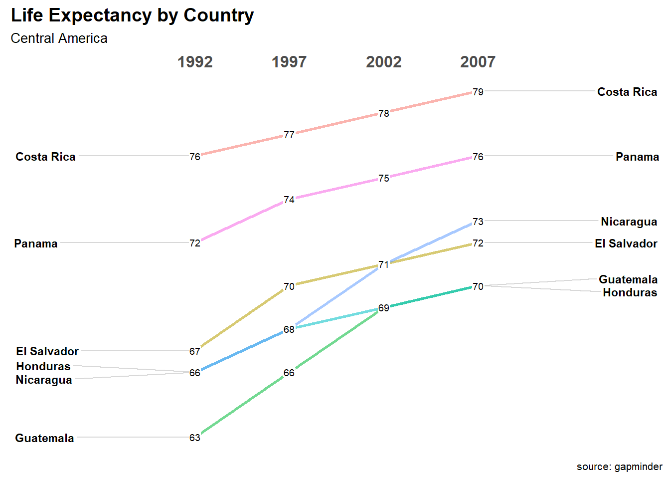
Figure 8.6: Slope graph
In the graph above, Costa Rica has the highest life expectancy across the range of years studied. Guatemala has the lowest, and caught up with Honduras (also low at 69) in 2002.
8.4 Area Charts
A simple area chart is basically a line graph, with a fill from the line to the x-axis.
# basic area chart
ggplot(economics, aes(x = date, y = psavert)) +
  geom_area(fill="lightblue", color="black") +
  labs(title = "Personal Savings Rate",
       x = "Date",
       y = "Personal Savings Rate")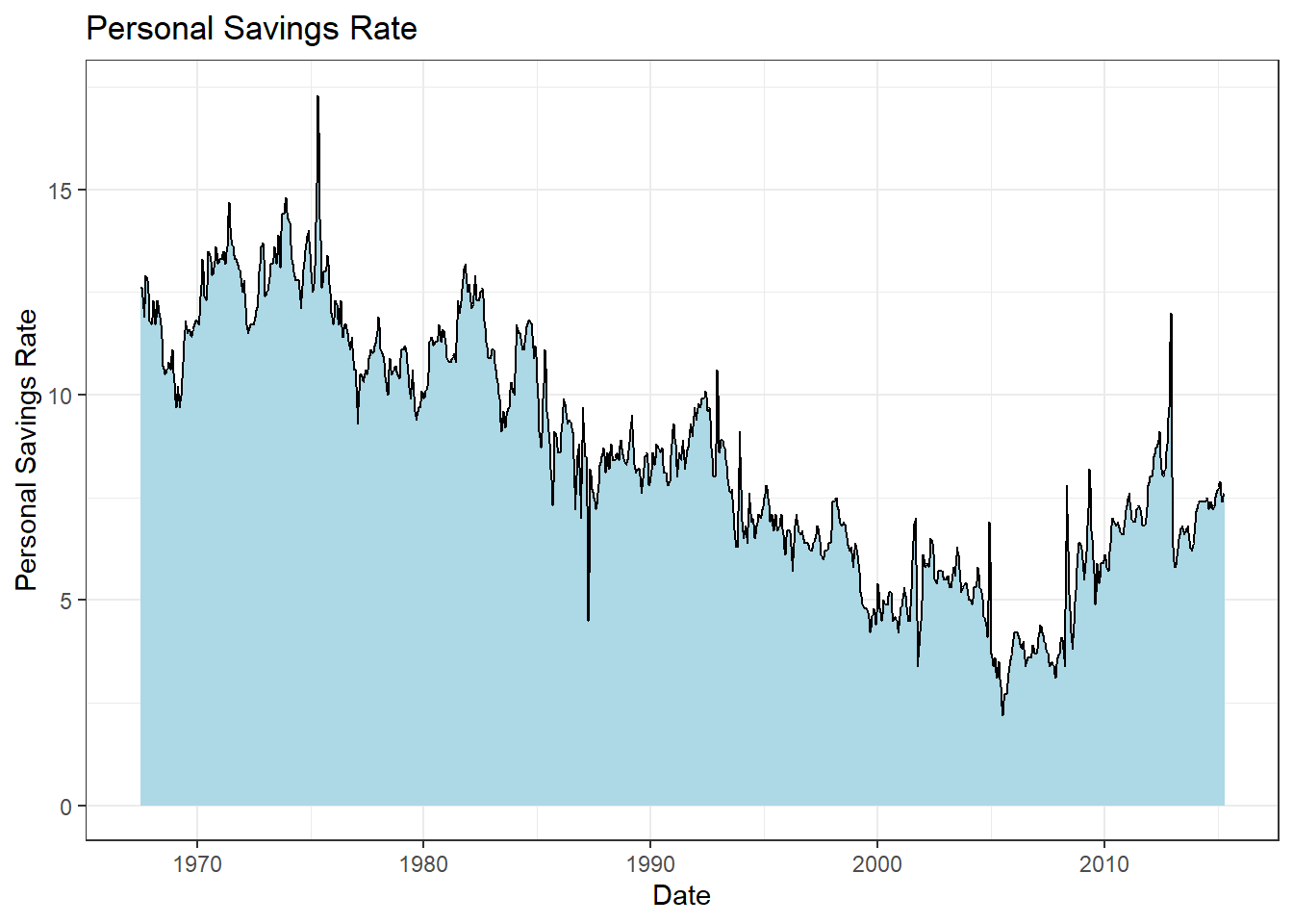
Figure 8.7: Basic area chart
A stacked area chart can be used to show differences between groups over time. Consider the uspopage dataset from the gcookbook package. The dataset describes the age distribution of the US population from 1900 to 2002. The variables are year, age group (AgeGroup), and number of people in thousands (Thousands). Let’s plot the population of each age group over time.
# stacked area chart
data(uspopage, package = "gcookbook")
ggplot(uspopage, aes(x = Year,
                     y = Thousands,
                     fill = AgeGroup)) +
  geom_area() +
  labs(title = "US Population by age",
       x = "Year",
       y = "Population in Thousands")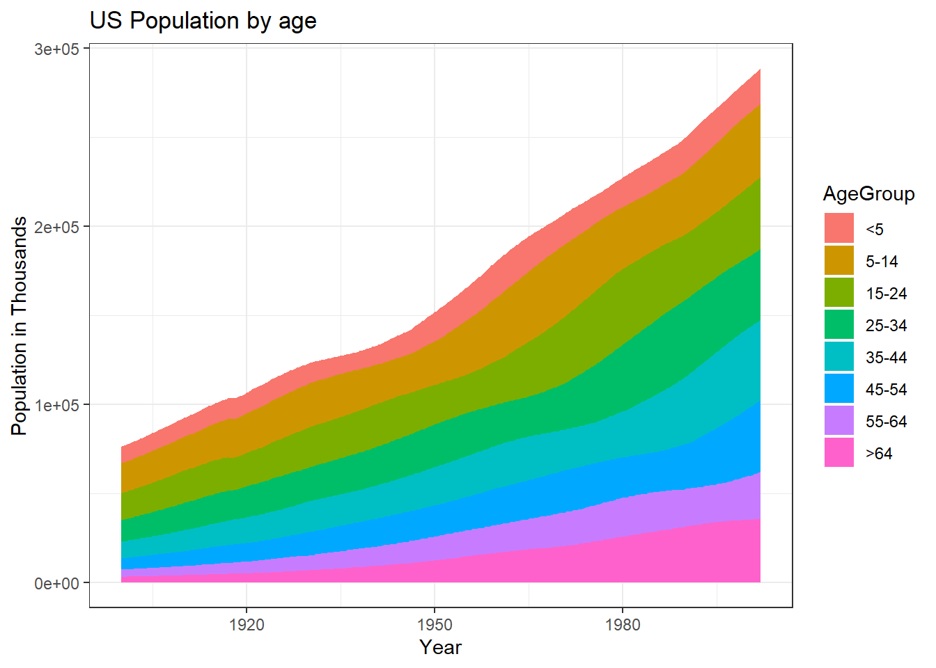
Figure 8.8: Stacked area chart
It is best to avoid scientific notation in your graphs. How likely is it that the average reader will know that 3e+05 means 300,000,000? It is easy to change the scale in ggplot2. Simply divide the Thousands variable by 1000 and report it as Millions. While we are at it, let’s
- create black borders to highlight the difference between groups
- reverse the order the groups to match increasing age
- improve labeling
- choose a different color scheme
- choose a simpler theme.
The levels of the AgeGroup variable can be reversed using the fct_rev function in the forcats package.
# stacked area chart
data(uspopage, package = "gcookbook")
ggplot(uspopage, aes(x = Year,
                     y = Thousands/1000,
                     fill = forcats::fct_rev(AgeGroup))) +
  geom_area(color = "black") +
  labs(title = "US Population by age",
       subtitle = "1900 to 2002",
       caption = "source: U.S. Census Bureau, 2003, HS-3",
       x = "Year",
       y = "Population in Millions",
       fill = "Age Group") +
  scale_fill_brewer(palette = "Set2") +
  theme_minimal()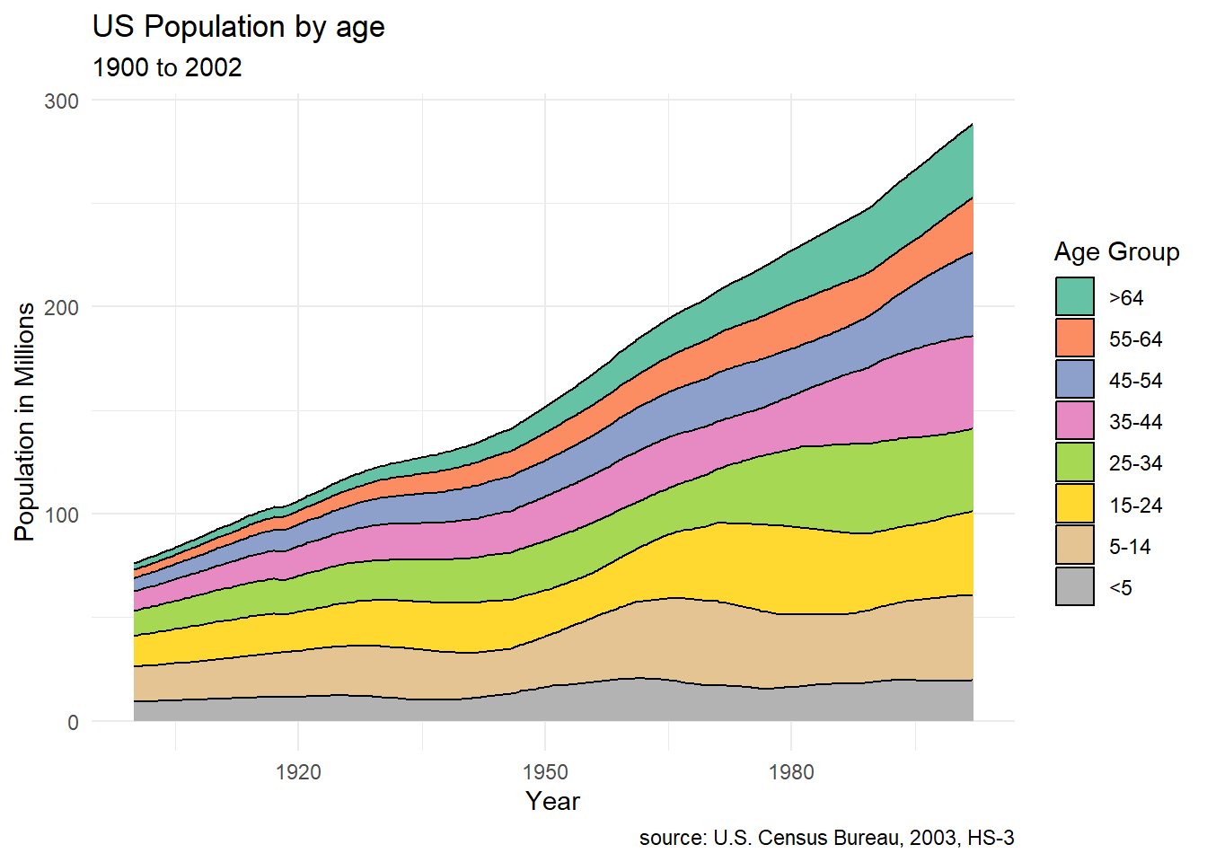
Figure 8.9: Stacked area chart with simpler scale
Apparently, the number of young children have not changed very much in the past 100 years.
Stacked area charts are most useful when interest is on both (1) group change over time and (2) overall change over time. Place the most important groups at the bottom. These are the easiest to interpret in this type of plot.
8.5 Stream graph
Stream graphs (Byron and Wattenberg 2008) are basically a variation on the stacked area chart. In a stream graph, the data is typically centered at each x-value around a mid-point and mirrored above and below that point. This is easiest to see in an example.
Let’s plot the previous stacked area chart (Figure 8.9) as a stream graph.
# basic stream graph
data(uspopage, package = "gcookbook")
library(ggstream)
ggplot(uspopage, aes(x = Year,
                     y = Thousands/1000,
                     fill = forcats::fct_rev(AgeGroup))) +
  geom_stream() +
  labs(title = "US Population by age",
       subtitle = "1900 to 2002",
       caption = "source: U.S. Census Bureau, 2003, HS-3",
       x = "Year",
       y = "",
       fill = "Age Group") +
  scale_fill_brewer(palette = "Set2") +
  theme_minimal() +
  theme(panel.grid.major.y = element_blank(),
        panel.grid.minor.y = element_blank(),
        axis.text.y = element_blank())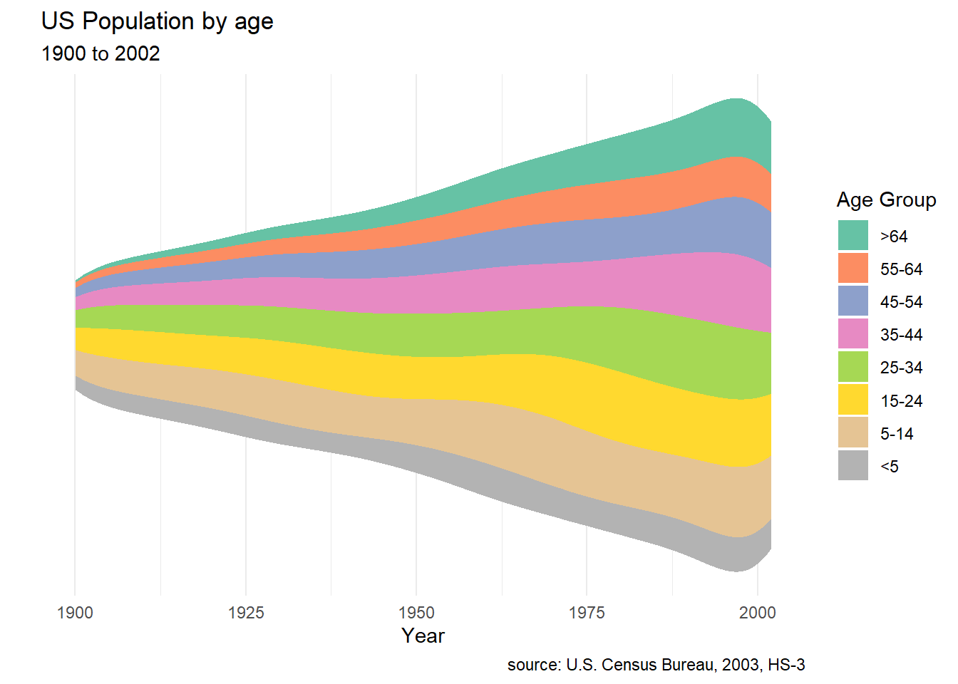
Figure 8.10: Basic stream graph
The theme function is used to surpress the y-axis, whose values are not easily interpreted. To interpret this graph, look at each value on the x-axis and compare the relative vertical heights of each group. You can see, for example, that the relative proportion of older people has increased significantly.
An interesting variation is the proportional steam graph displays in Figure 8.11
# basic stream graph
data(uspopage, package = "gcookbook")
library(ggstream)
ggplot(uspopage, aes(x = Year,
                     y = Thousands/1000,
                     fill = forcats::fct_rev(AgeGroup))) +
  geom_stream(type="proportional") +
  labs(title = "US Population by age",
       subtitle = "1900 to 2002",
       caption = "source: U.S. Census Bureau, 2003, HS-3",
       x = "Year",
       y = "Proportion",
       fill = "Age Group") +
  scale_fill_brewer(palette = "Set2") +
theme_minimal() 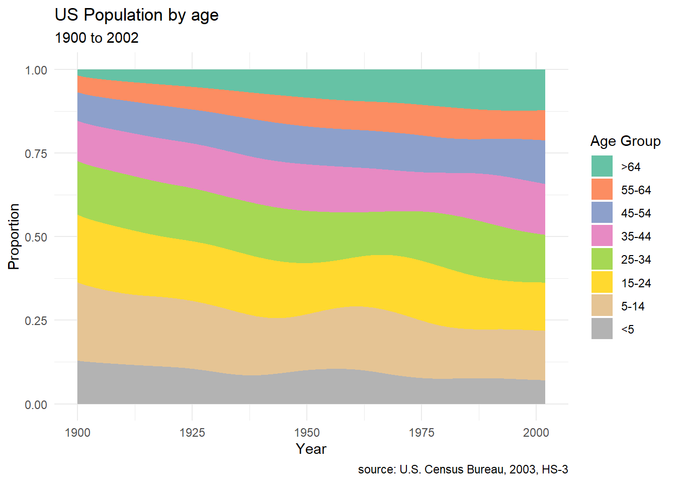
Figure 8.11: Proportional stream graph
This is similar to the filled bar chart (Section 5.1.3) and makes it easier to see the relative change in values by group across time.