Chapter 9 Statistical Models
A statistical model describes the relationship between one or more explanatory variables and one or more response variables. Graphs can help to visualize these relationships. In this section we’ll focus on models that have a single response variable that is either quantitative (a number) or binary (yes/no).
This chapter describes the use of graphs to enhance the output from statistical models. It is assumed that the reader has a passing familiarity with these models. The book R for Data Science (Wickham and Grolemund 2017) can provide the necessary background and freely available on-line.
9.1 Correlation plots
Correlation plots help you to visualize the pairwise relationships between a set of quantitative variables by displaying their correlations using color or shading.
Consider the Saratoga Houses dataset, which contains the sale price and property characteristics of Saratoga County, NY homes in 2006 (Appendix A.14). In order to explore the relationships among the quantitative variables, we can calculate the Pearson Product-Moment correlation coefficients.
In the code below, the select_if function in the dplyr package is used to select the numeric variables in the data frame. The cor function in base R calculates the correlations. The use=“complete.obs” option deletes any cases with missing data. The round function rounds the printed results to 2 decimal places.
data(SaratogaHouses, package="mosaicData")

# select numeric variables
df <- dplyr::select_if(SaratogaHouses, is.numeric)

# calulate the correlations
r <- cor(df, use="complete.obs")
round(r,2)
The ggcorrplot function in the ggcorrplot package can be used to visualize these correlations. By default, it creates a ggplot2 graph where darker red indicates stronger positive correlations, darker blue indicates stronger negative correlations and white indicates no correlation.
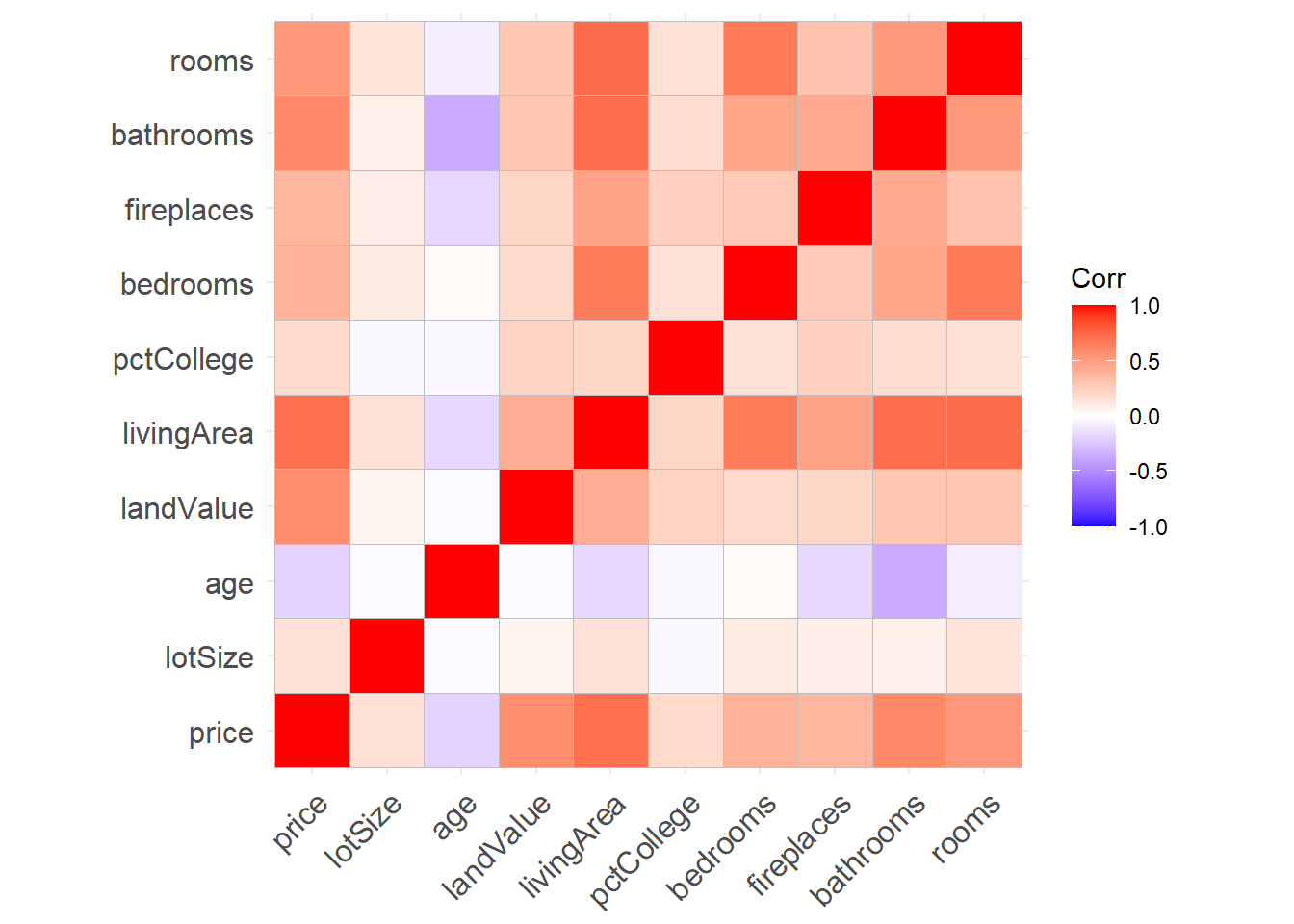
Figure 9.1: Correlation matrix
From the graph, an increase in number of bathrooms and living area are associated with increased price, while older homes tend to be less expensive. Older homes also tend to have fewer bathrooms.
The ggcorrplot function has a number of options for customizing the output. For example
hc.order = TRUEreorders the variables, placing variables with similar correlation patterns together.type = "lower"plots the lower portion of the correlation matrix.lab = TRUEoverlays the correlation coefficients (as text) on the plot.
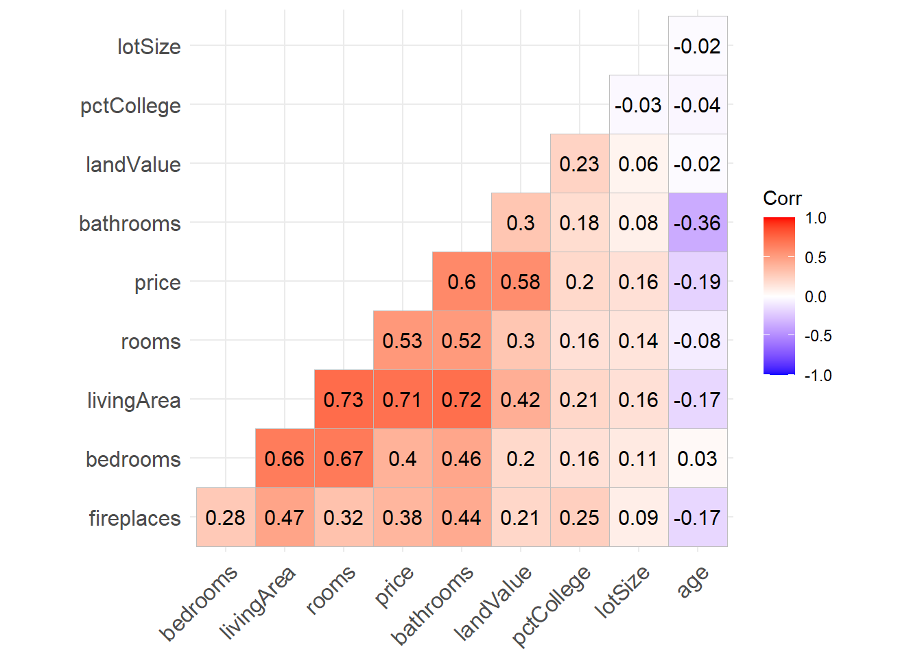
Figure 9.2: Sorted lower triangel correlation matrix with options
These, and other options, can make the graph easier to read and interpret. See ?ggcorrplot for details.
9.2 Linear Regression
Linear regression allows us to explore the relationship between a quantitative response variable and an explanatory variable while other variables are held constant.
Consider the prediction of home prices in the Saratoga Houses dataset from lot size (square feet), age (years), land value (1000s dollars), living area (square feet), number of bedrooms and bathrooms and whether the home is on the waterfront or not.
data(SaratogaHouses, package="mosaicData")
houses_lm <- lm(price ~ lotSize + age + landValue +
                  livingArea + bedrooms + bathrooms +
                  waterfront,
data = SaratogaHouses)| term | estimate | std.error | statistic | p.value |
|---|---|---|---|---|
| (Intercept) | 139878.80 | 16472.93 | 8.49 | 0.00 |
| lotSize | 7500.79 | 2075.14 | 3.61 | 0.00 |
| age | -136.04 | 54.16 | -2.51 | 0.01 |
| landValue | 0.91 | 0.05 | 19.84 | 0.00 |
| livingArea | 75.18 | 4.16 | 18.08 | 0.00 |
| bedrooms | -5766.76 | 2388.43 | -2.41 | 0.02 |
| bathrooms | 24547.11 | 3332.27 | 7.37 | 0.00 |
| waterfrontNo | -120726.62 | 15600.83 | -7.74 | 0.00 |
From the results, we can estimate that an increase of one square foot of living area is associated with a home price increase of $75, holding the other variables constant. Additionally, waterfront home cost approximately $120,726 more than non-waterfront home, again controlling for the other variables in the model.
The visreg (http://pbreheny.github.io/visreg) package provides tools for visualizing these conditional relationships.
The visreg function takes (1) the model and (2) the variable of interest and plots the conditional relationship, controlling for the other variables. The option gg = TRUE is used to produce a ggplot2 graph.
# conditional plot of price vs. living area
library(ggplot2)
library(visreg)
visreg(houses_lm, "livingArea", gg = TRUE) 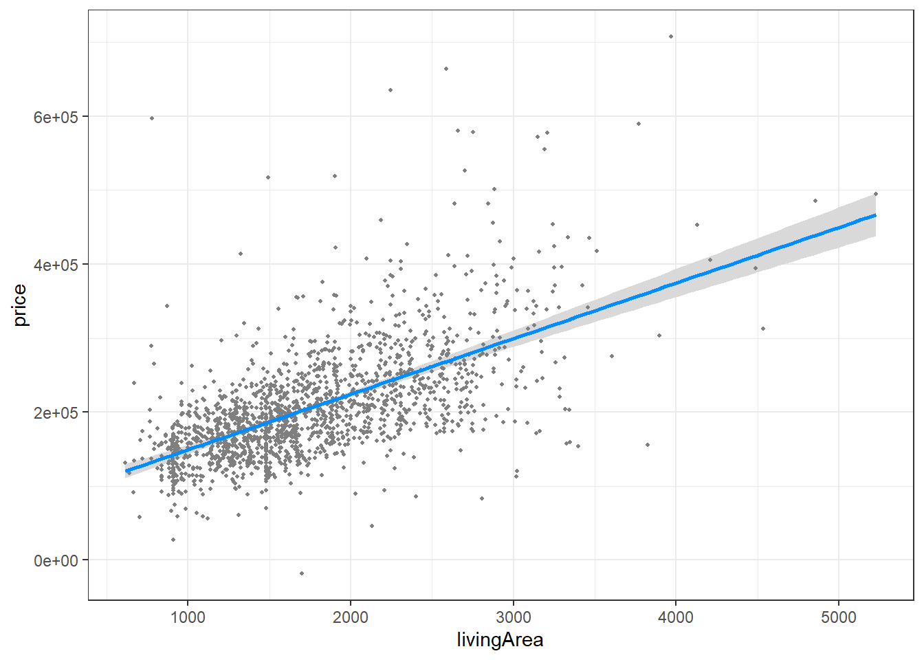
Figure 9.3: Conditional plot of living area and price
The graph suggests that, after controlling for lot size, age, living area, number of bedrooms and bathrooms, and waterfront location, sales price increases with living area in a linear fashion.
How does
visregwork? The fitted model is used to predict values of the response variable, across the range of the chosen explanatory variable. The other variables are set to their median value (for numeric variables) or most frequent category (for categorical variables). The user can override these defaults and chose specific values for any variable in the model.
Continuing the example, the price difference between waterfront and non-waterfront homes is plotted, controlling for the other seven variables. Since a ggplot2 graph is produced, other ggplot2 functions can be added to customize the graph.
# conditional plot of price vs. waterfront location
visreg(houses_lm, "waterfront", gg = TRUE) +
  scale_y_continuous(label = scales::dollar) +
  labs(title = "Relationship between price and location",
       subtitle = paste0("controlling for lot size, age, ",
                         "land value, bedrooms and bathrooms"),
       caption = "source: Saratoga Housing Data (2006)",
       y = "Home Price",
       x = "Waterfront")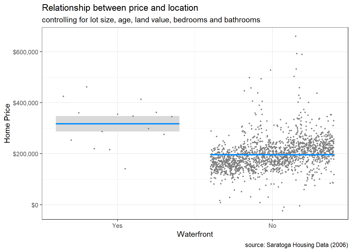
Figure 9.4: Conditional plot of location and price
There are far fewer homes on the water, and they tend to be more expensive (even controlling for size, age, and land value).
The vizreg package provides a wide range of plotting capabilities. See Visualization of regression models using visreg (Breheny and Burchett 2017) for details.
9.3 Logistic regression
Logistic regression can be used to explore the relationship between a binary response variable and an explanatory variable while other variables are held constant. Binary response variables have two levels (yes/no, lived/died, pass/fail, malignant/benign). As with linear regression, we can use the visreg package to visualize these relationships.
The CPS85 dataset in the mosaicData package contains a random sample of from the 1985 Current Population Survey, with data on the demographics and work experience of 534 individuals.
Let’s use this data to predict the log-odds of being married, given one’s sex, age, race and job sector. We’ll allow the relationship between age and marital status to vary between men and women by including an interaction term (sex*age).
# fit logistic model for predicting
# marital status: married/single
data(CPS85, package = "mosaicData")
cps85_glm <- glm(married ~ sex + age + sex*age + race + sector,
                 family="binomial",
                 data=CPS85)
Using the fitted model, let’s visualize the relationship between age and the probability of being married, holding the other variables constant. Again, the visreg function takes the model and the variable of interest and plots the conditional relationship, controlling for the other variables. The option gg = TRUE is used to produce a ggplot2 graph. The scale = "response" option creates a plot based on a probability (rather than log-odds) scale.
# plot results
library(ggplot2)
library(visreg)
visreg(cps85_glm, "age",
       gg = TRUE,
       scale="response") +
  labs(y = "Prob(Married)",
       x = "Age",
       title = "Relationship of age and marital status",
       subtitle = "controlling for sex, race, and job sector",
       caption = "source: Current Population Survey 1985")
## Conditions used in construction of plot
## sex: M
## race: W
## sector: prof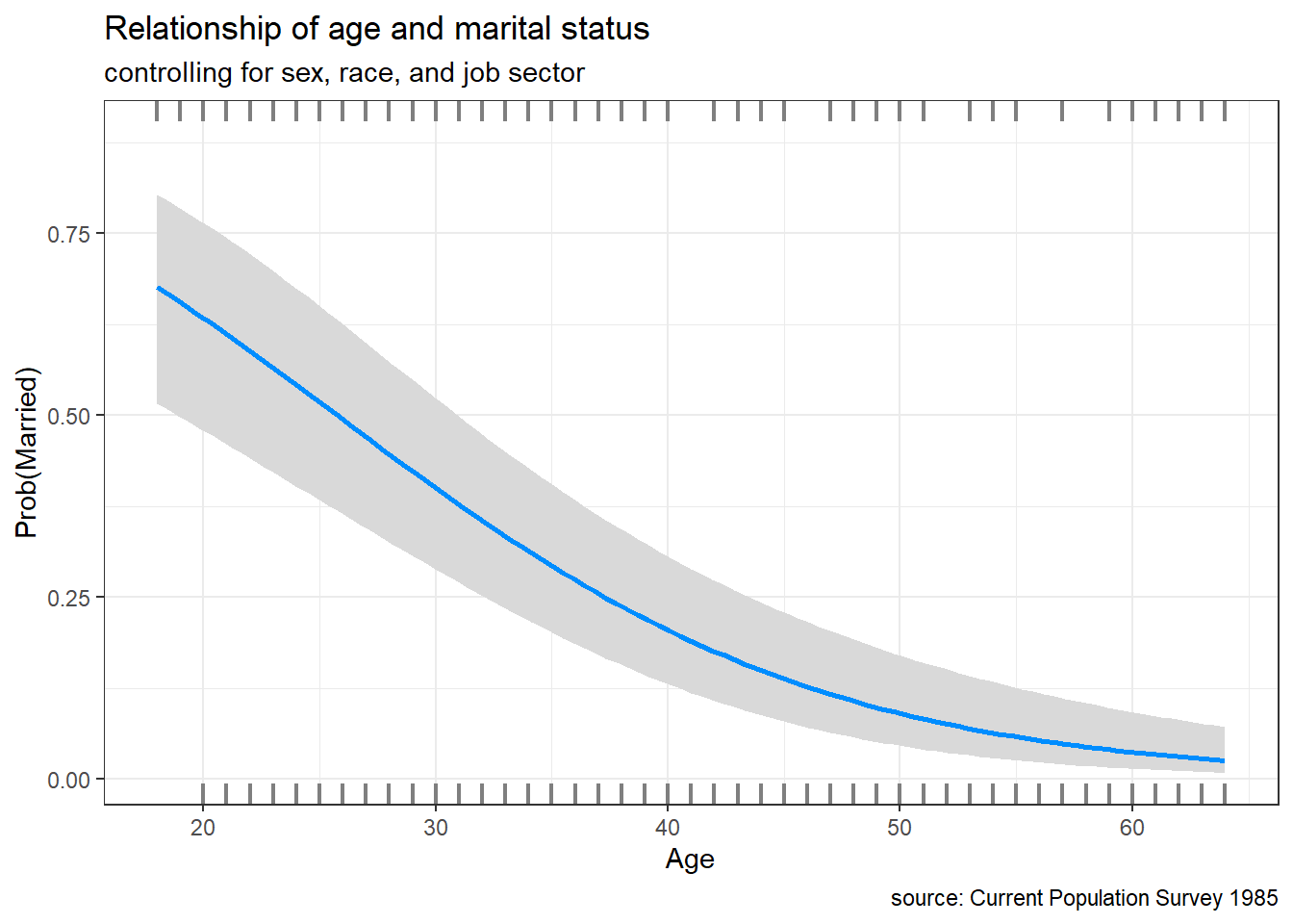
Figure 9.5: Conditional plot of age and marital status
For professional, white males, the probability of being married is roughly 0.5 at age 25 and decreases to 0.1 at age 55.
We can create multiple conditional plots by adding a by option. For example, the following code will plot the probability of being married by age, separately for men and women, controlling for race and job sector.
# plot results
library(ggplot2)
library(visreg)
visreg(cps85_glm, "age",
       by = "sex",
       gg = TRUE,
       scale="response") +
  labs(y = "Prob(Married)",
       x = "Age",
       title = "Relationship of age and marital status",
       subtitle = "controlling for race and job sector",
       caption = "source: Current Population Survey 1985")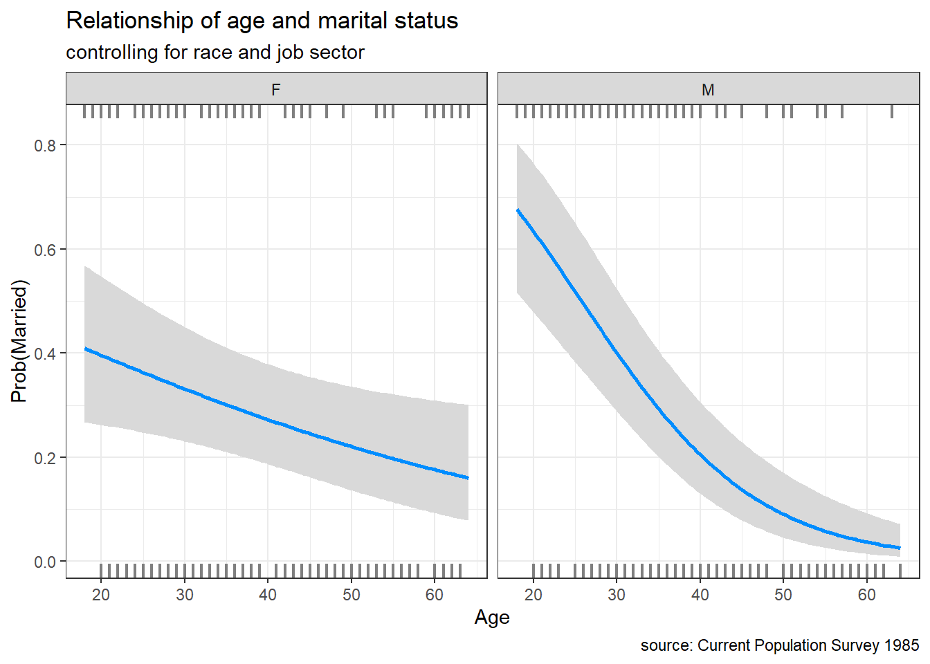
Figure 9.6: Conditional plot of age and marital status
In this data, the probability of marriage for men and women differ significantly over the ages measured.
9.4 Survival plots
In many research settings, the response variable is the time to an event. This is frequently true in healthcare research, where we are interested in time to recovery, time to death, or time to relapse.
If the event has not occurred for an observation (either because the study ended or the patient dropped out) the observation is said to be censored.
The NCCTG Lung Cancer dataset in the survival package provides data on the survival times of patients with advanced lung cancer following treatment. The study followed patients for up 34 months.
The outcome for each patient is measured by two variables
- time - survival time in days
- status - 1 = censored, 2 = dead
Thus a patient with time = 305 & status = 2 lived 305 days following treatment. Another patient with time = 400 & status = 1, lived at least 400 days but was then lost to the study. A patient with time = 1022 & status = 1, survived to the end of the study (34 months).
A survival plot (also called a Kaplan-Meier Curve) can be used to illustrates the probability that an individual survives up to and including time t.
# plot survival curve
library(survival)
library(survminer)

data(lung)
sfit <- survfit(Surv(time, status) ~  1, data=lung)
ggsurvplot(sfit,
title="Kaplan-Meier curve for lung cancer survival") 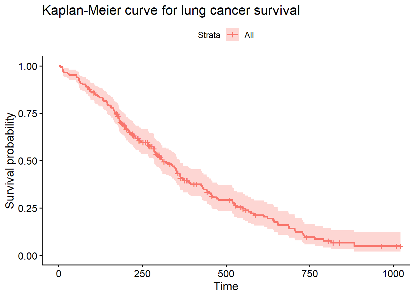
Figure 9.7: Basic survival curve
Roughly 50% of patients are still alive 300 days post treatment. Run summary(sfit) for more details.
It is frequently of great interest whether groups of patients have the same survival probabilities. In the next graph, the survival curve for men and women are compared.
# plot survival curve for men and women
sfit <- survfit(Surv(time, status) ~  sex, data=lung)
ggsurvplot(sfit,
           conf.int=TRUE,
           pval=TRUE,
           legend.labs=c("Male", "Female"),
           legend.title="Sex",
           palette=c("cornflowerblue", "indianred3"),
           title="Kaplan-Meier Curve for lung cancer survival",
           xlab = "Time (days)")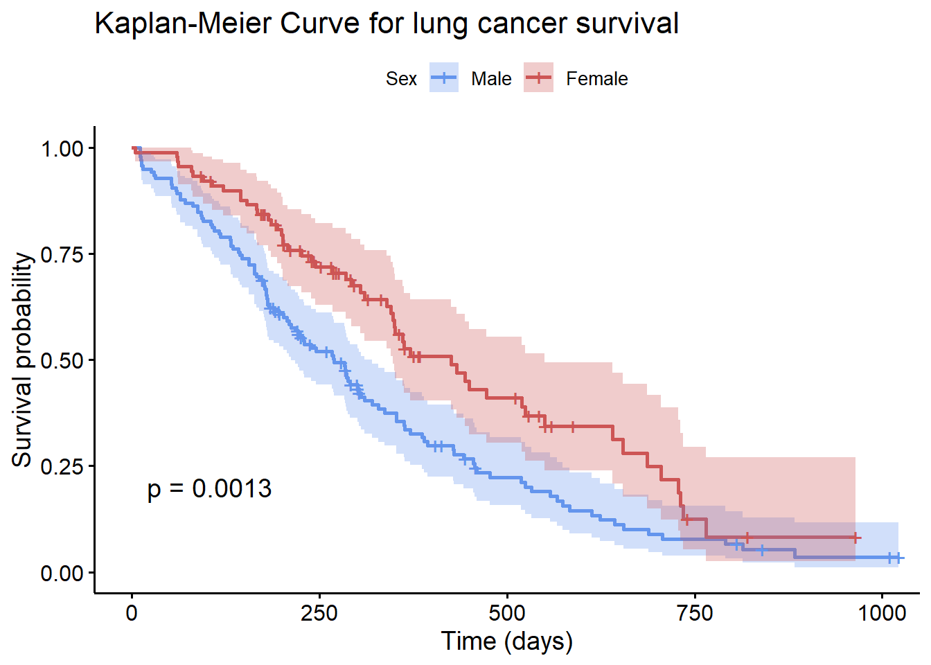
Figure 9.8: Comparison of survival curve
The ggsurvplot function has many options (see ?ggsurvplot). In particular, conf.int provides confidence intervals, while pval provides a log-rank test comparing the survival curves.
The p-value (0.0013) provides strong evidence that men and women have different survival probabilities following treatment. In this case, women are more likely to survive across the time period studied.
9.5 Mosaic plots
Mosaic charts can display the relationship between categorical variables using rectangles whose areas represent the proportion of cases for any given combination of levels. The color of the tiles can also indicate the degree relationship among the variables.
Although mosaic charts can be created with ggplot2 using the ggmosaic package, I recommend using the vcd package instead. Although it won’t create ggplot2 graphs, the package provides a more comprehensive approach to visualizing categorical data.
People are fascinated with the Titanic (or is it with Leo?). In the Titanic disaster, what role did sex and class play in survival? We can visualize the relationship between these three categorical variables using the code below.
The dataset (titanic.csv) describes the sex, passenger class, and survival status for each of the 2,201 passengers and crew. The xtabs function creates a cross-tabulation of the data, and the ftable function prints the results in a nice compact format.
# input data
library(readr)
titanic <- read_csv("titanic.csv")

# create a table
tbl <- xtabs(~Survived + Class + Sex, titanic)
ftable(tbl)
## Sex Female Male
## Survived Class
## No 1st 4 118
## 2nd 13 154
## 3rd 106 422
## Crew 3 670
## Yes 1st 141 62
## 2nd 93 25
## 3rd 90 88
## Crew 20 192The mosaic function in the vcd package plots the results.
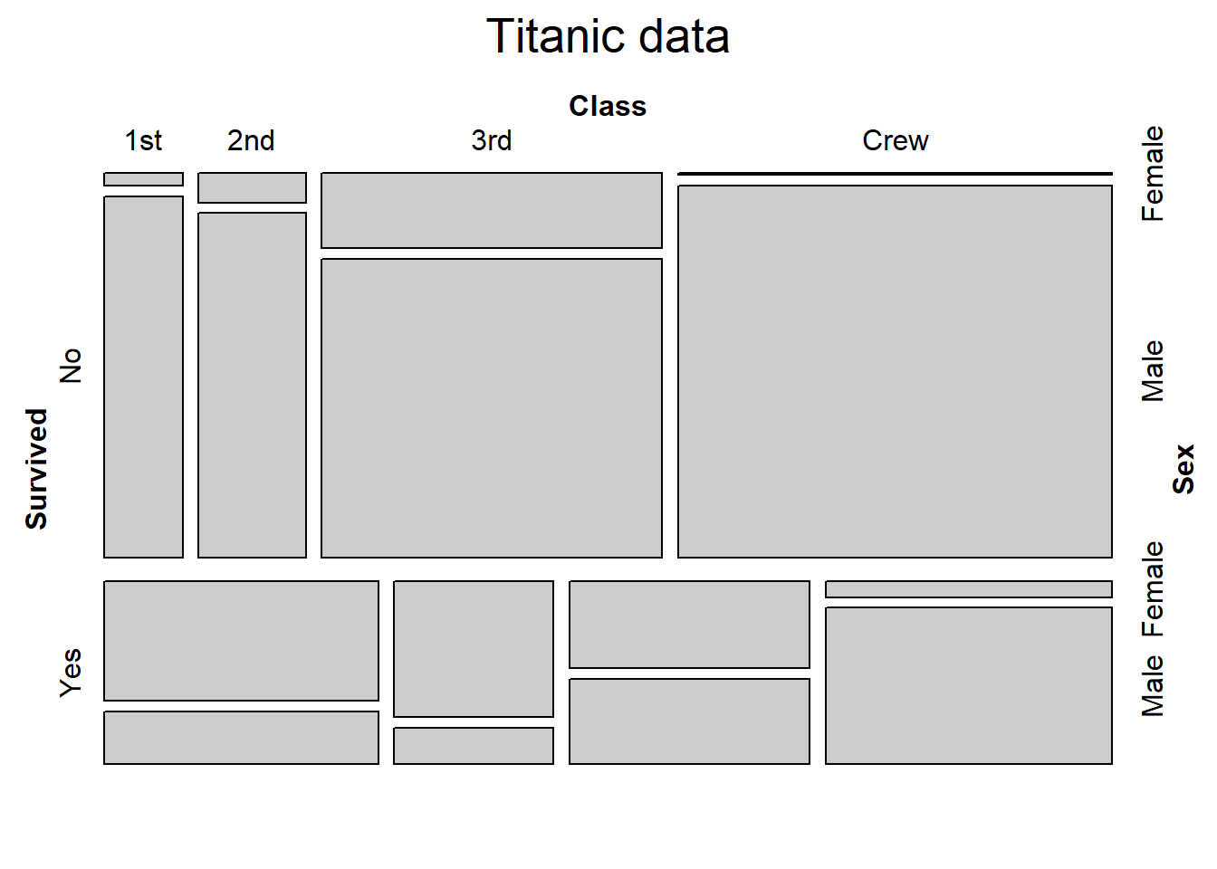
Figure 9.9: Basic mosaic plot
The size of the tile is proportional to the percentage of cases in that combination of levels. Clearly more passengers perished, than survived. Those that perished were primarily 3rd class male passengers and male crew (the largest group).
If we assume that these three variables are independent, we can examine the residuals from the model and shade the tiles to match. The shade = TRUE adds fill colors. Dark blue represents more cases than expected given independence. Dark red represents less cases than expected if independence holds.
The labeling_args, set_labels, and main options improve the plot labeling.
mosaic(tbl,
       shade = TRUE,
       labeling_args =
         list(set_varnames = c(Sex = "Gender",
                               Survived = "Survived",
                               Class = "Passenger Class")),
       set_labels =
         list(Survived = c("No", "Yes"),
                         Class = c("1st", "2nd", "3rd", "Crew"),
                         Sex = c("F", "M")),
       main = "Titanic data")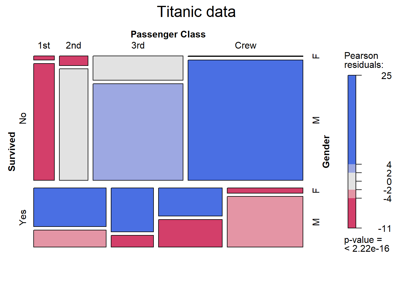
Figure 9.10: Mosaic plot with shading
We can see that if class, gender, and survival are independent, we are seeing many more male crew perishing, and 1st, 2nd and 3rd class females surviving than would be expected. Conversely, far fewer 1st class passengers (both male and female) died than would be expected by chance. Thus the assumption of independence is rejected. (Spoiler alert: Leo doesn’t make it.)
For complicated tables, labels can easily overlap. See ?labeling_border for plotting options.