Chapter 10 Other Graphs
Graphs in this chapter can be very useful, but don’t fit in easily within the other chapters. Feel free to look through these sections and see if any of these graphs meet your needs.
10.1 3-D Scatterplot
A scatterplot displays the relationship between two quantitative variables (Section 5.2.1). But what do you do when you want to observe the relation between three variables? One approach is the 3-D scatterplot.
The ggplot2 package and its extensions can’t create a 3-D plot. However, you can create a 3-D scatterplot with the scatterplot3d function in the scatterplot3d package.
Let’s say that we want to plot automobile mileage vs. engine displacement vs. car weight using the data in the mtcars data frame the comes installed with base R.
# basic 3-D scatterplot
library(scatterplot3d)
with(mtcars, {
   scatterplot3d(x = disp,
                 y = wt,
                 z = mpg,
                 main="3-D Scatterplot Example 1")
})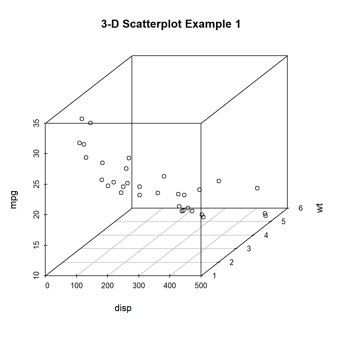
Figure 10.1: Basic 3-D scatterplot
Now lets, modify the graph by replacing the points with filled blue circles, add drop lines to the x-y plane, and create more meaningful labels.
library(scatterplot3d)
with(mtcars, {
  scatterplot3d(x = disp,
                y = wt,
                z = mpg,
                # filled blue circles
                color="blue",
                pch = 19,
                # lines to the horizontal plane
                type = "h",
                main = "3-D Scatterplot Example 2",
                xlab = "Displacement (cu. in.)",
                ylab = "Weight (lb/1000)",
                zlab = "Miles/(US) Gallon")
})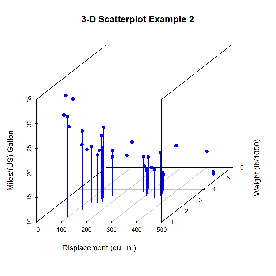
Figure 10.2: 3-D scatterplot with vertical lines
In the previous code, pch = 19 is the way we tell base R graphing function to plot points as a filled circle (pch stands for plotting character and 19 is the code for a filled circle). Similarly, type = "h" asks for vertical lines (like a histogram).
Next, let’s label the points. We can do this by saving the results of the scatterplot3d function to an object, using the xyz.convert function to convert coordinates from 3-D (x, y, z) to 2D-projections (x, y), and apply the text function to add labels to the graph.
library(scatterplot3d)
with(mtcars, {
  s3d <- scatterplot3d(
    x = disp,
    y = wt,
    z = mpg,
    color = "blue",
    pch = 19,
    type = "h",
    main = "3-D Scatterplot Example 3",
    xlab = "Displacement (cu. in.)",
    ylab = "Weight (lb/1000)",
    zlab = "Miles/(US) Gallon")

  # convert 3-D coords to 2D projection
  s3d.coords <- s3d$xyz.convert(disp, wt, mpg)

  # plot text with 50% shrink and place to right of points
  text(s3d.coords$x,
       s3d.coords$y,
       labels = row.names(mtcars),
       cex = .5,
       pos = 4)
})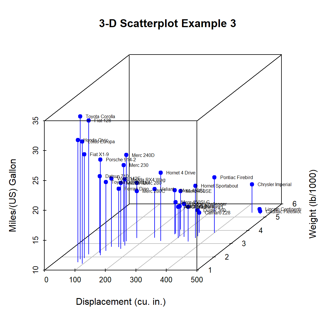
Figure 10.3: 3-D scatterplot with vertical lines and point labels
Almost there. As a final step, we’ll add information on the number of cylinders in each car. To do this, we’ll add a column to the mtcars data frame indicating the color for each point. For good measure, we will shorten the y-axis, change the drop lines to dashed lines, and add a legend.
library(scatterplot3d)

# create column indicating point color
mtcars$pcolor[mtcars$cyl == 4] <- "red"
mtcars$pcolor[mtcars$cyl == 6] <- "blue"
mtcars$pcolor[mtcars$cyl == 8] <- "darkgreen"

with(mtcars, {
    s3d <- scatterplot3d(
      x = disp,
      y = wt,
      z = mpg,
      color = pcolor,
      pch = 19,
      type = "h",
      lty.hplot = 2,
      scale.y = .75,
      main = "3-D Scatterplot Example 4",
      xlab = "Displacement (cu. in.)",
      ylab = "Weight (lb/1000)",
      zlab = "Miles/(US) Gallon")

     s3d.coords <- s3d$xyz.convert(disp, wt, mpg)
     text(s3d.coords$x,
          s3d.coords$y,
          labels = row.names(mtcars),
          pos = 4,
          cex = .5)

# add the legend
legend(# top left and indented
       "topleft", inset=.05,
       # suppress legend box, shrink text 50%
       bty="n", cex=.5,
       title="Number of Cylinders",
       c("4", "6", "8"),
       fill=c("red", "blue", "darkgreen"))
})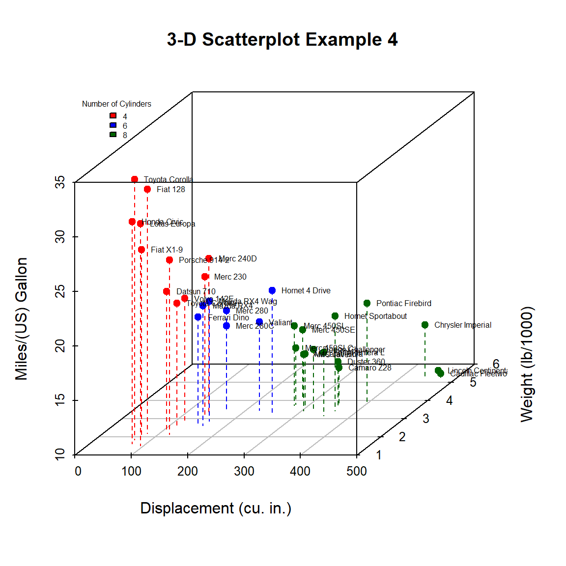
Figure 10.4: 3-D scatterplot with vertical lines and point labels and legend
We can easily see that the car with the highest mileage (Toyota Corolla) has low engine displacement, low weight, and 4 cylinders.
3-D scatterplots can be difficult to interpret because they are static. The scatter3d function in the car package allows you to create an interactive 3-D graph that can be manually rotated.
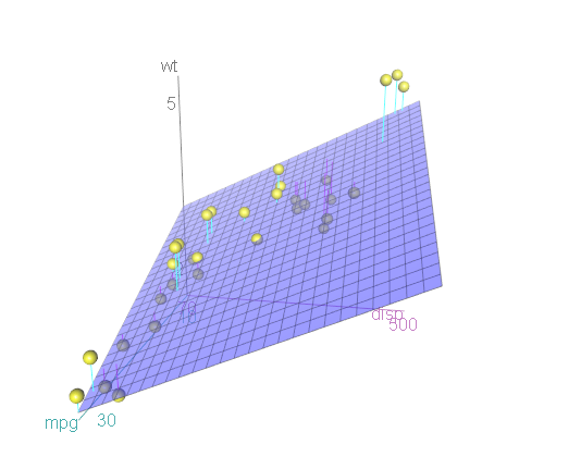
Figure 10.5: Interative 3-D scatterplot
You can now use your mouse to rotate the axes and zoom in and out with the mouse scroll wheel. Note that this will only work if you actually run the code on your desktop. If you are trying to manipulate the graph in this book you’ll drive yourself crazy!
The graph can be highly customized. In the next graph,
- each axis is colored black
- points are colored red for automatic transmission and blue for manual transmission
- all 32 data points are labeled with their rowname
- the default best fit surface is suppressed
- all three axes are given longer labels
library(car)
with(mtcars,
     scatter3d(disp, wt, mpg,
               axis.col = c("black", "black", "black"),
               groups = factor(am),
               surface.col = c("red", "blue"),
               col = c("red", "blue"),
               text.col = "grey",
               id = list(n=nrow(mtcars),
                         labels=rownames(mtcars)),
               surface = FALSE,
               xlab = "Displacement",
               ylab = "Weight",
               zlab = "Miles Per Gallon"))
The id option consists of a list of options that control the identification of points. If n is less than the total number of points, the n most extreme points are labelled. Here, all points are labeled and the row.names are used for the labels.
The axis.col option specifies the color of the x, y, and z axis respectively. The surface.col option specifies the colors of the points by group. The col option specifies by colors of the point labels by group. The text.col option specifies the color of the axis labels.
The surface option indicates if a surface fit should be plotted (default = TRUE) and the lab options adds labels to the axes.
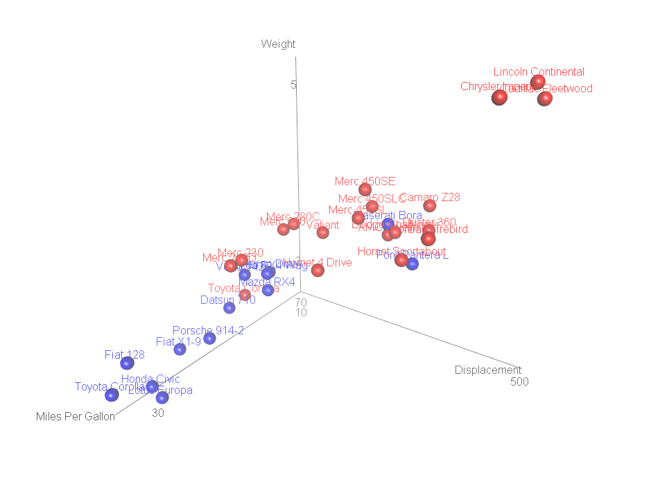
Figure 10.6: Interative 3-D scatterplot with labelled points
Labelled 3-D scatterplots are most effective when the number of labelled points is small. Otherwise label overlap becomes a significant issue.
10.2 Bubble charts
A bubble chart is also useful when plotting the relationship between three quantitative variables. A bubble chart is basically just a scatterplot where the point size is proportional to the values of a third quantitative variable.
Using the mtcars dataset, let’s plot car weight vs. mileage and use point size to represent horsepower.
# create a bubble plot
data(mtcars)
library(ggplot2)
ggplot(mtcars,
       aes(x = wt, y = mpg, size = hp)) +
  geom_point()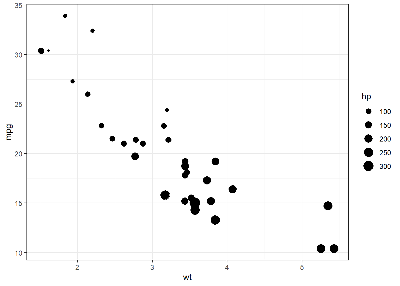
Figure 10.7: Basic bubble plot
We can improve the default appearance by increasing the size of the bubbles, choosing a different point shape and color, and adding some transparency.
# create a bubble plot with modifications
ggplot(mtcars,
       aes(x = wt, y = mpg, size = hp)) +
  geom_point(alpha = .5,
             fill="cornflowerblue",
             color="black",
             shape=21) +
  scale_size_continuous(range = c(1, 14)) +
  labs(title = "Auto mileage by weight and horsepower",
       subtitle = "Motor Trend US Magazine (1973-74 models)",
       x = "Weight (1000 lbs)",
       y = "Miles/(US) gallon",
size = "Gross horsepower") 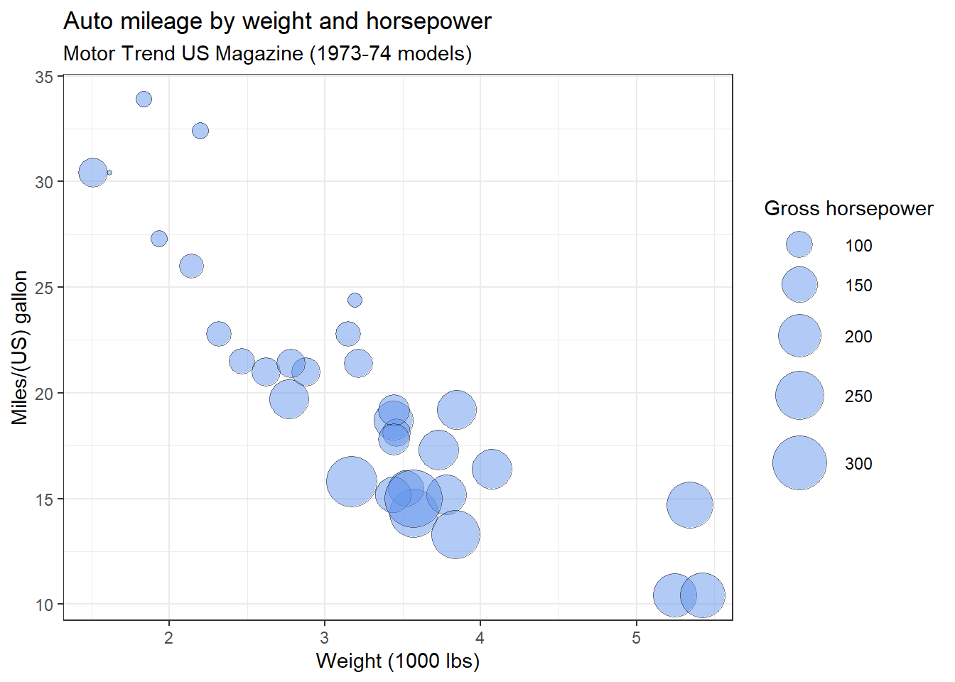
Figure 10.8: Bubble plot with modifications
The range parameter in the scale_size_continuous function specifies the minimum and maximum size of the plotting symbol. The default is range = c(1, 6).
The shape option in the geom_point function specifies an circle with a border color and fill color.
Clearly, miles per gallon decreases with increased car weight and horsepower. However, there is one car with low weight, high horsepower, and high gas mileage. Going back to the data, it’s the Lotus Europa.
Bubble charts are controversial for the same reason that pie charts are controversial. People are better at judging length than volume. However, they are quite popular.
10.3 Biplots
3-D scatterplots and bubble charts plot the relation between three quantitative variables. With more than three quantitative variables, a biplot (Nishisato et al. 2021) can be very useful. A biplot is a specialized graph that attempts to represent the relationship between observations, between variables, and between observations and variables, in a low (usually two) dimensional space.
It’s easiest to see how this works with an example. Let’s create a biplot for the mtcars dataset, using the fviz_pca function from the factoextra package.
# create a biplot
# load data
data(mtcars)

# fit a principal components model
fit <- prcomp(x = mtcars,
              center = TRUE,
              scale = TRUE)

# plot the results
library(factoextra)
fviz_pca(fit,
         repel = TRUE,
         labelsize = 3) +
  theme_bw() +
  labs(title = "Biplot of mtcars data")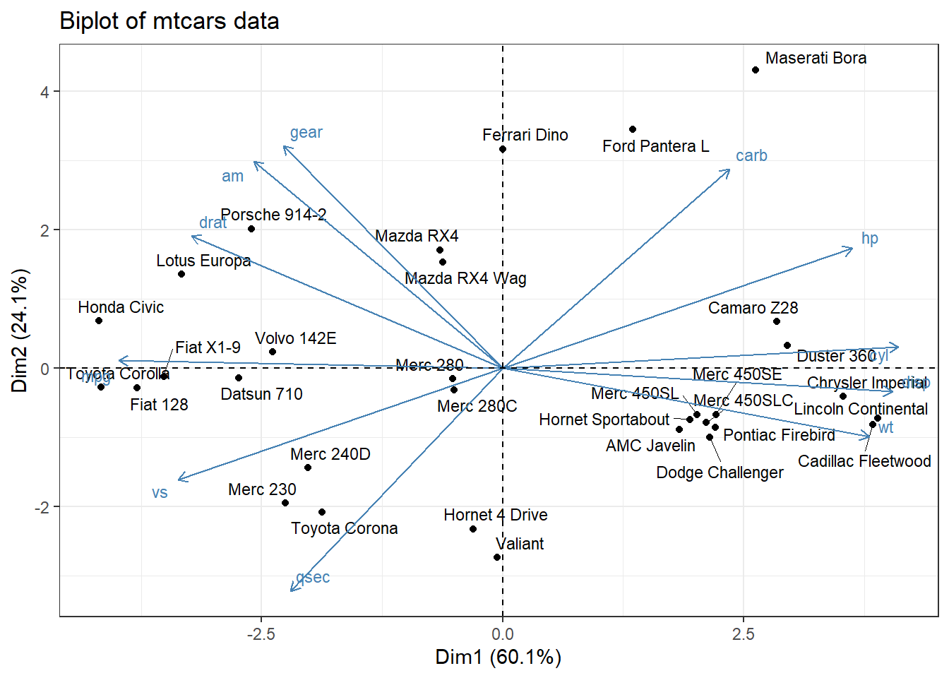
Figure 10.9: Basic biplot
The fviz_pca function produces a ggplot2 graph.
Dim1 and Dim2 are the first two principal components - linear combinations of the original p variables.
\[PC_{1} = \beta_{10} +\beta_{11}x_{1} + \beta_{12}x_{2} + \beta_{13}x_{3} + \dots + \beta_{1p}x_{p}\] \[PC_{2} = \beta_{20} +\beta_{21}x_{1} + \beta_{22}x_{2} + \beta_{23}x_{3} + \dots + \beta_{2p}x_{p}\]
The weights of these linear combinations (\(\beta_{ij}s\)) are chosen to maximize the variance accounted for in the original variables. Additionally, the principal components (PCs) are constrained to be uncorrelated with each other.
In this graph, the first PC accounts for 60% of the variability in the original data. The second PC accounts for 24%. Together, they account for 84% of the variability in the original p = 11 variables.
As you can see, both the observations (cars) and variables (car characteristics) are plotted in the same graph.
- Points represent observations. Smaller distances between points suggest similar values on the original set of variables. For example, the Toyota Corolla and Honda Civic are similar to each other, as are the Chrysler Imperial and Liconln Continental. However, the Toyota Corolla is very different from the Lincoln Continental.
- The vectors (arrows) represent variables. The angle between vectors are proportional to the correlation between the variables. Smaller angles indicate stronger correlations. For example, gear and am are positively correlated, gear and qsec are uncorrelated (90 degree angle), and am and wt are negatively correlated (angle greater then 90 degrees).
- The observations that are are farthest along the direction of a variable’s vector, have the highest values on that variable. For example, the Toyoto Corolla and Honda Civic have higher values on mpg. The Toyota Corona has a higher qsec. The Duster 360 has more cylinders.
As you can see, biplots convey an amazing amount of information in a single graph. However, care must be taken in interpreting biplots. They are only accurate when the percentage of variance accounted for is high. Always check your conclusion with the original data. For example, if the graph suggests that two cars are similar, go back to the original data and do a spot-check to see if that is so.
See the article by Forrest Young (https://www.uv.es/visualstats/vista-frames/help/lecturenotes/lecture13/biplot.html) to learn more about interpreting biplots correctly.
A flow diagram represents a set of dynamic relationships. It usually captures the physical or metaphorical flow of people, materials, communications, or objects through a set of nodes in a network.
10.4 Alluvial diagrams
Alluvial diagrams are useful for displaying the relation among two or more categorical variables. They use a flow analogy to represent in changes in group composition across variables. This will be more understandable when you see an example.
Alluvial diagrams are created with ggalluvial package, generating ggplot2 graphs. As an example, let’s diagram the survival of Titanic passengers, using the Titanic dataset. We will look at the relationship between passenger class, sex, and survival.
To create an alluvial diagram, first count the frequency of of each combination of the categorical variables.
# input data
library(readr)
titanic <- read_csv("titanic.csv")

# summarize data
library(dplyr)
titanic_table <- titanic %>%
  group_by(Class, Sex, Survived) %>%
  count()

# convert survived to a factor with labels
titanic_table$Survived <- factor(titanic_table$Survived,
                                 levels = c("Yes", "No"))
# view the first 6 cases
head(titanic_table)
## # A tibble: 6 × 4
## # Groups: Class, Sex, Survived [6]
## Class Sex Survived n
## <chr> <chr> <fct> <int>
## 1 1st Female No 4
## 2 1st Female Yes 141
## 3 1st Male No 118
## 4 1st Male Yes 62
## 5 2nd Female No 13
## 6 2nd Female Yes 93Next create an alluvial diagram in ggplot2 using the ggplot, geom_alluvium and geom_stratum functions. The categorical variables are mapped to axes and n to y. This will produce Figure 10.10
library(ggalluvial)
ggplot(titanic_table,
       aes(axis1 = Class,
           axis2 = Sex,
           axis3 = Survived,
           y = n)) +
  geom_alluvium(aes(fill = Class)) +
  geom_stratum() +
  geom_text(stat = "stratum",
            aes(label = after_stat(stratum)))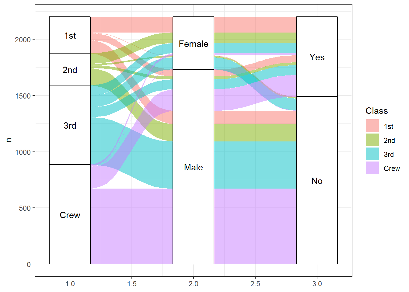
Figure 10.10: Basic alluvial diagram
To interpret the graph, start with the variable on the left (Class) and follow the flow to the right. The height of the category level represent the proportion of observations in that level. For example the crew made up roughly 40% of the passengers. Roughly, 30% of passengers survived.
The height of the flow represents the proportion of observations contained in the two variable levels they connect. About 50% of first class passengers were females and all female first class passengers survived. The crew was overwhelmingly male and roughly 75% of this group perished.
As a second example, let’s look at the relationship between the number carburetors, cylinders, gears, and the transmission type (manual or automatic) for the 32 cars in the mtcars dataset. We’ll treat each variable as categorical.
First, we need to prepare the data.
library(dplyr)
data(mtcars)
mtcars_table <- mtcars %>%
  mutate(am = factor(am, labels = c("Auto", "Man")),
         cyl = factor(cyl),
         gear = factor(gear),
         carb = factor(carb)) %>%
  group_by(cyl, gear, carb, am) %>%
  count()

head(mtcars_table)
## # A tibble: 6 × 5
## # Groups: cyl, gear, carb, am [6]
## cyl gear carb am n
## <fct> <fct> <fct> <fct> <int>
## 1 4 3 1 Auto 1
## 2 4 4 1 Man 4
## 3 4 4 2 Auto 2
## 4 4 4 2 Man 2
## 5 4 5 2 Man 2
## 6 6 3 1 Auto 2Next create the graph. Several options and functions are added to enhance the results. Specifically,
- the flow borders are set to black (
geom_alluvium) - the strata are given transparency (
geom_strata) - the strata are labeled and made wider (
scale_x_discrete) - titles are added (
labs) - the theme is simplified (
theme_minimal) - and the legend is suppressed (
theme)
ggplot(mtcars_table,
       aes(axis1 = carb,
           axis2 = cyl,
           axis3 = gear,
           axis4 = am,
           y = n)) +
  geom_alluvium(aes(fill = carb), color="black") +
  geom_stratum(alpha=.8) +
  geom_text(stat = "stratum",
            aes(label = after_stat(stratum))) +
  scale_x_discrete(limits = c("Carburetors", "Cylinders",
                              "Gears", "Transmission"),
                   expand = c(.1, .1)) +
  # scale_fill_brewer(palette="Paired") +
  labs(title = "Mtcars data",
       subtitle = "stratified by carb, cyl, gear, and am",
       y = "Frequency") +
  theme_minimal() +
theme(legend.position = "none") 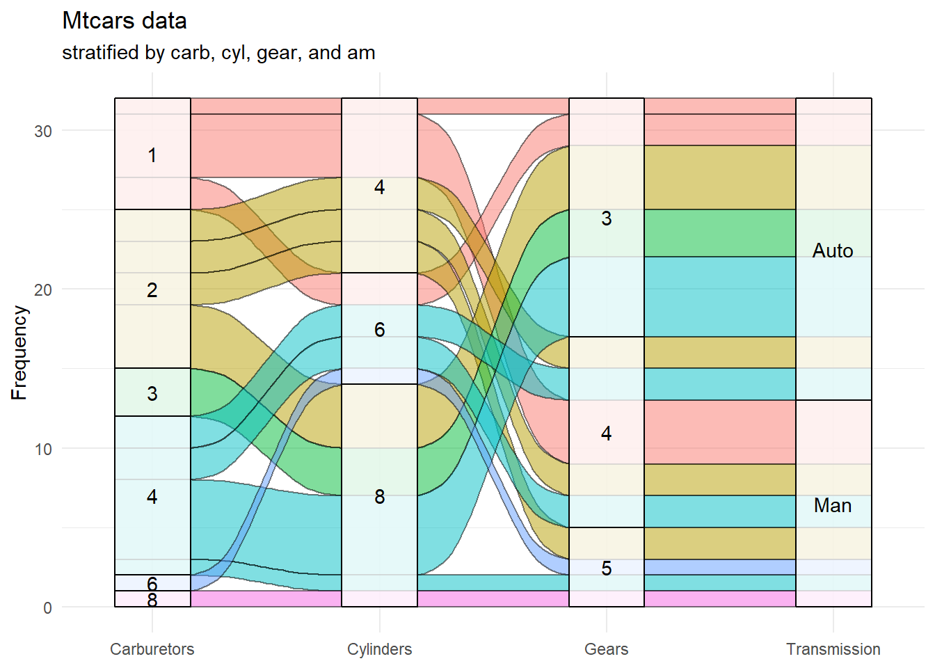
Figure 10.11: Basic alluvial diagram for the mtcars dataset
I think that these changes make the graph easier to follow. For example, all 8 carburetor cars have 8 cylinders, 5 gears, and a manual transmission. Most 4 carburetor cars have 8 cylinders, 3 gears, and an automatic transmission.
See the ggalluvial website (https://github.com/corybrunson/ggalluvial) for additional details.
10.5 Heatmaps
A heatmap displays a set of data using colored tiles for each variable value within each observation. There are many varieties of heatmaps. Although base R comes with a heatmap function, we’ll use the more powerful superheat package (I love these names).
First, let’s create a heatmap for the mtcars dataset that come with base R. The mtcars dataset contains information on 32 cars measured on 11 variables.
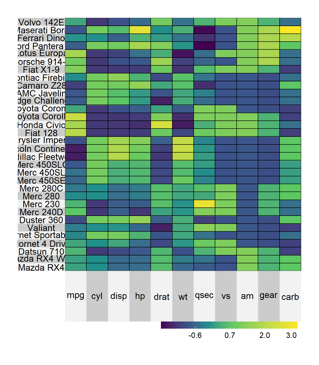
Figure 10.12: Basic heatmap
The scale = TRUE options standardizes the columns to a mean of zero and standard deviation of one. Looking at the graph, we can see that the Merc 230 has a quarter mile time (qsec) the is well above average (bright yellow). The Lotus Europa has a weight is well below average (dark blue).
We can use clustering to sort the rows and/or columns. In the next example, we’ll sort the rows so that cars that are similar appear near each other. We will also adjust the text and label sizes.
# sorted heat map
superheat(mtcars,
          scale = TRUE,
          left.label.text.size=3,
          bottom.label.text.size=3,
          bottom.label.size = .05,
          row.dendrogram = TRUE )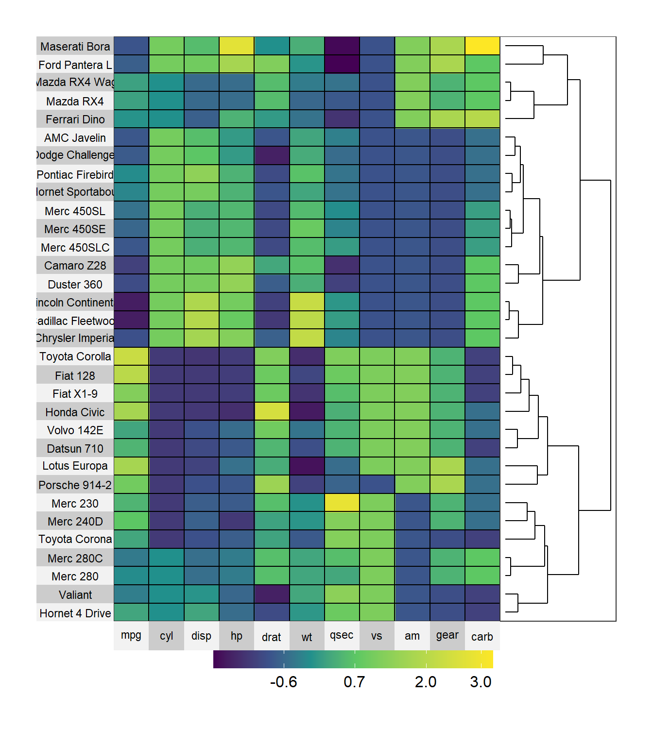
Figure 10.13: Sorted heatmap
Here we can see that the Toyota Corolla and Fiat 128 have similar characteristics. The Lincoln Continental and Cadillac Fleetwood also have similar characteristics.
The superheat function requires that the data be in particular format. Specifically
- the data most be all numeric
- the row names are used to label the left axis. If the desired labels are in a column variable, the variable must be converted to row names (more on this below)
- missing values are allowed
Let’s use a heatmap to display changes in life expectancies over time for Asian countries. The data come from the gapminder dataset (Appendix A.8.
Since the data is in long format (Section 2.2.7), we first have to convert to wide format. Then we need to ensure that it is a data frame and convert the variable country into row names. Finally, we’ll sort the data by 2007 life expectancy. While we are at it, let’s change the color scheme.
# create heatmap for gapminder data (Asia)
library(tidyr)
library(dplyr)

# load data
data(gapminder, package="gapminder")

# subset Asian countries
asia <- gapminder %>%
  filter(continent == "Asia") %>%
  select(year, country, lifeExp)

# convert to long to wide format
plotdata <- pivot_wider(asia, names_from = year,
                        values_from = lifeExp)

# save country as row names
plotdata <- as.data.frame(plotdata)
row.names(plotdata) <- plotdata$country
plotdata$country <- NULL

# row order
sort.order <- order(plotdata$"2007")

# color scheme
library(RColorBrewer)
colors <- rev(brewer.pal(5, "Blues"))


# create the heat map
superheat(plotdata,
          scale = FALSE,
          left.label.text.size=3,
          bottom.label.text.size=3,
          bottom.label.size = .05,
          heat.pal = colors,
          order.rows = sort.order,
          title = "Life Expectancy in Asia")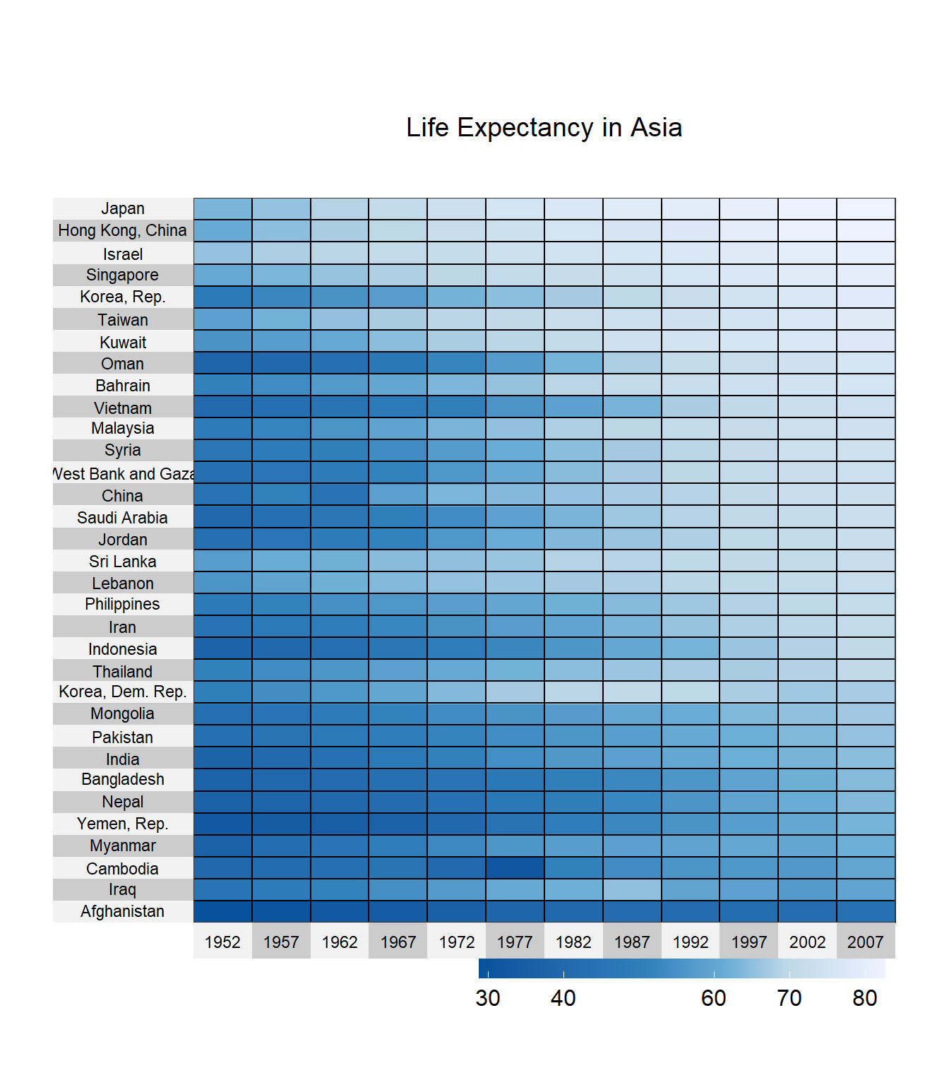
Figure 10.14: Heatmap for time series
Japan, Hong Kong, and Israel have the highest life expectancies. South Korea was doing well in the 80s but has lost some ground. Life expectancy in Cambodia took a sharp hit in 1977.
To see what you can do with heat maps, see the extensive superheat vignette (https://rlbarter.github.io/superheat/).
10.6 Radar charts
A radar chart (also called a spider or star chart) displays one or more groups or observations on three or more quantitative variables.
In the example below, we’ll compare dogs, pigs, and cows in terms of body size, brain size, and sleep characteristics (total sleep time, length of sleep cycle, and amount of REM sleep). The data come from the msleep dataset that ships with ggplot2.
Radar charts can be created with ggradar function in the ggradar package.
Next, we have to put the data in a specific format:
- The first variable should be called group and contain the identifier for each observation
- The numeric variables have to be rescaled so that their values range from 0 to 1
# create a radar chart

# prepare data
data(msleep, package = "ggplot2")
library(ggplot2)
library(ggradar)
library(scales)
library(dplyr)

plotdata <- msleep %>%
  filter(name %in% c("Cow", "Dog", "Pig")) %>%
  select(name, sleep_total, sleep_rem,
         sleep_cycle, brainwt, bodywt) %>%
  rename(group = name) %>%
  mutate_at(vars(-group),
            funs(rescale))
plotdata
## # A tibble: 3 × 6
## group sleep_total sleep_rem sleep_cycle brainwt bodywt
## <chr> <dbl> <dbl> <dbl> <dbl> <dbl>
## 1 Cow 0 0 1 1 1
## 2 Dog 1 1 0 0 0
## 3 Pig 0.836 0.773 0.5 0.312 0.123# generate radar chart
ggradar(plotdata,
grid.label.size = 4,
axis.label.size = 4,
group.point.size = 5,
group.line.width = 1.5,
legend.text.size= 10) +
labs(title = "Mammals, size, and sleep")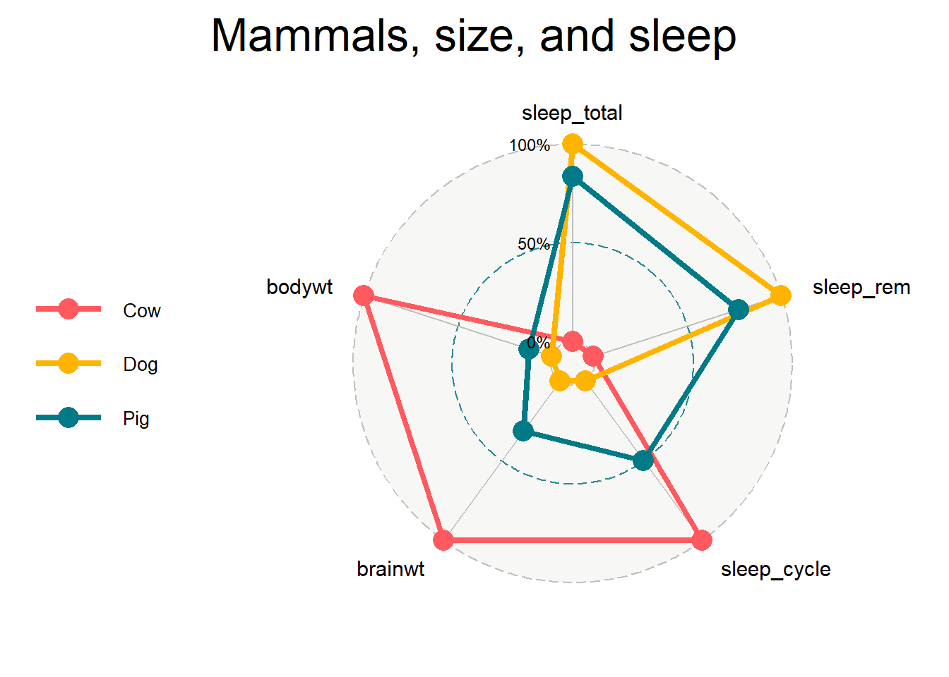
Figure 10.15: Basic radar chart
In the previous chart, the mutate_at function rescales all variables except group. The various size options control the font sizes for the percent labels, variable names, point size, line width, and legend labels respectively.
We can see from the chart that, relatively speaking, cows have large brain and body weights, long sleep cycles, short total sleep time and little time in REM sleep. Dogs in comparison, have small body and brain weights, short sleep cycles, and a large total sleep time and time in REM sleep (The obvious conclusion is that I want to be a dog - but with a bigger brain).
10.7 Scatterplot matrix
A scatterplot matrix is a collection of scatterplots (Section 5.2.1) organized as a grid. It is similar to a correlation plot (Section 9.1 but instead of displaying correlations, displays the underlying data.
You can create a scatterplot matrix using the ggpairs function in the GGally package.
We can illustrate its use by examining the relationships between mammal size and sleep characteristics using msleep dataset. Brain weight and body weight are highly skewed (think mouse and elephant) so we’ll transform them to log brain weight and log body weight before creating the graph.
library(GGally)

# prepare data
data(msleep, package="ggplot2")
library(dplyr)
df <- msleep %>%
  mutate(log_brainwt = log(brainwt),
         log_bodywt = log(bodywt)) %>%
  select(log_brainwt, log_bodywt, sleep_total, sleep_rem)


# create a scatterplot matrix
ggpairs(df)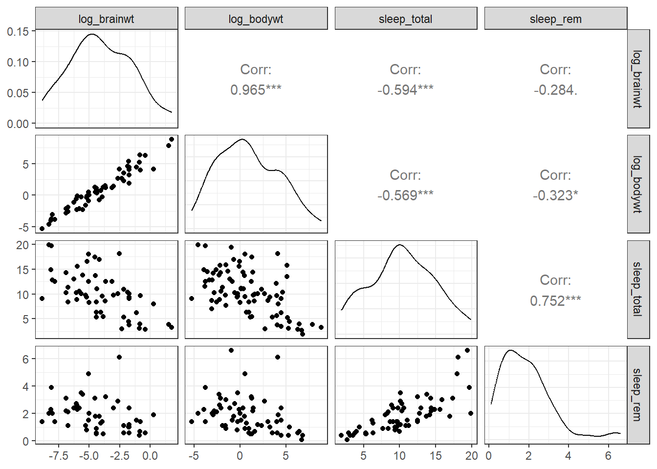
Figure 10.16: Scatterplot matrix
By default,
- the principal diagonal contains the kernel density charts (Section 4.2.2) for each variable.
- The cells below the principal diagonal contain the scatterplots represented by the intersection of the row and column variables. The variables across the top are the x-axes and the variables down the right side are the y-axes.
- The cells above the principal diagonal contain the correlation coefficients.
For example, as brain weight increases, total sleep time and time in REM sleep decrease.
The graph can be modified by creating custom functions.
# custom function for density plot
my_density <- function(data, mapping, ...){
  ggplot(data = data, mapping = mapping) +
    geom_density(alpha = 0.5,
                 fill = "cornflowerblue", ...)
}

# custom function for scatterplot
my_scatter <- function(data, mapping, ...){
  ggplot(data = data, mapping = mapping) +
    geom_point(alpha = 0.5,
               color = "cornflowerblue") +
    geom_smooth(method=lm,
                se=FALSE, ...)
}


# create scatterplot matrix
ggpairs(df,
        lower=list(continuous = my_scatter),
        diag = list(continuous = my_density)) +
  labs(title = "Mammal size and sleep characteristics") +
  theme_bw()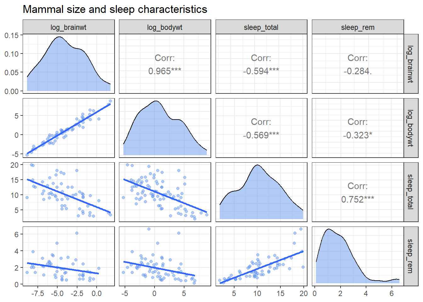
Figure 10.17: Customized scatterplot matrix
Being able to write your own functions provides a great deal of flexibility. Additionally, since the resulting plot is a ggplot2 graph, addition functions can be added to alter the theme, title, labels, etc. See the ?ggpairs for more details.
10.8 Waterfall charts
A waterfall chart illustrates the cumulative effect of a sequence of positive and negative values.
For example, we can plot the cumulative effect of revenue and expenses for a fictional company. First, let’s create a dataset
# create company income statement
category <- c("Sales", "Services", "Fixed Costs",
              "Variable Costs", "Taxes")
amount <- c(101000, 52000, -23000, -15000, -10000)
income <- data.frame(category, amount)
Now we can visualize this with a waterfall chart, using the waterfall function in the waterfalls package.
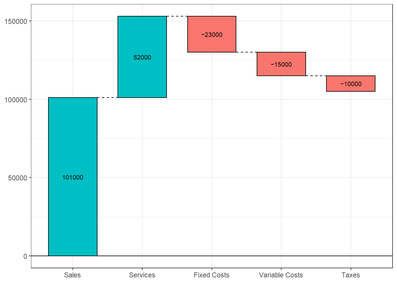
Figure 10.18: Basic waterfall chart
We can also add a total (net) column. Since the result is a ggplot2 graph, we can use additional functions to customize the results.
# create waterfall chart with total column
waterfall(income,
          calc_total=TRUE,
          total_axis_text = "Net",
          total_rect_text_color="black",
          total_rect_color="goldenrod1") +
  scale_y_continuous(label=scales::dollar) +
  labs(title = "West Coast Profit and Loss",
       subtitle = "Year 2017",
       y="",
       x="") +
theme_minimal() 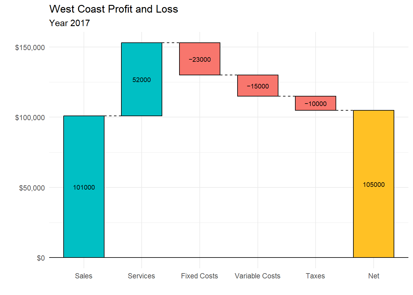
Figure 10.19: Waterfall chart with total column
Waterfall charts are particularly useful when you want to show change from a starting point to an end point and when there are positive and negative values.
10.9 Word clouds
A word cloud (also called a tag cloud), is basically an infographic that indicates the frequency of words in a collection of text (e.g., tweets, a text document, a set of text documents). There is a very nice script produced by STHDA (http://www.sthda.com/english/) that will generate a word cloud directly from a text file.
To demonstrate, we’ll use President Kennedy’s Address (Appendix A.17) during the Cuban Missile crisis.
To use the script, there are several packages you need to install first. The were not mentioned earlier because they are only needed for this section.
# install packages for text mining
install.packages(c("tm", "SnowballC",
                   "wordcloud", "RColorBrewer",
                   "RCurl", "XML"))
Once the packages are installed, you can run the script on your text file.
# create a word cloud
script <- "http://www.sthda.com/upload/rquery_wordcloud.r"
source(script)
res<-rquery.wordcloud("JFKspeech.txt",
                      type ="file",
                      lang = "english",
                      textStemming=FALSE,
                      min.freq=3,
                      max.words=200)
Figure 10.20: Word cloud
First, the script
- coverts each word to lowercase
- removes numbers, punctuation, and whitespace
- removes stopwords (common words such as “a”, “and”, and “the”)
- if the
textStemming = TRUE(default is FALSE), words are stemmed (reducing words such as cats, and catty to cat) - counts the number of times each word appears
- drops words that appear less than 3 times (min.freq)
The script then plots up to 200 words (max.words) with word size proportional to the number of times the word appears.
As you can see, the most common words in the speech are soviet, cuba, world, weapons, etc. The terms missile and ballistic are used rarely.
The rquery.wordcloud function supports several languages, including Danish, Dutch, English, Finnish, french, German, Italian, Norwegian, Portuguese, Russian, Spanish, and Swedish! See http://www.sthda.com/english/wiki/word-cloud-generator-in-r-one-killer-function-to-do-everything-you-need for details.