Chapter 7 Maps
Data are often tied to geographic locations. Examples include traffic accidents in a city, inoculation rates by state, or life expectancy by country. Viewing data superimposed onto a map can help you discover important patterns, outliers, and trends. It can also be an impactful way of conveying information to others.
In order to plot data on a map, you will need position information that ties each observation to a location. Typically position information is provided in the form of street addresses, geographic coordinates (longitude and latitude), or the names of counties, cities, or countries.
R provides a myriad of methods for creating both static and interactive maps containing spatial information. In this chapter, you’ll use of tidygeocoder, ggmap, mapview, choroplethr, and sf to plot data onto maps.
7.1 Geocoding
Geocoding translates physical addresses (e.g. street addresses) to geographical coordinates (such as longitude and latitude.) The tidygeocoder package contains functions that can accomplish this translation in either direction.
Consider the following dataset.
location <- c("lunch", "view")
addr <- c( "10 Main Street, Middletown, CT",
           "20 W 34th St., New York, NY, 10001")
df <- data.frame(location, addr)| location | addr |
|---|---|
| lunch | 10 Main Street, Middletown, CT |
| view | 20 W 34th St., New York, NY, 10001 |
The first observation contains the street address of my favorite pizzeria. The second address is location of the Empire State Building. I can get the latitude and longitude of these addresses using the geocode function.
The address argument points to the variable containing the street address. The method refers to the geocoding service employed (osm or Open Street Maps here).
| location | addr | lat | long |
|---|---|---|---|
| lunch | 10 Main Street, Middletown, CT | 41.55713 | -72.64697 |
| view | 20 W 34th St., New York, NY, 10001 | 40.74865 | -73.98530 |
The geocode function supports many other services including the US Census, ArcGIS, Google, MapQuest, TomTom and others. See ?geocode and ?geo for details.
7.2 Dot density maps
Now that we know to to obtain latitude/longitude from address data, let’s look at dot density maps. Dot density graphs plot observations as points on a map.
The Houston crime dataset (see Appendix A.10) contains the date, time, and address of six types of criminal offenses reported between January and August 2010. We’ll use this dataset to plot the locations of homicide reports.
library(ggmap)

# subset the data
library(dplyr)
homicide <- filter(crime, offense == "murder") %>%
  select(date, offense, address, lon, lat)

# view data
head(homicide, 3)
## date offense address lon lat
## 1 1/1/2010 murder 9650 marlive ln -95.43739 29.67790
## 2 1/5/2010 murder 1350 greens pkwy -95.43944 29.94292
## 3 1/5/2010 murder 10250 bissonnet st -95.55906 29.67480We can create a dot density maps using either the mapview or ggmap packages. The mapview package uses the sf and leaflet packages (primarily) to quickly create interactive maps. The ggmap package uses ggplot2 to creates static maps.
7.2.1 Interactive maps with mapview
Let’s create an interactive map using the mapview and sf packages. If you are reading a hardcopy version of this chapter, be sure to run the code in order to to interact with the graph.
First, the sf function st_as_sfconverts the data frame to an sf object. An sf or simple features object, is a data frame containing attributes and spatial geometries that follows a widely accepted format for geographic vector data. The argument crs = 4326 specifies a popular coordinate reference system. The mapview function takes this sf object and generates an interactive graph.
library(mapview)
library(sf)
mymap <- st_as_sf(homicide, coords = c("lon", "lat"), crs = 4326)
mapview(mymap)
Clicking on a point, opens a pop-up box containing the observation’s data. You can zoom in or out of the graph using the scroll wheel on your mouse, or via the + and - in the upper left corner of the plot. Below that is an option for choosing the base graph type. There is a home button in the lower right corner of the graph that resets the orientation of the graph.
There are numerous options for changing the the plot. For example, let’s change the point outline to black, the point fill to red, and the transparency to 0.5 (halfway between transparent and opaque). We’ll also suppress the legend and home button and set the base map source to OpenstreetMap.
library(sf)
library(mapview)
mymap <- st_as_sf(homicide, coords = c("lon", "lat"), crs = 4326)
mapview(mymap, color="black", col.regions="red",
        alpha.regions=0.5, legend = FALSE,
        homebutton = FALSE, map.types = "OpenStreetMap" )
Other map types include include CartoDB.Positron, CartoDB.DarkMatter, Esri.WorldImagery, and OpenTopoMap.
7.2.1.1 Using leaflet
Leaflet (https://leafletjs.com/) is a javascript library for interactive maps and the leaflet package can be used to generate leaflet graphs in R. The mapview package uses the leaflet package when creating maps. I’ve focused on mapview because of its ease of use. For completeness, let’s use leaflet directly.
The following is a simple example. You can click on the pin, zoom in and out with the +/- buttons or mouse wheel, and drag the map around with the hand cursor.
# create leaflet graph
library(leaflet)
leaflet() %>%
  addTiles() %>%
  addMarkers(lng=-72.6560002,
             lat=41.5541829,
             popup="The birthplace of quantitative wisdom.</br>
             No, Waldo is not here.")
Figure 7.1: Interactive map (leaflet)
Leaflet allows you to create both dot density and choropleth maps. The package website (https://rstudio.github.io/leaflet/) offers a detailed tutorial and numerous examples.
7.2.2 Static maps with ggmap
You can create a static map using the free Stamen Map Tiles (http://maps.stamen.com), or the paid Google maps platform (http://developers.google.com/maps). We’ll consider each in turn.
7.2.2.1 Stamen maps
As of July 31, 2023, Stamen Map Tiles are served by Stadia Maps. To create a stamen map, you will need to obtain a Stadia Maps API key. The service is free from non-commercial use.
The steps are
Sign up for an account at stadiamaps.com.
Go to the client dashboard.The client dashboard lets you generate, view, or revoke your API key.
Click on “Manage Properties”. Under “Authentication Configuration”, generate your API key. Save this key and keep it private.
In R, use ggmap::register_stadiamaps(“your API key”) to register your key.
To create a stamen map, you’ll need a bounding box - the latitude and longitude for each corner of the map. The getbb function in the osmdata package can provide this.
##         min       max
## x -95.90974 -95.01205
## y  29.53707  30.11035
The get_stadiamap function takes this information and returns the map. The ggmap function then plots the map.
library(ggmap)
houston <- get_stadiamap(bbox = c(bb[1,1], bb[2,1],
                                  bb[1,2], bb[2,2]),
                         maptype="stamen_toner_lite")
ggmap(houston)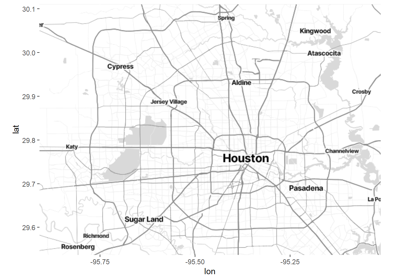
Figure 7.2: Static Houston map
The map returned by the ggmap function if a ggplot2 map. We can add to this graph using the standard ggplot2 functions.
# add incident locations
ggmap(houston) +
  geom_point(aes(x=lon,y=lat),data=homicide,
             color = "red", size = 2, alpha = 0.5)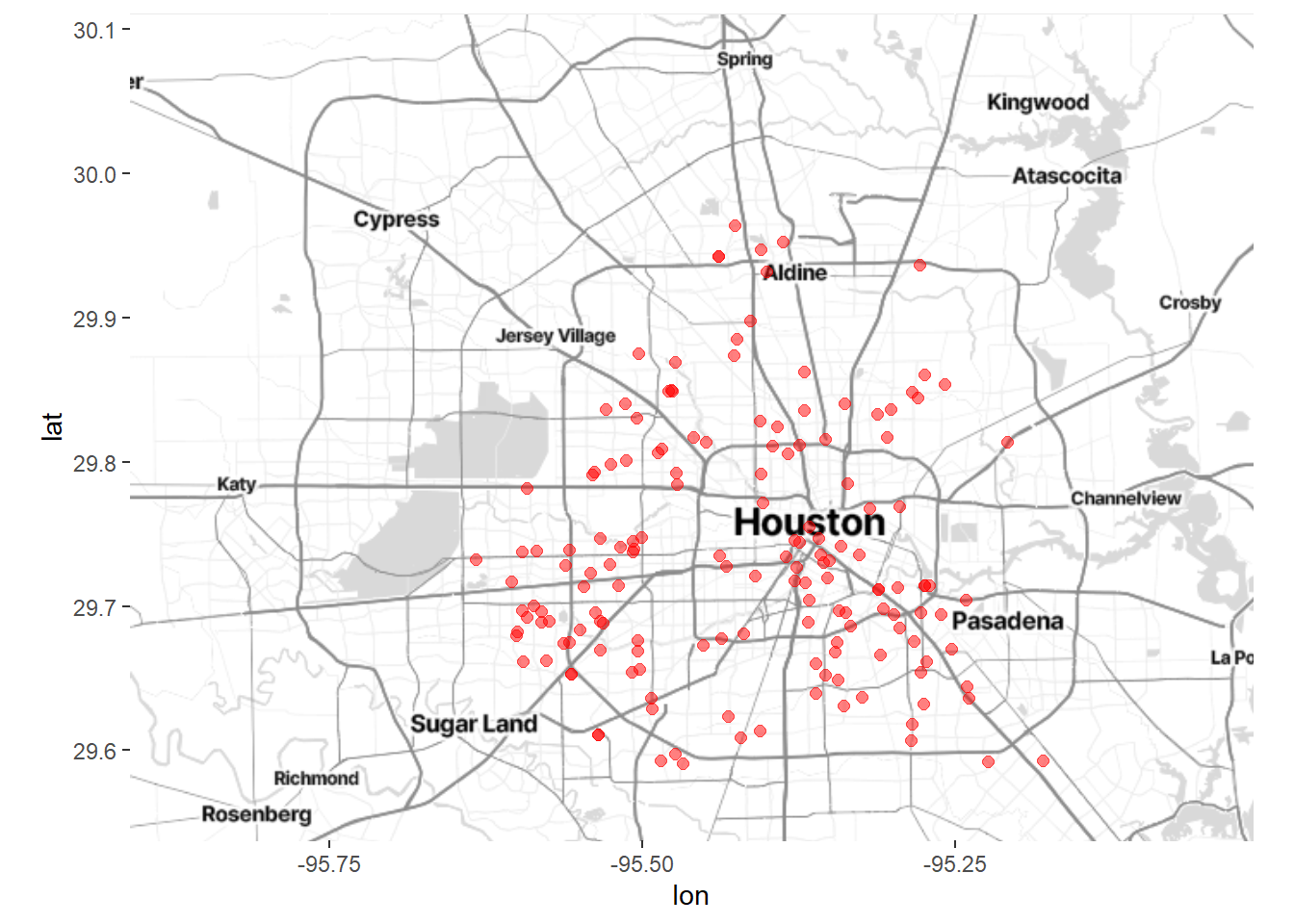
Figure 7.3: Houston map with crime locations
To clean up the results, remove the axes and add meaningful labels.
# remove long and lat numbers and add titles
ggmap(houston) +
  geom_point(aes(x=lon,y=lat),data=homicide,
             color = "red", size = 2, alpha = 0.5) +
  theme_void() +
  labs(title = "Location of reported homocides",
       subtitle = "Houston Jan - Aug 2010",
       caption = "source: http://www.houstontx.gov/police/cs/")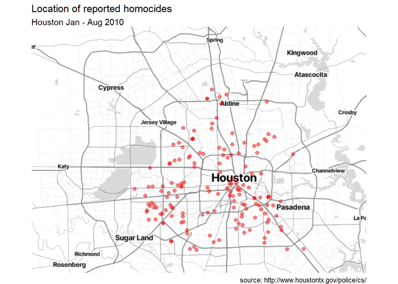
Figure 7.4: Crime locations with titles, and without longitude and latitude
7.2.2.2 Google maps
To use a Google map as the base map, you will need a Google API key. Unfortunately this requires an account and valid credit card. Fortunately, Google provides a large number of uses for free, and a very reasonable rate afterwards (but I take no responsibility for any costs you incur!).
Go to mapsplatform.google.com to create an account. Activate static maps and geocoding (you need to activate each separately), and receive your Google API key. Keep this API key safe and private! Once you have your key, you can create the dot density plot. The steps are listed below.
- Find the center coordinates for Houston, TX
library(ggmap)
# using geocode function to obtain the center coordinates
register_google(key="PutYourGoogleAPIKeyHere")
houston_center <- geocode("Houston, TX")## lon lat
## -95.36980 29.76043- Get the background map image.
- Specify a
zoomfactor from 3 (continent) to 21 (building). The default is 10 (city).
- Specify a
maptype. Types include terrain, terrain-background, satellite, roadmap, hybrid, watercolor, and toner.
# get Houston map
houston_map <- get_map(houston_center,
                       zoom = 13,
                       maptype = "roadmap")
ggmap(houston_map)
Figure 7.5: Houston map using Google Maps
- Add crime locations to the map.
# add incident locations
ggmap(houston_map) +
  geom_point(aes(x=lon,y=lat),data=homicide,
             color = "red", size = 2, alpha = 0.5)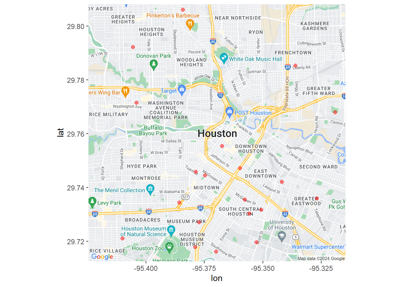
Figure 7.6: Houston crime locations using Google Maps
- Clean up the plot and add labels.
# add incident locations
ggmap(houston_map) +
  geom_point(aes(x=lon,y=lat),data=homicide,
             color = "red", size = 2, alpha = 0.5) +
  theme_void() +
  labs(title = "Location of reported homocides",
       subtitle = "Houston Jan - Aug 2010",
       caption = "source: http://www.houstontx.gov/police/cs/")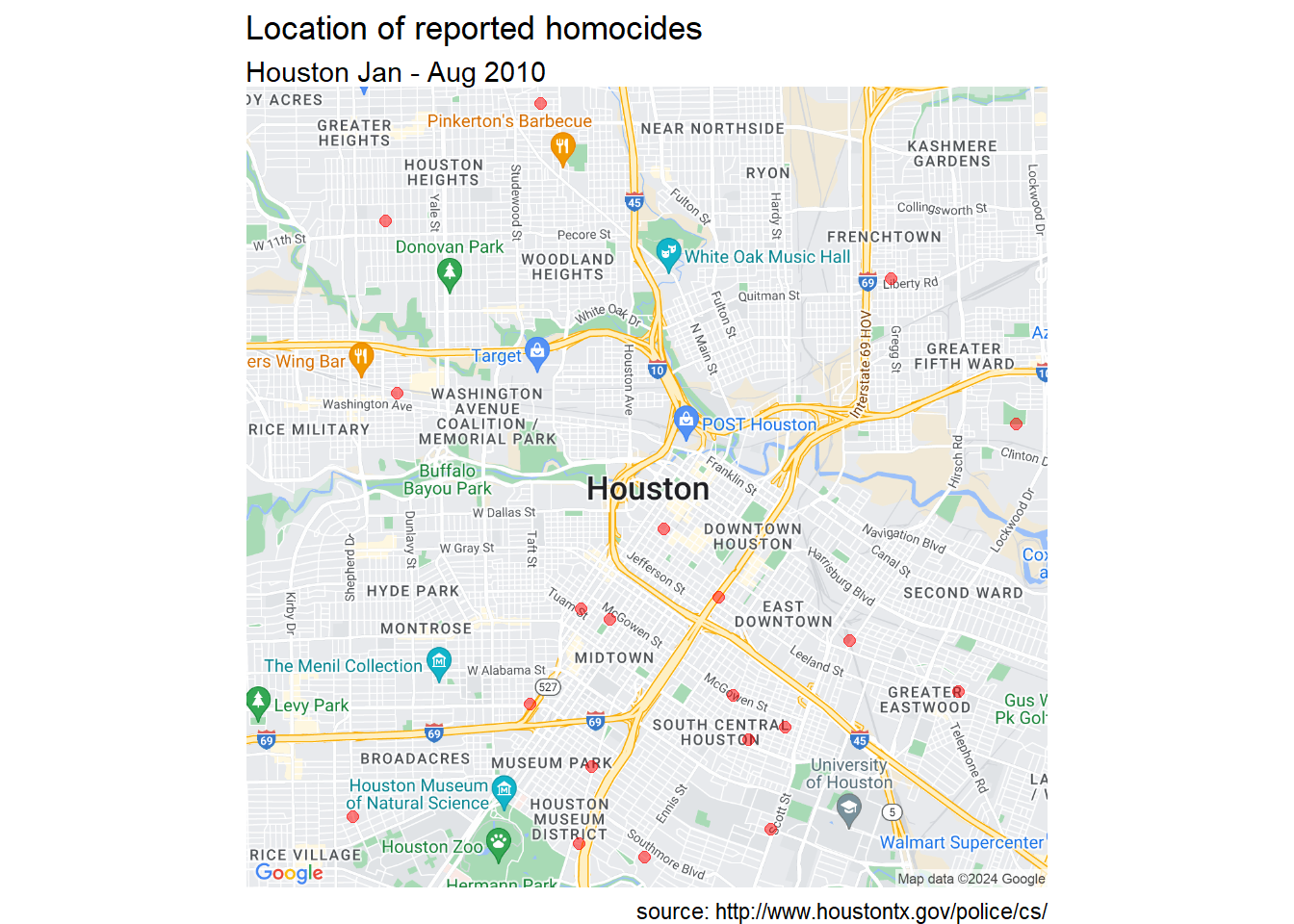
Figure 7.7: Customize Houston crime locations using Google Maps
There seems to be a concentration of homicide reports in the souther portion of the city. However this could simply reflect population density. More investigation is needed. To learn more about ggmap, see ggmap: Spatial Visualization with ggplot2 (Kahle and Wickham 2013).
7.3 Choropleth maps
Choropleth maps use color or shading on predefined areas to indicate the values of a numeric variable in that area. There are numerous approaches to creating chorpleth maps. One of the easiest relies on Ari Lamstein’s excellent choroplethr package which can create maps that display information by country, US state, and US county.
There may be times that you want to create a map for an area not covered in the choroplethr package. Additionally, you may want to create a map with greater customization. Towards this end, we’ll also look at a more customizable approach using a shapefile and the sf and ggplot2 packages.
7.3.1 Data by country
Let’s create a world map and color the countries by life expectancy using the 2007 gapminder data.
The choroplethr package has numerous functions that simplify the task of creating a choropleth map. To plot the life expectancy data, we’ll use the country_choropleth function.
The function requires that the data frame to be plotted has a column named region and a column named value. Additionally, the entries in the region column must exactly match how the entries are named in the region column of the dataset country.map from the choroplethrMaps package.
# view the first 12 region names in country.map
data(country.map, package = "choroplethrMaps")
head(unique(country.map$region), 12)
## [1] "afghanistan" "angola" "azerbaijan" "moldova" "madagascar"
## [6] "mexico" "macedonia" "mali" "myanmar" "montenegro"
## [11] "mongolia" "mozambique"Note that the region entries are all lower case.
To continue, we need to make some edits to our gapminder dataset. Specifically, we need to
- select the 2007 data
- rename the country variable to region
- rename the lifeExp variable to value
- recode region values to lower case
- recode some region values to match the region values in the country.map data frame. The
recodefunction in the dplyr package take the formrecode(variable, oldvalue1 = newvalue1, oldvalue2 = newvalue2, ...)
# prepare dataset
data(gapminder, package = "gapminder")
plotdata <- gapminder %>%
  filter(year == 2007) %>%
  rename(region = country,
         value = lifeExp) %>%
  mutate(region = tolower(region)) %>%
  mutate(region =
    recode(region,
          "united states"    = "united states of america",
          "congo, dem. rep." = "democratic republic of the congo",
          "congo, rep."      = "republic of congo",
          "korea, dem. rep." = "south korea",
          "korea. rep."      = "north korea",
          "tanzania"         = "united republic of tanzania",
          "serbia"           = "republic of serbia",
          "slovak republic"  = "slovakia",
          "yemen, rep."      = "yemen"))
Now lets create the map.
Figure 7.8: Choropleth map of life expectancy
choroplethr functions return ggplot2 graphs. Let’s make it a bit more attractive by modifying the code with additional ggplot2 functions.
country_choropleth(plotdata,
                   num_colors=9) +
  scale_fill_brewer(palette="YlOrRd") +
  labs(title = "Life expectancy by country",
       subtitle = "Gapminder 2007 data",
       caption = "source: https://www.gapminder.org",
       fill = "Years")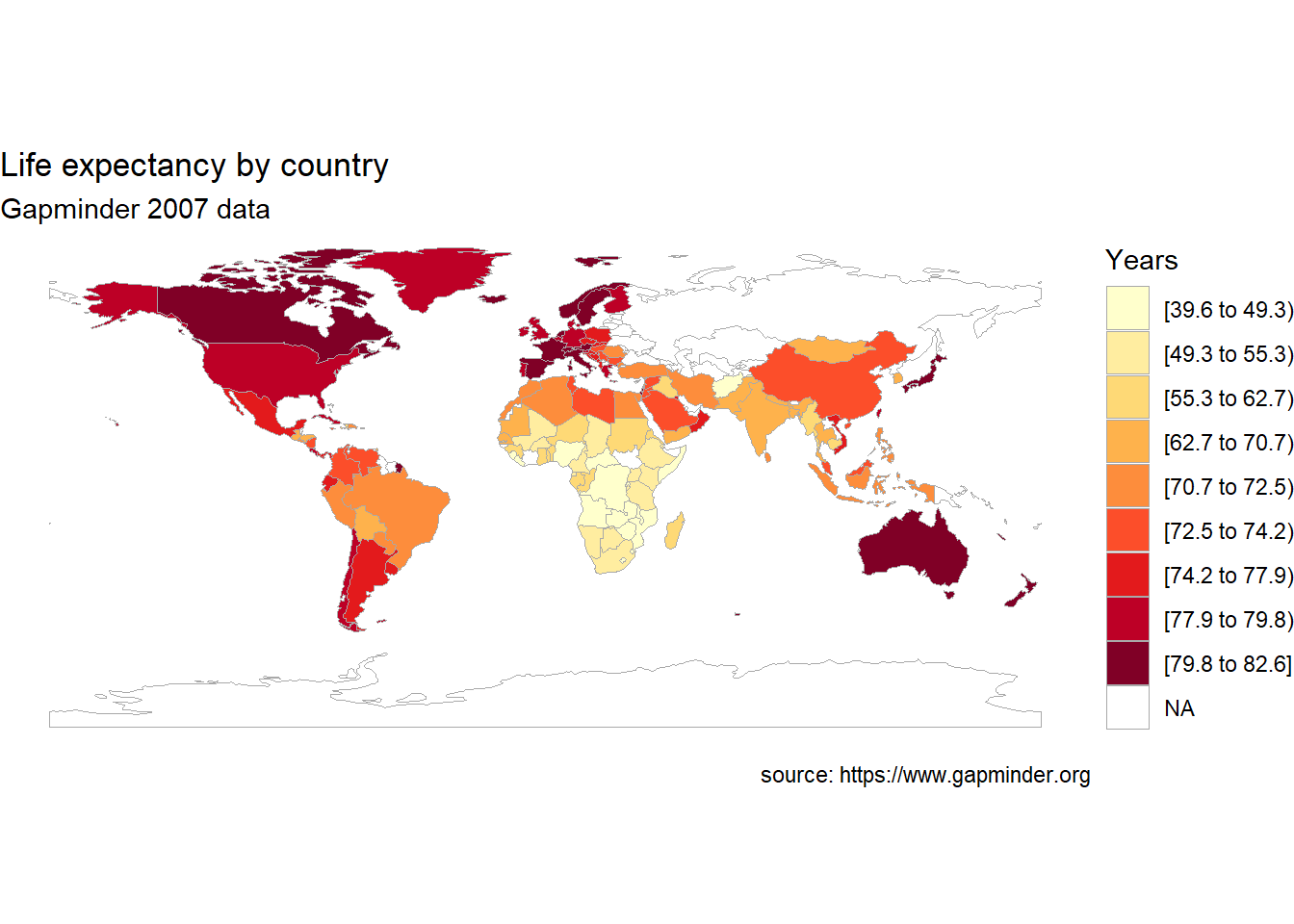
Figure 7.9: Choropleth map of life expectancy with labels and a better color scheme
Note that the num_colors option controls how many colors are used in graph. The default is seven and the maximum is nine.
7.3.2 Data by US state
For US data, the choroplethr package provides functions for creating maps by county, state, zip code, and census tract. Additionally, map regions can be labeled.
Let’s plot US states by Hispanic and Latino populations, using the 2010 Census (see Appendix A.11).
To plot the population data, we’ll use the state_choropleth function. The function requires that the data frame to be plotted has a column named region to represent state, and a column named value (the quantity to be plotted). Additionally, the entries in the region column must exactly match how the entries are named in the region column of the dataset state.map from the choroplethrMaps package.
The zoom = continental_us_states option will create a map that excludes Hawaii and Alaska.
library(ggplot2)
library(choroplethr)
data(continental_us_states)

# input the data
library(readr)
hisplat <- read_tsv("hisplat.csv")

# prepare the data
hisplat$region <- tolower(hisplat$state)
hisplat$value <- hisplat$percent

# create the map
state_choropleth(hisplat,
                 num_colors=9,
                 zoom = continental_us_states) +
  scale_fill_brewer(palette="YlGnBu") +
  labs(title = "Hispanic and Latino Population",
       subtitle = "2010 US Census",
       caption = "source: https://tinyurl.com/2fp7c5bw",
fill = "Percent") 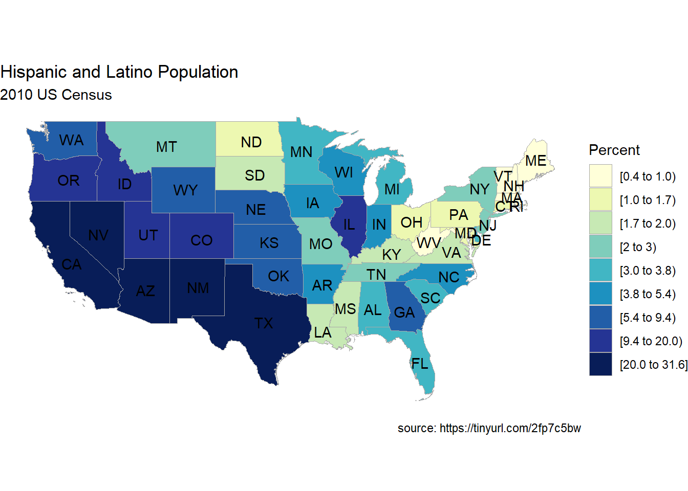
Figure 7.10: Choropleth map of US States
7.3.3 Data by US county
Finally, let’s plot data by US counties. We’ll plot the violent crime rate per 1000 individuals for Connecticut counties in 2012. Data come from the FBI Uniform Crime Statistics.
We’ll use the county_choropleth function. Again, the function requires that the data frame to be plotted has a column named region and a column named value.
Additionally, the entries in the region column must be numeric codes and exactly match how the entries are given in the region column of the dataset county.map from the choroplethrMaps package.
Our dataset has country names (e.g. fairfield). However, we need region codes (e.g., 9001). We can use the county.regions dataset to look up the region code for each county name.
Additionally, we’ll use the option reference_map = TRUE to add a reference map from Google Maps.
library(ggplot2)
library(choroplethr)
library(dplyr)

# enter violent crime rates by county
crimes_ct <- data.frame(
  county = c("fairfield", "hartford",
             "litchfield", "middlesex",
             "new haven", "new london",
             "tolland", "windham"),
  value = c(3.00, 3.32,
            1.02, 1.24,
            4.13, 4.61,
            0.16, 1.60)
)

crimes_ct
## county value
## 1 fairfield 3.00
## 2 hartford 3.32
## 3 litchfield 1.02
## 4 middlesex 1.24
## 5 new haven 4.13
## 6 new london 4.61
## 7 tolland 0.16
## 8 windham 1.60# obtain region codes for connecticut
data(county.regions,
package = "choroplethrMaps")
region <- county.regions %>%
filter(state.name == "connecticut")
region# join crime data to region code data
plotdata <- inner_join(crimes_ct,
region,
by=c("county" = "county.name"))
plotdata## county value region county.fips.character state.name
## 1 fairfield 3.00 9001 09001 connecticut
## 2 hartford 3.32 9003 09003 connecticut
## 3 litchfield 1.02 9005 09005 connecticut
## 4 middlesex 1.24 9007 09007 connecticut
## 5 new haven 4.13 9009 09009 connecticut
## 6 new london 4.61 9011 09011 connecticut
## 7 tolland 0.16 9013 09013 connecticut
## 8 windham 1.60 9015 09015 connecticut
## state.fips.character state.abb
## 1 09 CT
## 2 09 CT
## 3 09 CT
## 4 09 CT
## 5 09 CT
## 6 09 CT
## 7 09 CT
## 8 09 CT# create choropleth map
county_choropleth(plotdata,
state_zoom = "connecticut",
reference_map = TRUE,
num_colors = 8) +
scale_fill_brewer(palette="YlOrRd") +
labs(title = "Connecticut Violent Crime Rates",
subtitle = "FBI 2012 data",
caption = "source: https://ucr.fbi.gov",
fill = "Violent Crime\n Rate Per 1000")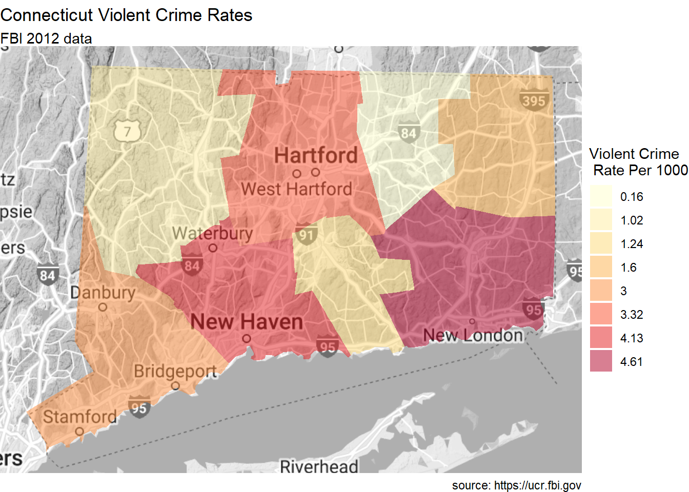
See the choroplethr help (https://cran.r-project.org/web/packages/choroplethr/choroplethr.pdf) for more details.
7.3.4 Building a choropleth map using the sf and ggplot2 packages and a shapefile
As stated previously, there may be times that you want to map a region not covered by the choroplethr package. Additionally, you may want greater control over the customization.
In this section, we’ll create a map of the continental United States and color each states by their 2023 literacy rate (the percent of individuals who can both read and write). The literacy rates were obtained from the World Population Review (see Appendix A.7). Rather than using the choroplethr package, we’ll download a US state shapefile and create the map using the sf and ggplot2 packages.
- Prepare a shapefile
A shapefile is a data format that spatially describes vector features such as points, lines, and polygons. The shapefile is used to draw the geographic boundaries of the map.
You will need to find a shapefile for your the geographic area you want to plot. There are a wide range of shapefiles for cities, regions, states, and countries freely available on the internet. Natural Earth (http://naturalearthdata.com) is a good place to start. The shapefile used in the current example comes from the US Census Bureau (https://www.census.gov/geographies/mapping-files/time-series/geo/cartographic-boundary.html).
A shapefile will download as a zipped file. The code below unzips the file into a folder of the same name in the working directory (of course you can also do this by hand). The sf function st_read then converts the shapefile into a data frame that ggplot2 can access.
library(sf)
# unzip shape file
shapefile <- "cb_2022_us_state_20m.zip"
shapedir  <- tools::file_path_sans_ext(shapefile)
if(!dir.exists(shapedir)){
  unzip(shapefile, exdir=shapedir)
}

# convert the shapefile into a data frame
# of class sf (simple features)
USMap <- st_read("cb_2022_us_state_20m/cb_2022_us_state_20m.shp")Note that although the sf_read function points the .shp file, all the files in the folder must be present.
The NAME column contains the state identifier, STUPSPS contains state abbreviations, and the geometry column is a special list object containing the coordinates need to draw the state boundaries.
- Prepare the data file
The literacy rates are contained in the comma delimited file named USLitRates.csv.
##           State Rate
## 1 New Hampshire 94.2
## 2     Minnesota 94.0
## 3  North Dakota 93.7
One of the most annoying aspects of creating a choropleth map is that the location variable in the data file (State in this case) must match the location file in the sf data frame (NAME in this case) exactly.
The following code will help identify any mismatches. Mismatches are printed and can be corrected.
## character(0)We have no mismatches, so we are ready to move on.
- Merge the data frames
The next step combine the two data frames. Since we want to focus the on lower 48 states, we’ll also eliminate Hawaii, Alaska, and Puerto Rico.
continentalUS <- USMap %>%
  left_join(litRates, by=c("NAME"="State")) %>%
  filter(NAME != "Hawaii" & NAME != "Alaska" &
           NAME != "Puerto Rico")
head(continentalUS, 3)- Create the graph
The graph is created using ggplot2. Rather than specifying aes(x=, y=), aes(geometry = geometry) is used. The fill color is mapped to the literacy rate. The geom_sf function generates the map.
Figure 7.11: Choropleth map of state literacy rates
- Customize the graph
Before finishing, lets customize the graph by
- removing the axes
- adding state labels
- modifying the fill colors and legend
- adding a title, subtitle, and caption
library(dplyr)
ggplot(continentalUS, aes(geometry=geometry, fill=Rate)) +
  geom_sf() +
  theme_void() +
  geom_sf_text(aes(label=STUSPS), size=2) +
  scale_fill_steps(low="yellow", high="royalblue",
                   n.breaks = 10) +
  labs(title="Literacy Rates by State",
       fill = "% literate",
       x = "", y = "",
       subtitle="Updated May 2023",
       caption="source: https://worldpopulationreview.com")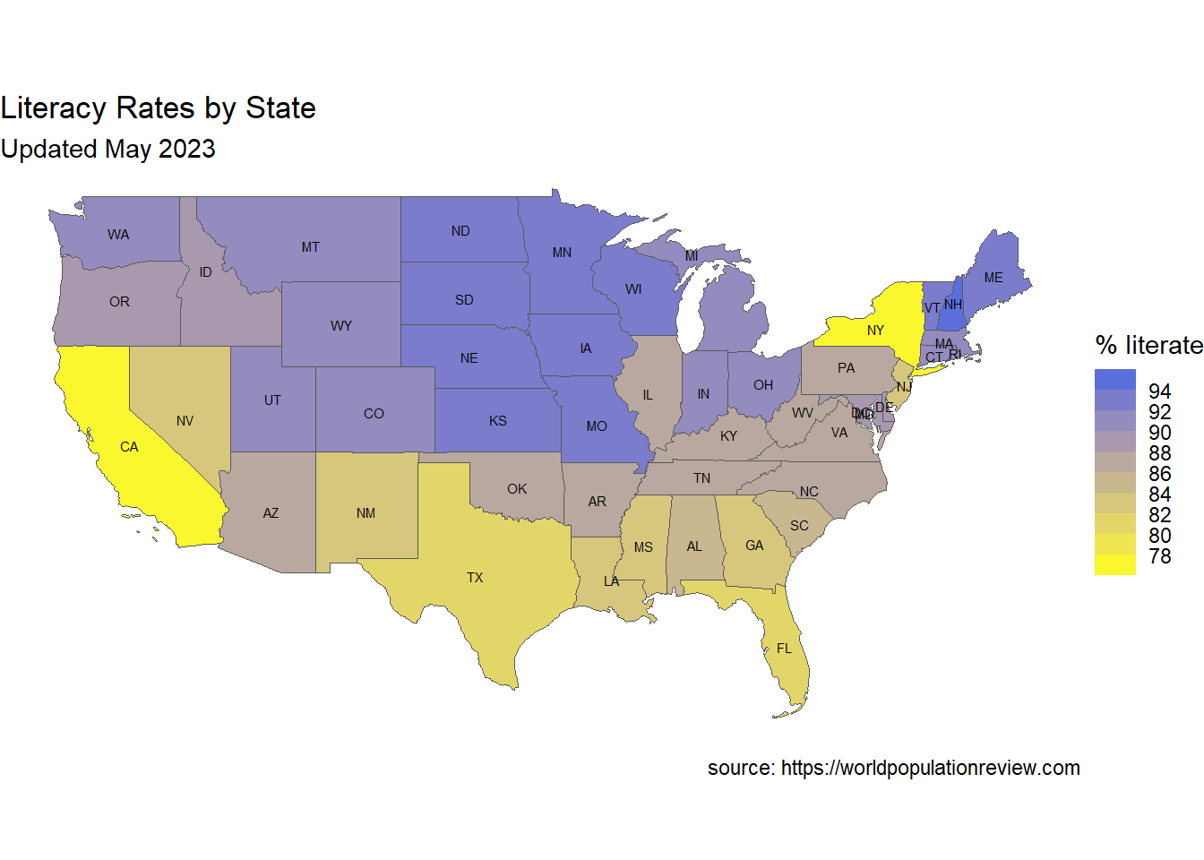
Figure 7.12: Customized choropleth map
The map clearly displays the range of literacy rates among the states. Rates are lowest in New York and California.
7.4 Going further
We’ve just scratched the surface of what you can do with maps in R. To learn more, see the CRAN Task View on the Analysis of Spacial Data (https://cran.r-project.org/web/views/Spatial.html) and Geocomputation with R, an comprehensive on-line book and hard-copy book (Lovelace R., Nowasad, and Meuchow 2019).