Chapter 11 Customizing Graphs
Graph defaults are fine for quick data exploration, but when you want to publish your results to a blog, paper, article or poster, you’ll probably want to customize the results. Customization can improve the clarity and attractiveness of a graph.
This chapter describes how to customize a graph’s axes, gridlines, colors, fonts, labels, and legend. It also describes how to add annotations (text and lines). The last section describes how to combine two of graphs together into one composite image.
11.1 Axes
The x-axis and y-axis represent numeric, categorical, or date values. You can modify the default scales and labels with the functions below.
11.1.1 Quantitative axes
A quantitative axis is modified using the scale_x_continuous or scale_y_continuous function.
Options include
breaks- a numeric vector of positions
limits- a numeric vector with the min and max for the scale
# customize numerical x and y axes
library(ggplot2)
ggplot(mpg, aes(x=displ, y=hwy)) +
  geom_point() +
  scale_x_continuous(breaks = seq(1, 7, 1),
                     limits=c(1, 7)) +
  scale_y_continuous(breaks = seq(10, 45, 5),
                     limits=c(10, 45))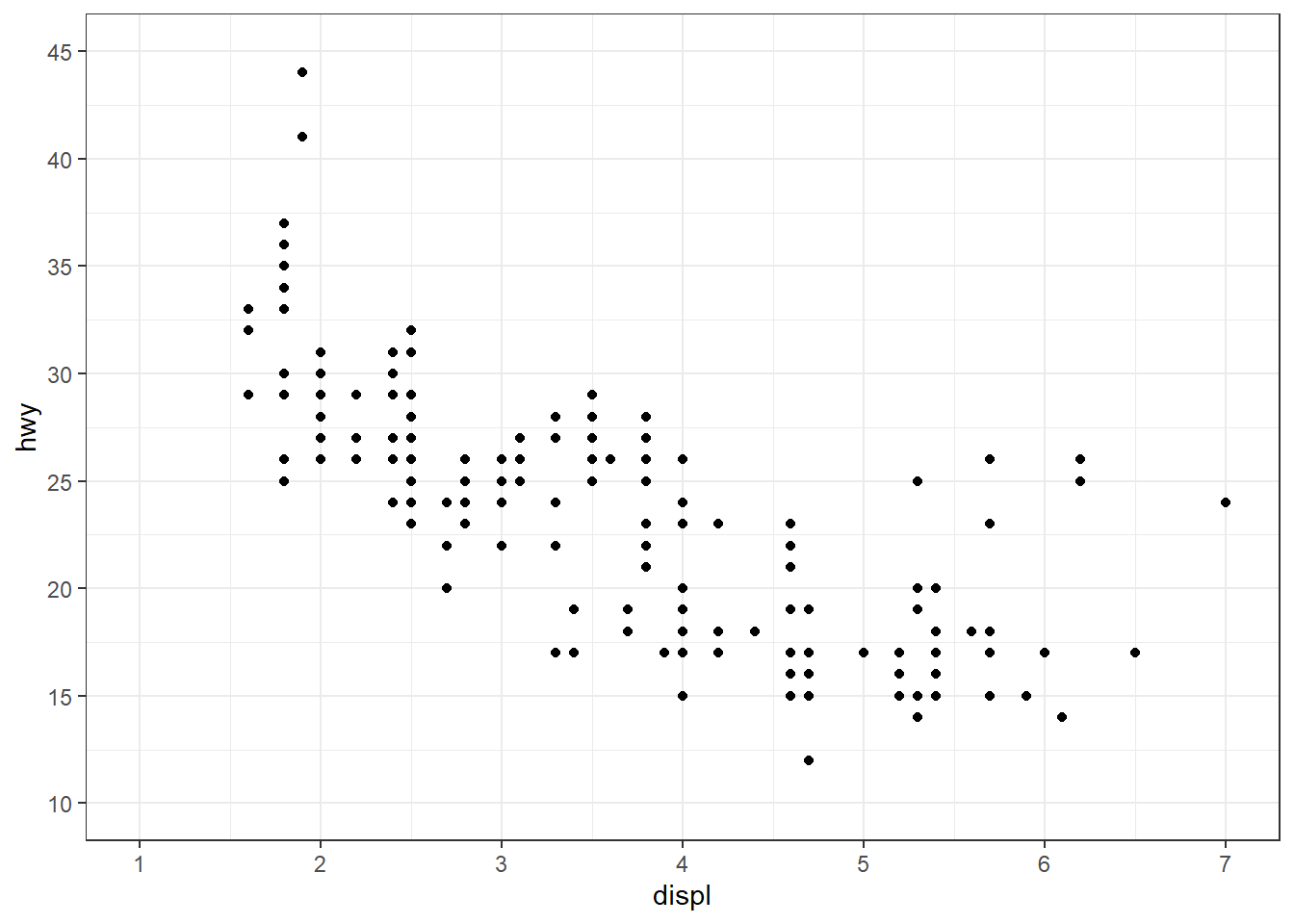
Figure 11.1: Customized quantitative axes
The seq(from, to, by) function generates a vector of numbers starting with from, ending with to, and incremented by by. For example
is equivalent to
11.1.1.1 Numeric formats
The scales package provides a number of functions for formatting numeric labels. Some of the most useful are
dollar
comma
percent
Let’s demonstrate these functions with some synthetic data.
# create some data
set.seed(1234)
df <- data.frame(xaxis = rnorm(50, 100000, 50000),
                 yaxis = runif(50, 0, 1),
                 pointsize = rnorm(50, 1000, 1000))
library(ggplot2)

# plot the axes and legend with formats
ggplot(df, aes(x = xaxis,
               y = yaxis,
               size=pointsize)) +
  geom_point(color = "cornflowerblue",
             alpha = .6) +
  scale_x_continuous(label = scales::comma) +
  scale_y_continuous(label = scales::percent) +
  scale_size(range = c(1,10), # point size range
             label = scales::dollar)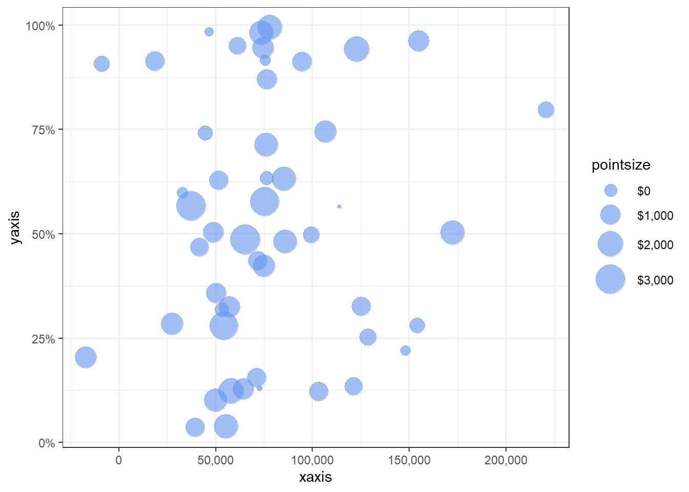
Figure 11.2: Formatted axes
To format currency values as euros, you can use
label = scales::dollar_format(prefix = "", suffix = "\u20ac").
11.1.2 Categorical axes
A categorical axis is modified using the scale_x_discrete or scale_y_discrete function.
Options include
limits- a character vector (the levels of the quantitative variable in the desired order)labels- a character vector of labels (optional labels for these levels)
library(ggplot2)
# customize categorical x axis
ggplot(mpg, aes(x = class)) +
  geom_bar(fill = "steelblue") +
  scale_x_discrete(limits = c("pickup", "suv", "minivan",
                             "midsize", "compact", "subcompact",
                             "2seater"),
                   labels = c("Pickup\nTruck",
                              "Sport Utility\nVehicle",
                              "Minivan", "Mid-size", "Compact",
                              "Subcompact", "2-Seater"))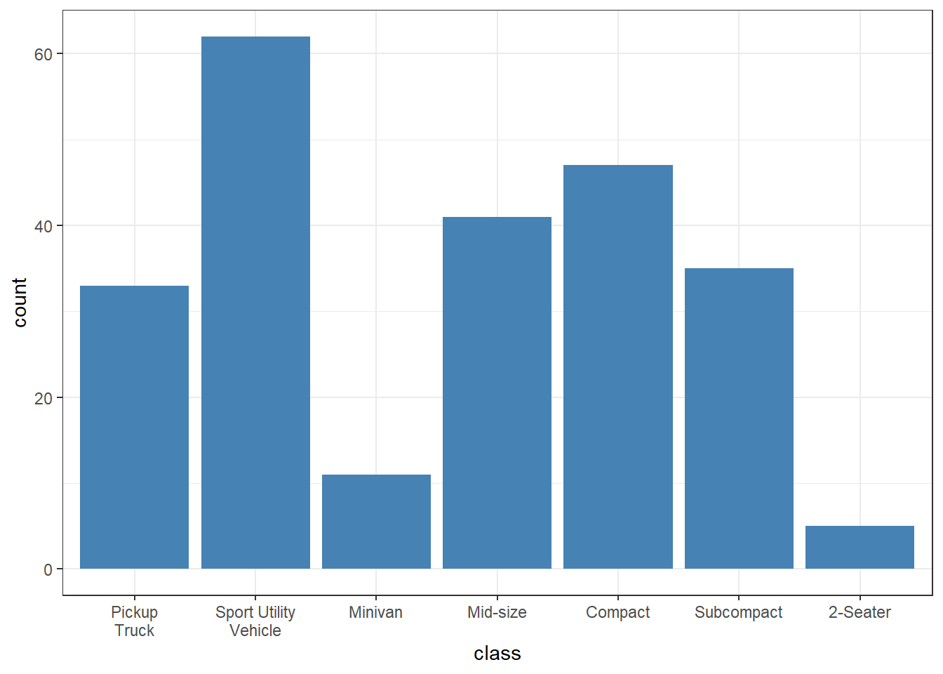
Figure 11.3: Customized categorical axis
11.1.3 Date axes
A date axis is modified using the scale_x_date or scale_y_date function.
Options include
date_breaks- a string giving the distance between breaks like “2 weeks” or “10 years”date_labels- A string giving the formatting specification for the labels
The table below gives the formatting specifications for date values.
| Symbol | Meaning | Example |
|---|---|---|
| %d | day as a number (0-31) | 01-31 |
| %a | abbreviated weekday | Mon |
| %A | unabbreviated weekday | Monday |
| %m | month (00-12) | 00-12 |
| %b | abbreviated month | Jan |
| %B | unabbreviated month | January |
| %y | 2-digit year | 07 |
| %Y | 4-digit year | 2007 |
library(ggplot2)
# customize date scale on x axis
ggplot(economics, aes(x = date, y = unemploy)) +
  geom_line(color="darkgreen") +
  scale_x_date(date_breaks = "5 years",
               date_labels = "%b-%y")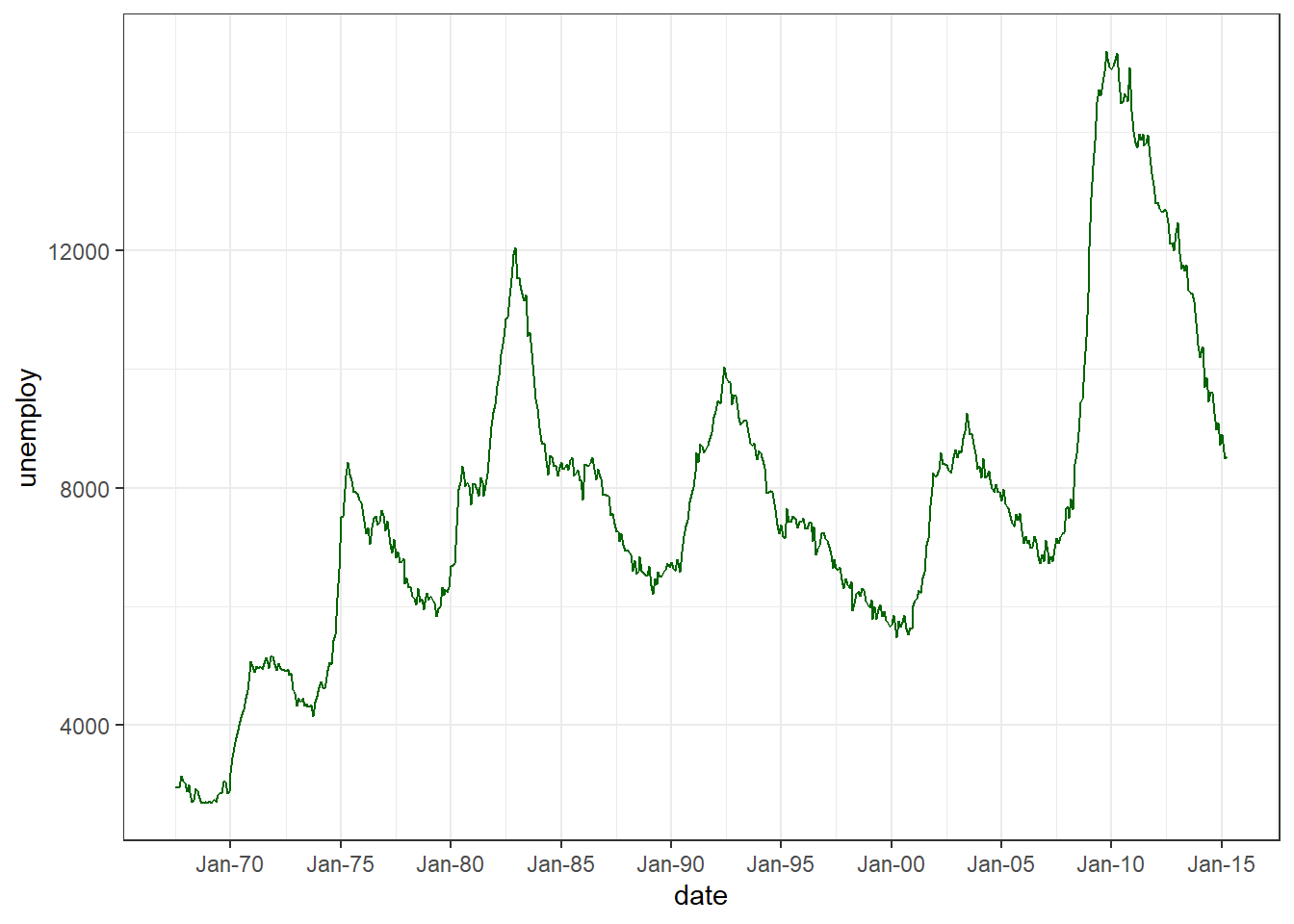
Figure 11.4: Customized date axis
11.2 Colors
The default colors in ggplot2 graphs are functional, but often not as visually appealing as they can be. Happily this is easy to change.
Specific colors can be
- specified for points, lines, bars, areas, and text, or
- mapped to the levels of a variable in the dataset.
11.2.1 Specifying colors manually
To specify a color for points, lines, or text, use the color = "colorname" option in the appropriate geom. To specify a color for bars and areas, use the fill = "colorname" option.
Examples:
geom_point(color = "blue")
geom_bar(fill = "steelblue")
Colors can be specified by name or hex code (https://r-charts.com/colors/).
To assign colors to the levels of a variable, use the scale_color_manual and scale_fill_manual functions. The former is used to specify the colors for points and lines, while the later is used for bars and areas.
Here is an example, using the diamonds dataset that ships with ggplot2. The dataset contains the prices and attributes of 54,000 round cut diamonds.
# specify fill color manually
library(ggplot2)
ggplot(diamonds, aes(x = cut, fill = clarity)) +
  geom_bar() +
  scale_fill_manual(values = c("darkred", "steelblue",
                               "darkgreen", "gold",
                               "brown", "purple",
                               "grey", "khaki4"))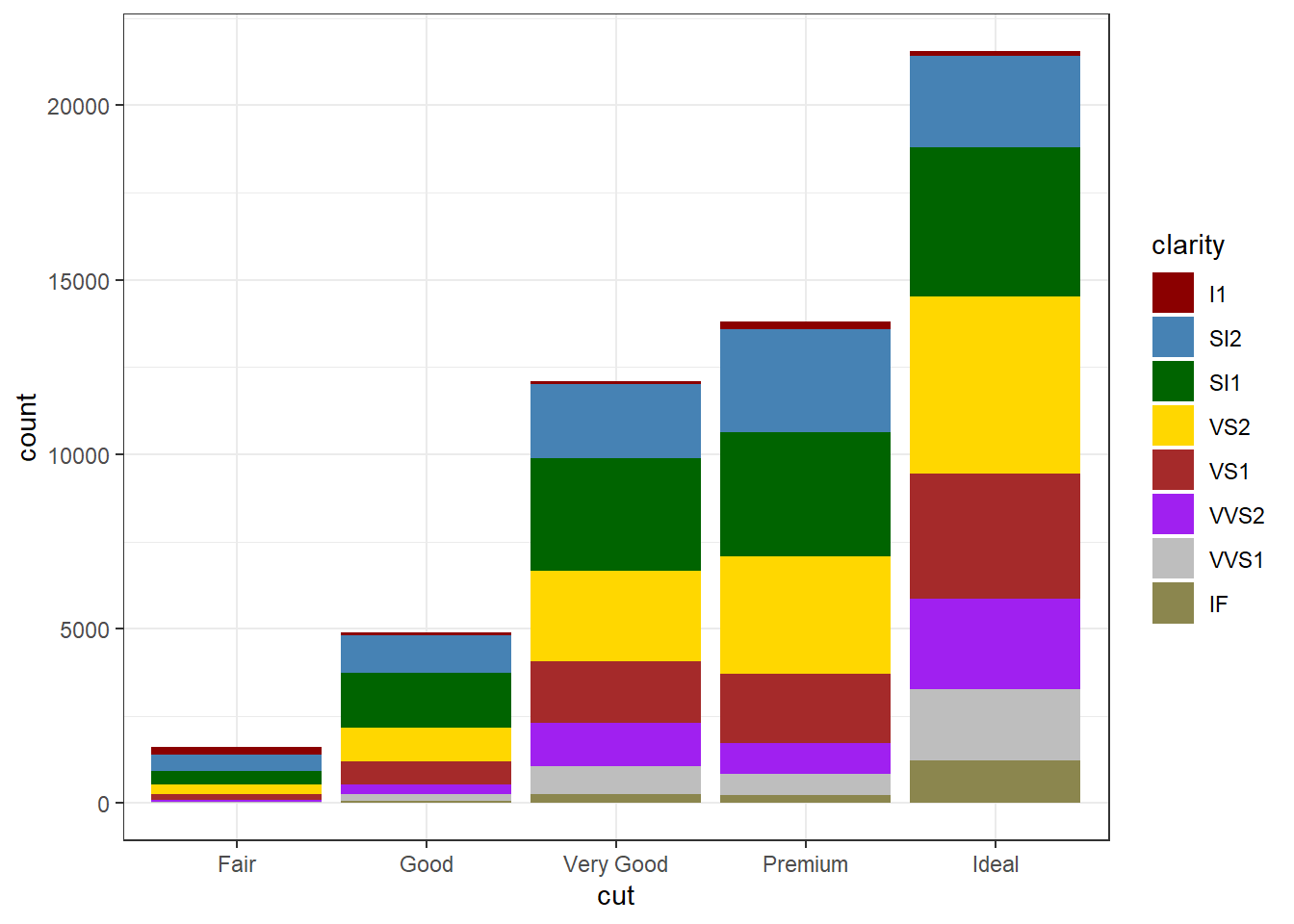
Figure 11.5: Manual color selection
If you are aesthetically challenged like me, an alternative is to use a predefined palette.
11.2.2 Color palettes
There are many predefined color palettes available in R.
11.2.2.1 RColorBrewer
The most popular alternative palettes are probably the ColorBrewer palettes.
Figure 11.6: RColorBrewer palettes
You can specify these palettes with the scale_color_brewer and scale_fill_brewer functions.
# use an ColorBrewer fill palette
ggplot(diamonds, aes(x = cut, fill = clarity)) +
  geom_bar() +
scale_fill_brewer(palette = "Dark2") 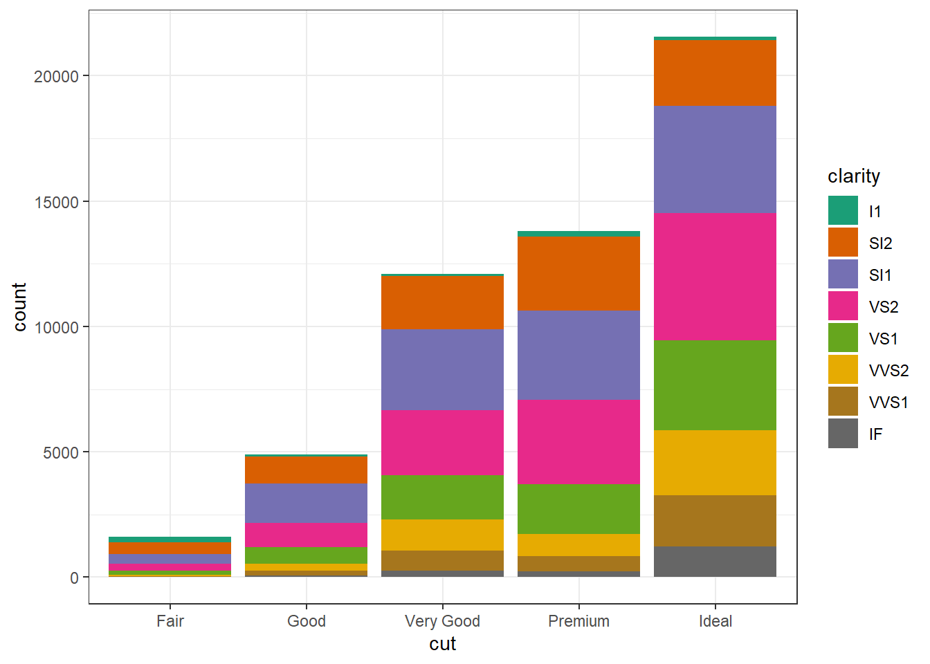
Figure 11.7: Using RColorBrewer
Adding direction = -1 to these functions reverses the order of the colors in a palette.
11.2.2.2 Viridis
The viridis palette is another popular choice.
For continuous scales use
scale_fill_viridis_c
scale_color_viridis_c
For discrete (categorical scales) use
scale_fill_viridis_d
scale_color_viridis_d
# Use a viridis fill palette
ggplot(diamonds, aes(x = cut, fill = clarity)) +
  geom_bar() +
  scale_fill_viridis_d()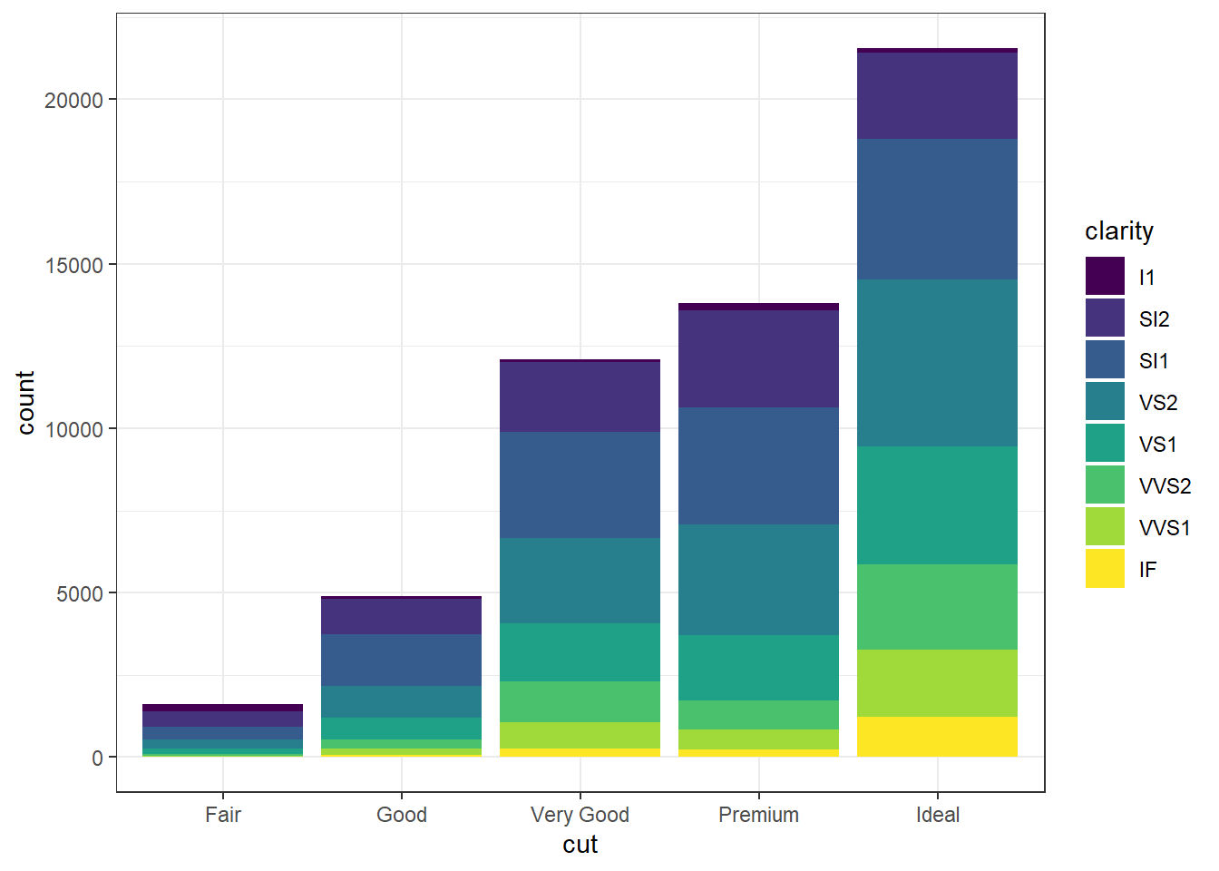
Figure 11.8: Using the viridis palette
11.2.2.3 Other palettes
Other palettes to explore include
| Package | URL |
|---|---|
| dutchmasters | https://github.com/EdwinTh/dutchmasters |
| ggpomological | https://github.com/gadenbuie/ggpomological |
| LaCroixColoR | https://github.com/johannesbjork/LaCroixColoR |
| nord | https://github.com/jkaupp/nord |
| ochRe | https://github.com/ropenscilabs/ochRe |
| palettetown | https://github.com/timcdlucas/palettetown |
| pals | https://github.com/kwstat/pals |
| rcartocolor | https://github.com/Nowosad/rcartocolor |
| wesanderson | https://github.com/karthik/wesanderson |
If you want to explore all the palette options (or nearly all), take a look at the paletter (https://github.com/EmilHvitfeldt/paletteer) package.
To learn more about color specifications, see the R Cookpage page on ggplot2 colors (http://www.cookbook-r.com/Graphs/Colors_(ggplot2)/). For advice on selecting colors, see Section 14.3.
11.3 Points & Lines
11.3.1 Points
For ggplot2 graphs, the default point is a filled circle. To specify a different shape, use the shape = # option in the geom_point function. To map shapes to the levels of a categorical variable use the shape = variablename option in the aes function.
Examples:
geom_point(shape = 1)
- geom_point(
aes(shape = sex))
Availabe shapes are given in the table below.
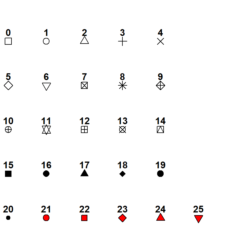
Figure 11.9: Point shapes
Shapes 21 through 26 provide for both a fill color and a border color.
11.3.2 Lines
The default line type is a solid line. To change the linetype, use the linetype = # option in the geom_line function. To map linetypes to the levels of a categorical variable use the linetype = variablename option in the aes function.
Examples:
geom_line(linetype = 1)
- geom_line(
aes(linetype = sex))
Availabe linetypes are given in the table below.
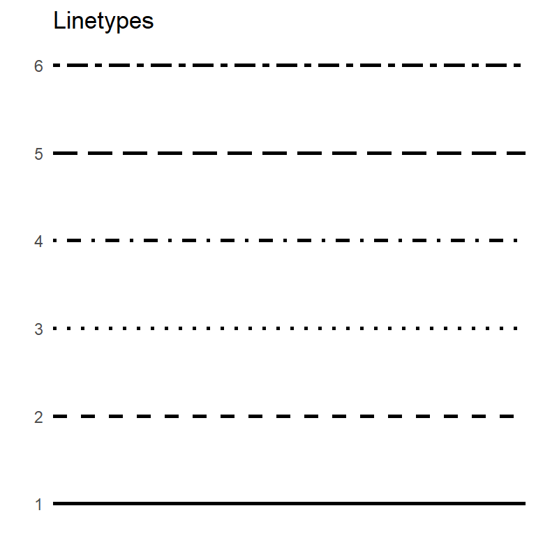
Figure 11.10: Linetypes
11.4 Fonts
R does not have great support for fonts, but with a bit of work, you can change the fonts that appear in your graphs. First you need to install and set-up the extrafont package.
# one time install
install.packages("extrafont")
library(extrafont)
font_import()

# see what fonts are now available
fonts()
Apply the new font(s) using the text option in the theme function.
# specify new font
library(extrafont)
ggplot(mpg, aes(x = displ, y=hwy)) +
  geom_point() +
  labs(title = "Diplacement by Highway Mileage",
       subtitle = "MPG dataset") +
  theme(text = element_text(size = 16, family = "Comic Sans MS"))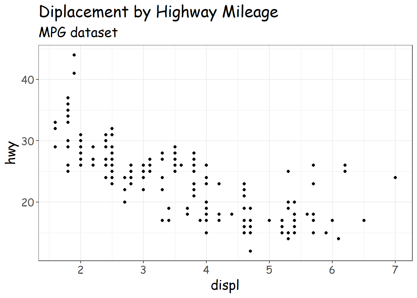
Figure 11.11: Alternative fonts
To learn more about customizing fonts, see Andrew Heiss’s blog on Working with R, Cairo graphics, custom fonts, and ggplot (https://www.andrewheiss.com/blog/2017/09/27/working-with-r-cairo-graphics-custom-fonts-and-ggplot/#windows).
11.5 Legends
In ggplot2, legends are automatically created when variables are mapped to color, fill, linetype, shape, size, or alpha.
You have a great deal of control over the look and feel of these legends. Modifications are usually made through the theme function and/or the labs function. Here are some of the most sought after changes.
11.5.1 Legend location
The legend can appear anywhere in the graph. By default, it’s placed on the right. You can change the default with
theme(legend.position = position)
where
| Position | Location |
|---|---|
| “top” | above the plot area |
| “right” | right of the plot area |
| “bottom” | below the plot area |
| “left” | left of the plot area |
| c(x, y) | within the plot area. The x and y values must range between 0 and 1. c(0,0) represents (left, bottom) and c(1,1) represents (right, top). |
| “none” | suppress the legend |
For example, to place the legend at the top, use the following code.
# place legend on top
ggplot(mpg,
       aes(x = displ, y=hwy, color = class)) +
  geom_point(size = 4) +
  labs(title = "Diplacement by Highway Mileage") +
  theme_minimal() +
theme(legend.position = "top") 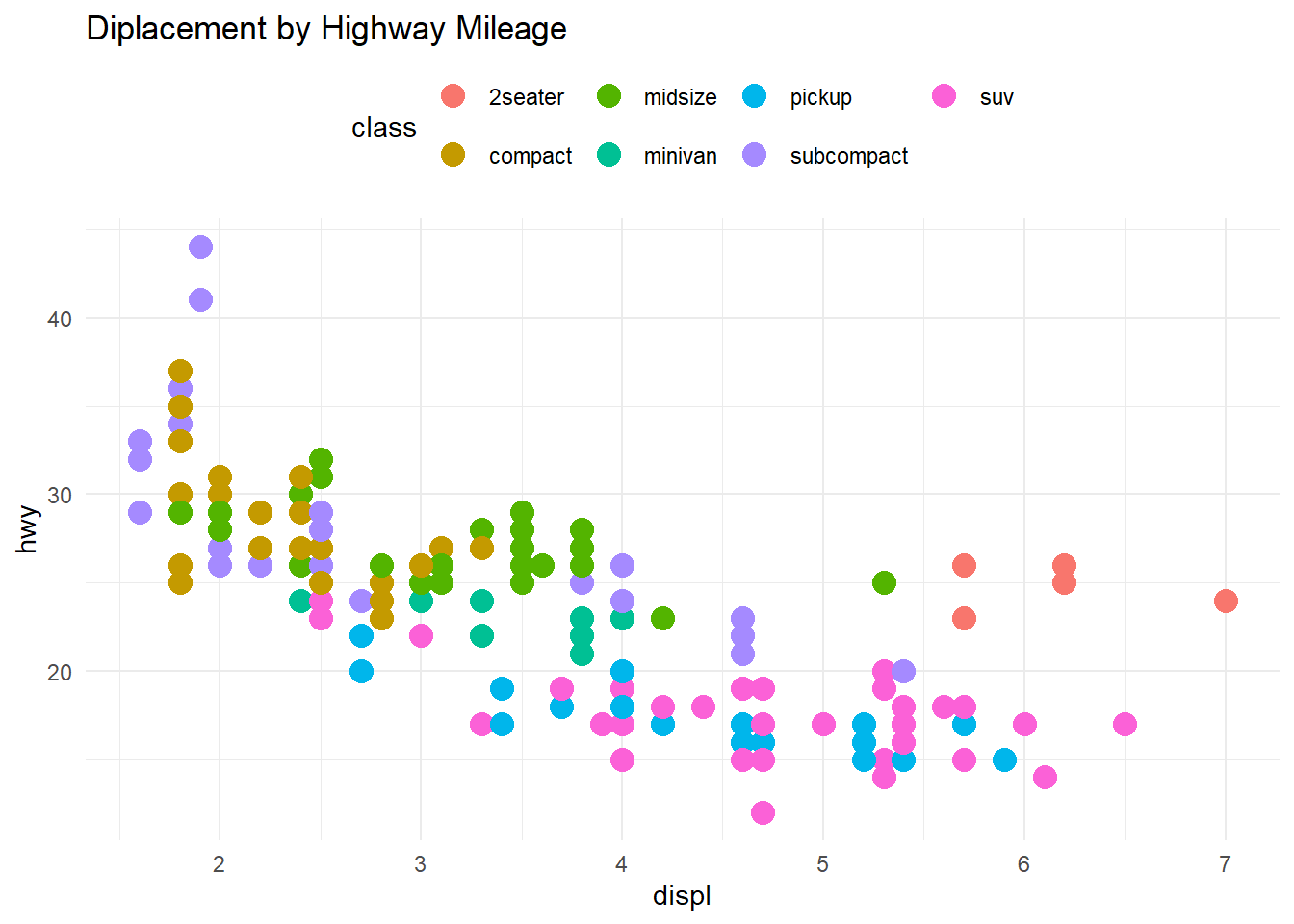
Figure 11.12: Moving the legend to the top
11.5.2 Legend title
You can change the legend title through the labs function. Use color, fill, size, shape, linetype, and alpha to give new titles to the corresponding legends.
The alignment of the legend title is controlled through the legend.title.align option in the theme function. (0=left, 0.5=center, 1=right)
# change the default legend title
ggplot(mpg,
       aes(x = displ, y=hwy, color = class)) +
  geom_point(size = 4) +
  labs(title = "Diplacement by Highway Mileage",
       color = "Automobile\nClass") +
  theme_minimal() +
  theme(legend.title.align=0.5)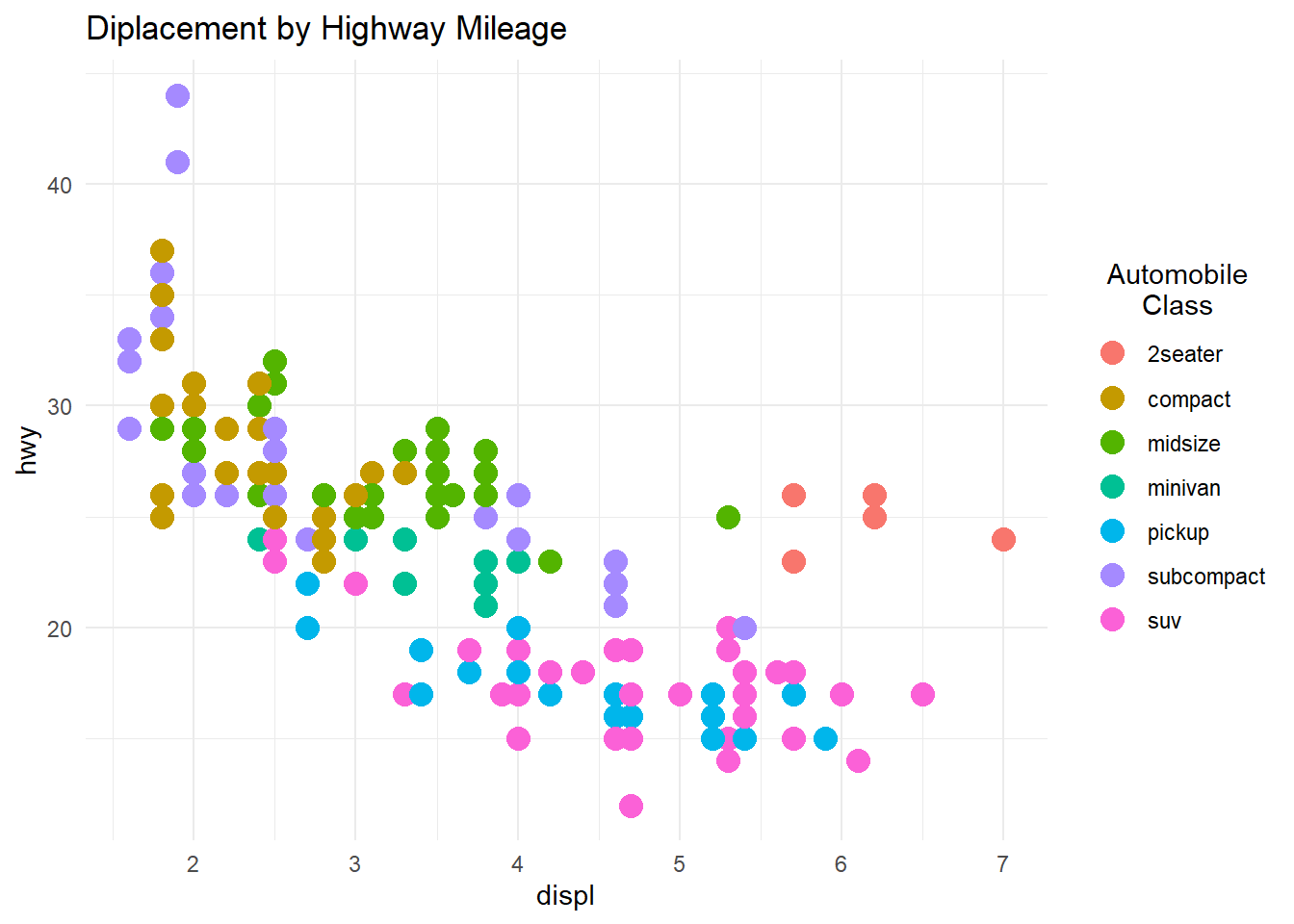
Figure 11.13: Changing the legend title
11.6 Labels
Labels are a key ingredient in rendering a graph understandable. They’re are added with the labs function. Available options are given below.
| option | Use |
|---|---|
| title | main title |
| subtitle | subtitle |
| caption | caption (bottom right by default) |
| x | horizontal axis |
| y | vertical axis |
| color | color legend title |
| fill | fill legend title |
| size | size legend title |
| linetype | linetype legend title |
| shape | shape legend title |
| alpha | transparency legend title |
| size | size legend title |
For example
# add plot labels
ggplot(mpg,
       aes(x = displ, y=hwy,
           color = class,
           shape = factor(year))) +
  geom_point(size = 3,
             alpha = .5) +
  labs(title = "Mileage by engine displacement",
       subtitle = "Data from 1999 and 2008",
       caption = "Source: EPA (http://fueleconomy.gov)",
       x = "Engine displacement (litres)",
       y = "Highway miles per gallon",
       color = "Car Class",
       shape = "Year") +
  theme_minimal()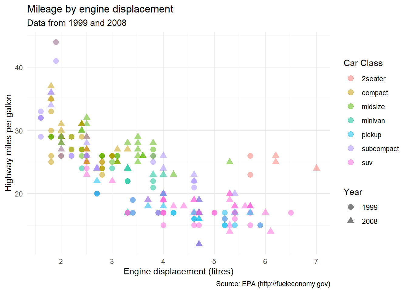
Figure 11.14: Graph with labels
This is not a great graph - it is too busy, making the identification of patterns difficult. It would better to facet the year variable, the class variable or both (Section 6.2). Trend lines would also be helpful (Section 5.2.1.1).
11.7 Annotations
Annotations are additional information added to a graph to highlight important points.
11.7.1 Adding text
There are two primary reasons to add text to a graph.
One is to identify the numeric qualities of a geom. For example, we may want to identify points with labels in a scatterplot, or label the heights of bars in a bar chart.
Another reason is to provide additional information. We may want to add notes about the data, point out outliers, etc.
11.7.1.1 Labeling values
Consider the following scatterplot, based on the car data in the mtcars dataset.
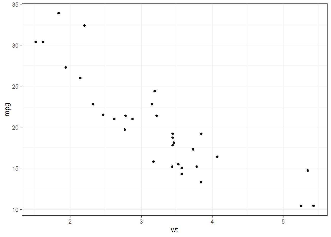
Figure 11.15: Simple scatterplot
Let’s label each point with the name of the car it represents.
# scatterplot with labels
data(mtcars)
ggplot(mtcars, aes(x = wt, y = mpg)) +
  geom_point() +
  geom_text(label = row.names(mtcars))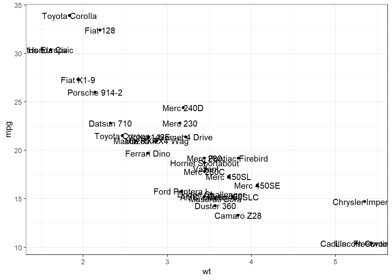
Figure 11.16: Scatterplot with labels
The overlapping labels make this chart difficult to read. The ggrepel package can help us here. It nudges text to avoid overlaps.
# scatterplot with non-overlapping labels
data(mtcars)
library(ggrepel)
ggplot(mtcars, aes(x = wt, y = mpg)) +
  geom_point() +
  geom_text_repel(label = row.names(mtcars),
                  size=3)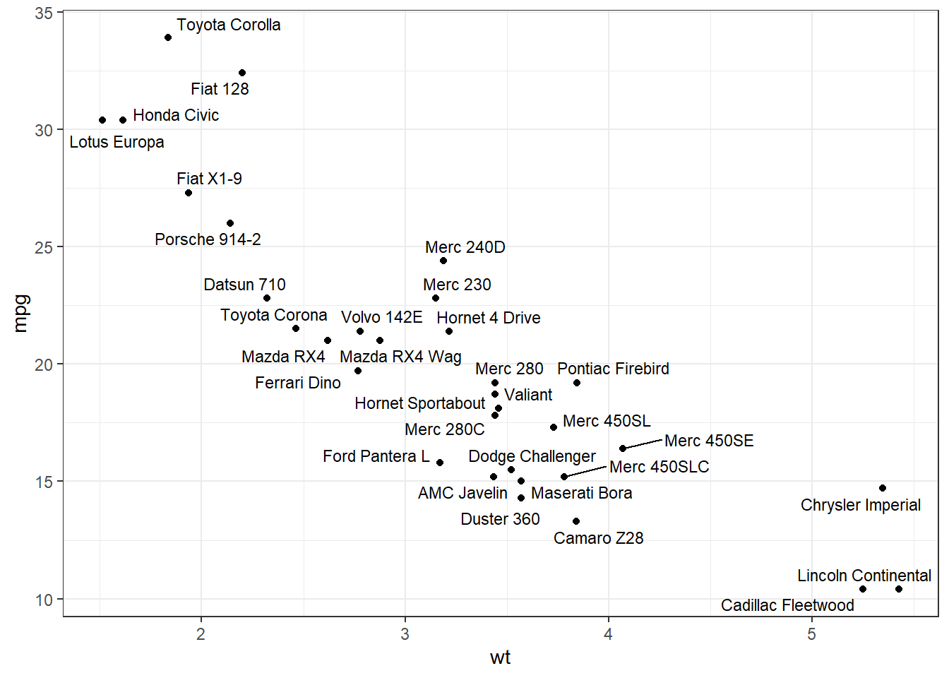
Figure 11.17: Scatterplot with non-overlapping labels
Much better.
Adding labels to bar charts is covered in the aptly named labeling bars section (Section 4.1.1.3).
11.7.1.2 Adding additional information
We can place text anywhere on a graph using the annotate function. The format is
where x and y are the coordinates on which to place the text. The color and size parameters are optional.
By default, the text will be centered. Use hjust and vjust to change the alignment.
hjust0 = left justified, 0.5 = centered, and 1 = right centered.vjust0 = above, 0.5 = centered, and 1 = below.
Continuing the previous example.
# scatterplot with explanatory text
data(mtcars)
library(ggrepel)
txt <- paste("The relationship between car weight",
              "and mileage appears to be roughly linear",
              sep = "\n")
ggplot(mtcars, aes(x = wt, y = mpg)) +
  geom_point(color = "red") +
  geom_text_repel(label = row.names(mtcars),
                  size=3) +
  ggplot2::annotate("text",
                    6, 30,
                    label=txt,
                    color = "red",
                    hjust = 1) +
  theme_bw()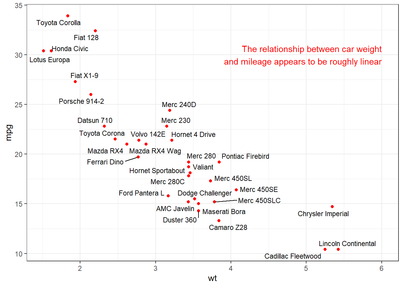
Figure 11.18: Scatterplot with arranged labels
See the this stackoverflow blog post (https://stackoverflow.com/questions/7263849/what-do-hjust-and-vjust-do-when-making-a-plot-using-ggplot) for more details.
11.7.2 Adding lines
Horizontal and vertical lines can be added using:
geom_hline(yintercept = a)geom_vline(xintercept = b)
where a is a number on the y-axis and b is a number on the x-axis respectively. Other options include linetype and color.
In the following example, we plot city vs. highway miles and indicate the mean highway miles with a horizontal line and label.
# add annotation line and text label
min_cty <- min(mpg$cty)
mean_hwy <- mean(mpg$hwy)
ggplot(mpg,
       aes(x = cty, y=hwy, color=drv)) +
  geom_point(size = 3) +
  geom_hline(yintercept = mean_hwy,
             color = "darkred",
             linetype = "dashed") +
  ggplot2::annotate("text",
           min_cty,
           mean_hwy + 1,
           label = "Mean",
           color = "darkred") +
  labs(title = "Mileage by drive type",
       x = "City miles per gallon",
       y = "Highway miles per gallon",
       color = "Drive")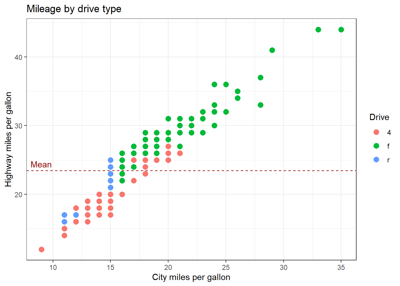
Figure 11.19: Graph with line annotation
We could add a vertical line for the mean city miles per gallon as well. In any case, always label your annotation lines in some way. Otherwise the reader will not know what they mean.
11.7.3 Highlighting a single group
Sometimes you want to highlight a single group in your graph. The gghighlight function in the gghighlight package is designed for this.
Here is an example with a scatterplot. Midsize cars are highlighted.
# highlight a set of points
library(ggplot2)
library(gghighlight)
ggplot(mpg, aes(x = cty, y = hwy)) +
  geom_point(color = "red",
             size=2) +
  gghighlight(class == "midsize")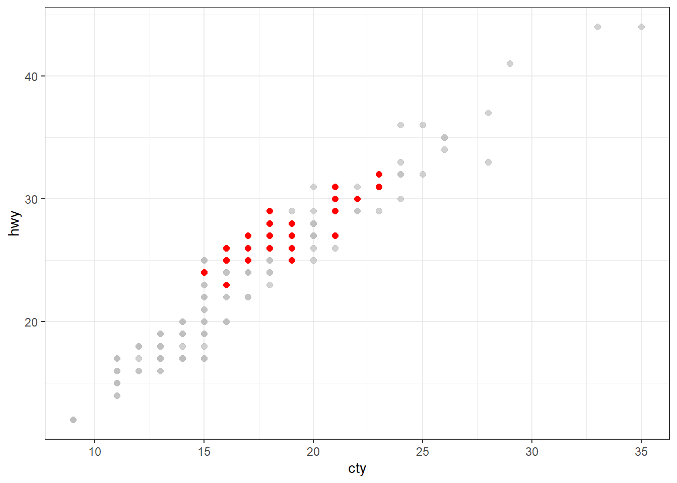
Figure 11.20: Highlighting a group
Below is an example with a bar chart. Again, midsize cars are highlighted.
# highlight a single bar
library(gghighlight)
ggplot(mpg, aes(x = class)) +
  geom_bar(fill = "red") +
  gghighlight(class == "midsize")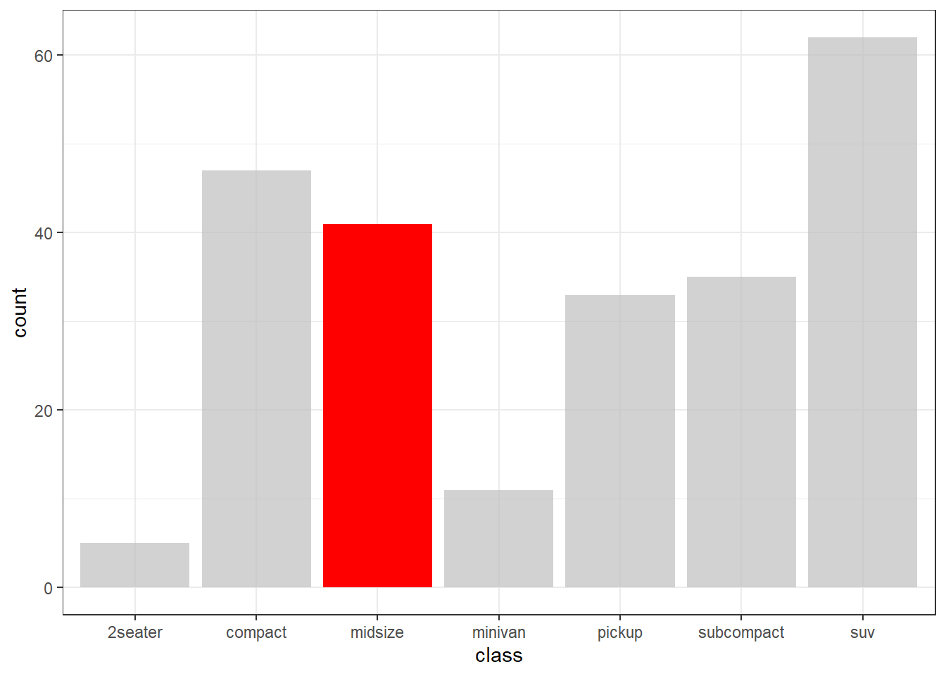
Figure 11.21: Highlighting a group
Highlighting is helpful for drawing the reader’s attention to a particular group of observations and their standing with respect to the other observations in the data.
11.8 Themes
ggplot2 themes control the appearance of all non-data related components of a plot. You can change the look and feel of a graph by altering the elements of its theme.
11.8.1 Altering theme elements
The theme function is used to modify individual components of a theme.
Consider the following graph. It shows the number of male and female faculty by rank and discipline at a particular university in 2008-2009. The data come from the salaries dataset in the carData package.
# create graph
data(Salaries, package = "carData")
p <- ggplot(Salaries, aes(x = rank, fill = sex)) +
  geom_bar() +
  facet_wrap(~discipline) +
  labs(title = "Academic Rank by Gender and Discipline",
       x = "Rank",
       y = "Frequency",
       fill = "Gender")
p
Figure 11.22: Graph with default theme
Let’s make some changes to the theme.
- Change label text from black to navy blue
- Change the panel background color from grey to white
- Add solid grey lines for major y-axis grid lines
- Add dashed grey lines for minor x-axis grid lines
- Eliminate x-axis grid lines
- Change the strip background color to white with a grey border
Using the ?theme help in ggplot2 gives us
p +
  theme(text = element_text(color = "navy"),
        panel.background = element_rect(fill = "white"),
        panel.grid.major.y = element_line(color = "grey"),
        panel.grid.minor.y = element_line(color = "grey",
                                          linetype = "dashed"),
        panel.grid.major.x = element_blank(),
        panel.grid.minor.x = element_blank(),
        strip.background = element_rect(fill = "white", color="grey"))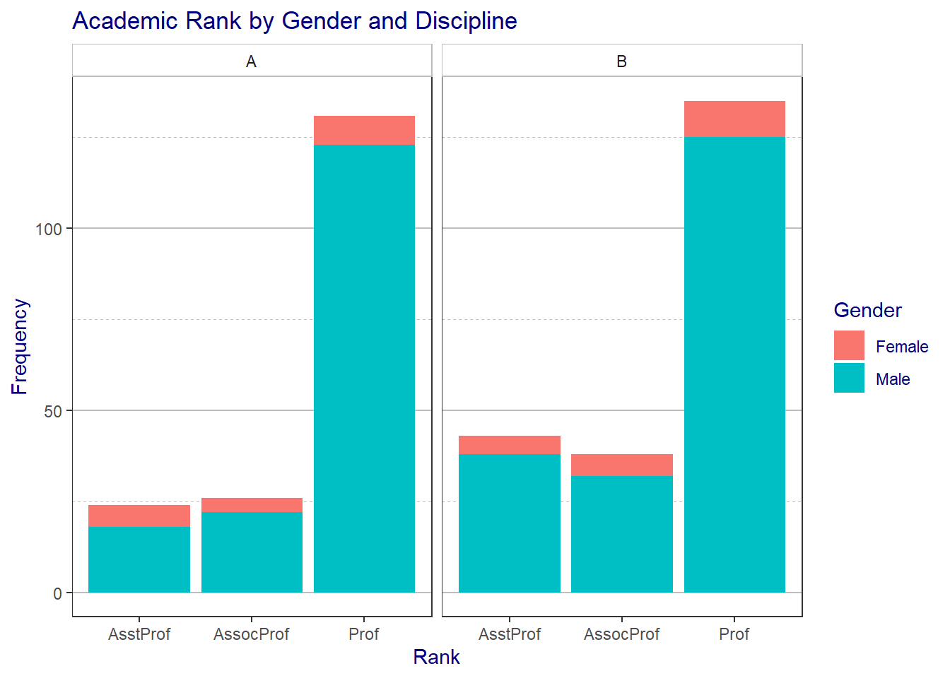
Figure 11.23: Graph with modified theme
Wow, this looks pretty awful, but you get the idea.
11.8.1.1 ggThemeAssist
If you would like to create your own theme using a GUI, take a look at ggThemeAssist package. After you install the package, a new menu item will appear under Addins in RStudio.
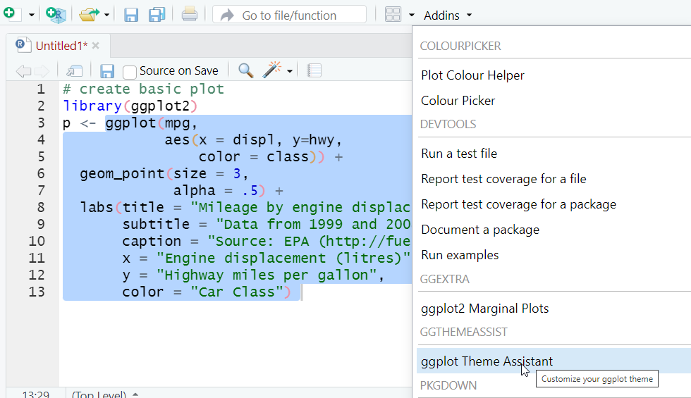 Highlight the code that creates your graph, then choose the
 ggThemeAssist option from the Addins drop-down menu. You can change many of the features of your theme using point-and-click. When you’re done, the theme code will be appended to your graph code.
11.8.2 Pre-packaged themes
I’m not a very good artist (just look at the last example), so I often look for pre-packaged themes that can be applied to my graphs. There are many available.
Some come with ggplot2. These include theme_classic, theme_dark, theme_gray, theme_grey, theme_light theme_linedraw, theme_minimal, and theme_void. We’ve used theme_minimal often in this book. Others are available through add-on packages.
11.8.2.1 ggthemes
The ggthemes package come with 19 themes.
| Theme | Description |
|---|---|
| theme_base | Theme Base |
| theme_calc | Theme Calc |
| theme_economist | ggplot color theme based on the Economist |
| theme_economist_white | ggplot color theme based on the Economist |
| theme_excel | ggplot color theme based on old Excel plots |
| theme_few | Theme based on Few’s “Practical Rules for Using Color in Charts” |
| theme_fivethirtyeight | Theme inspired by fivethirtyeight.com plots |
| theme_foundation | Foundation Theme |
| theme_gdocs | Theme with Google Docs Chart defaults |
| theme_hc | Highcharts JS theme |
| theme_igray | Inverse gray theme |
| theme_map | Clean theme for maps |
| theme_pander | A ggplot theme originated from the pander package |
| theme_par | Theme which takes its values from the current ‘base’ graphics parameter values in ‘par’. |
| theme_solarized | ggplot color themes based on the Solarized palette |
| theme_solarized_2 | ggplot color themes based on the Solarized palette |
| theme_solid | Theme with nothing other than a background color |
| theme_stata | Themes based on Stata graph schemes |
| theme_tufte | Tufte Maximal Data, Minimal Ink Theme |
| theme_wsj | Wall Street Journal theme |
To demonstrate their use, we’ll first create and save a graph.
# create basic plot
library(ggplot2)
p <- ggplot(mpg,
            aes(x = displ, y=hwy,
                color = class)) +
  geom_point(size = 3,
             alpha = .5) +
  labs(title = "Mileage by engine displacement",
       subtitle = "Data from 1999 and 2008",
       caption = "Source: EPA (http://fueleconomy.gov)",
       x = "Engine displacement (litres)",
       y = "Highway miles per gallon",
       color = "Car Class")

# display graph
p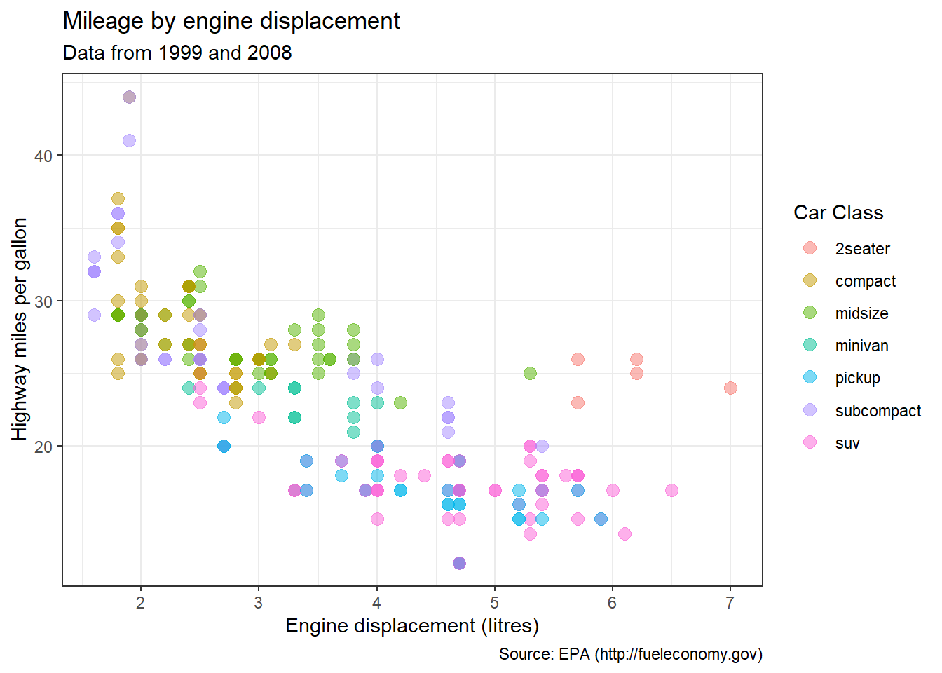
Figure 11.24: Default theme
Now let’s apply some themes.
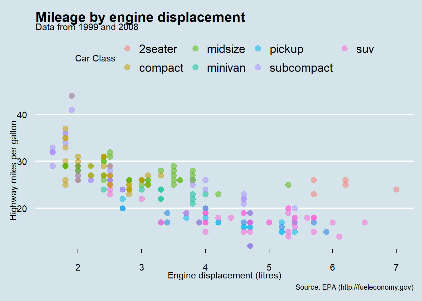
Figure 11.25: Economist theme
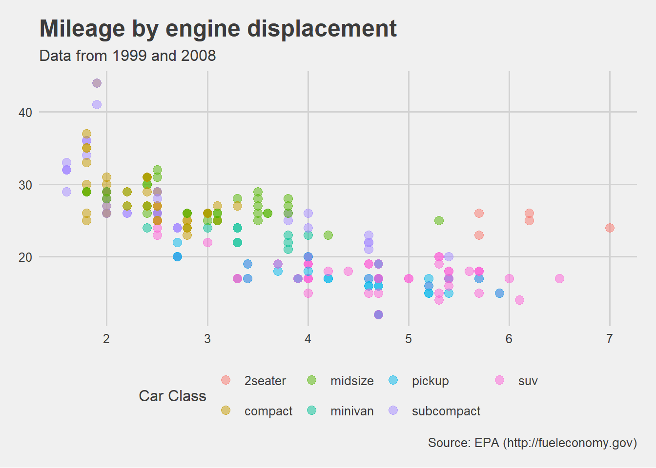
Figure 11.26: Five Thirty Eight theme
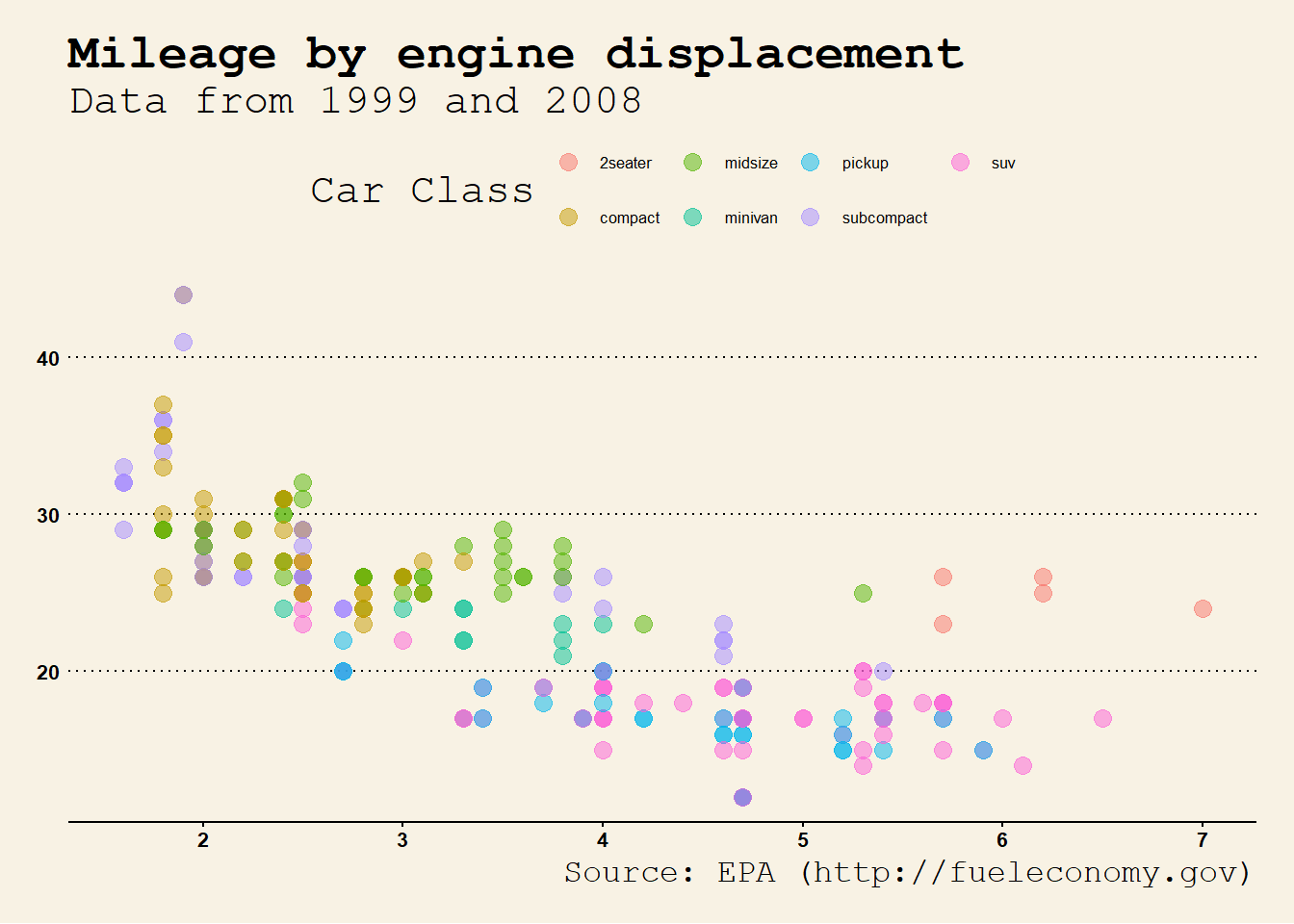
Figure 11.27: Wall Street Journal theme
By default, the font size for the wsj theme is usually too large. Changing the base_size option can help.
Each theme also comes with scales for colors and fills. In the next example, both the few theme and colors are used.
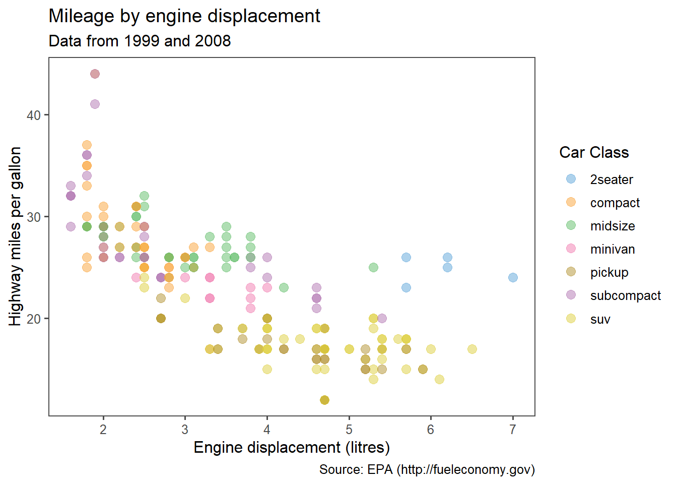
Figure 11.28: Few theme and colors
Try out different themes and scales to find one that you like.
11.8.2.2 hrbrthemes
The hrbrthemes package is focused on typography-centric themes. The results are charts that tend to have a clean look.
Continuing the example plot from above
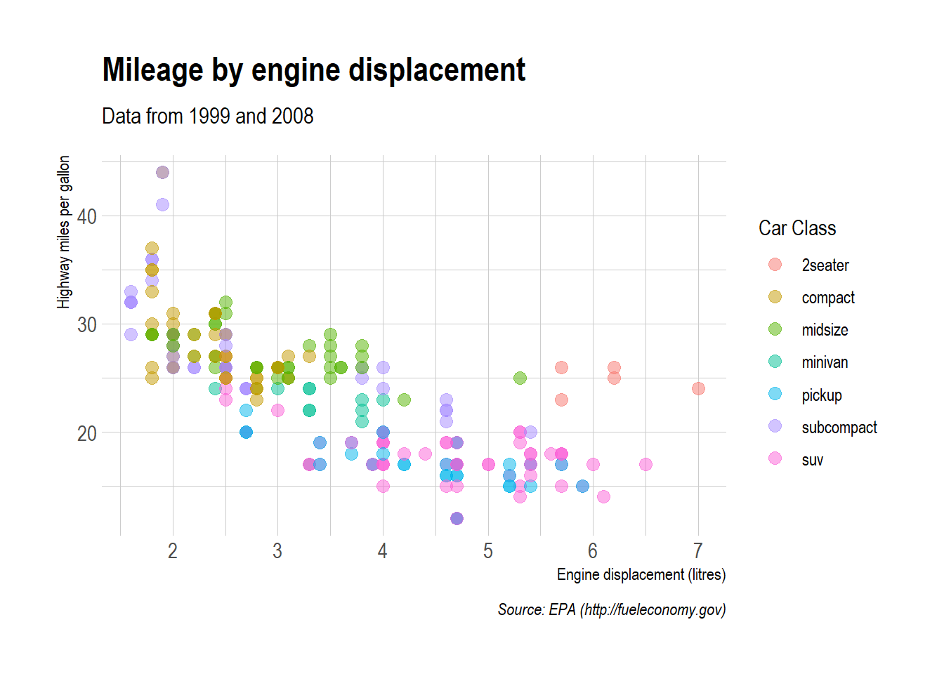
Figure 11.29: Ipsum theme
See the hrbrthemes homepage (https://github.com/hrbrmstr/hrbrthemes) for additional examples.
11.8.2.3 ggthemer
The ggthemer package offers a wide range of themes (17 as of this printing).
The package is not available on CRAN and must be installed from GitHub.
The functions work a bit differently. Use the ggthemr("themename") function to set future graphs to a given theme. Use ggthemr_reset() to return future graphs to the ggplot2 default theme.
Current themes include flat, flat dark, camoflauge, chalk, copper, dust, earth, fresh, grape, grass, greyscale, light, lilac, pale, sea, sky, and solarized.
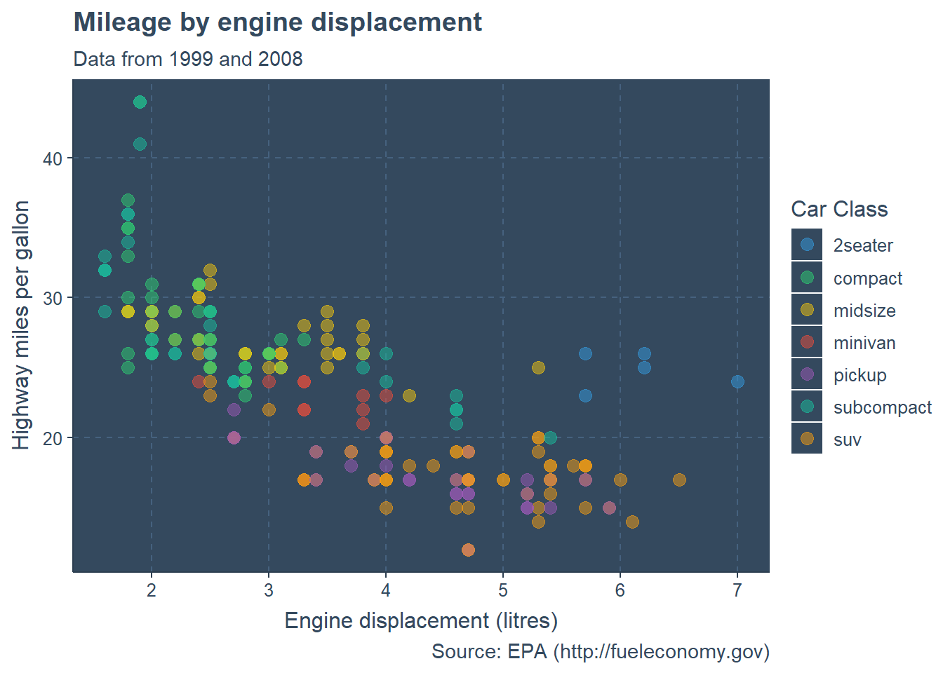
Figure 11.30: Ipsum theme
I would not actually use this theme for this particular graph. It is difficult to distinguish colors. Which green represents compact cars and which represents subcompact cars?
Select a theme that best conveys the graph’s information to your audience.
11.9 Combining graphs
At times, you may want to combine several graphs together into a single image. Doing so can help you describe several relationships at once. The patchwork package can be used to combine ggplot2 graphs into a mosaic and save the results as a ggplot2 graph.
First save each graph as a ggplot2 object. Then combine them using | to combine graphs horizontally and / to combine graphs vertically. You can use parentheses to group graphs.
Here is an example using the Salaries dataset from the carData package. The combined plot will display the relationship between sex, salary, experience, and rank.
data(Salaries, package = "carData")
library(ggplot2)
library(patchwork)

# boxplot of salary by sex
p1 <- ggplot(Salaries, aes(x = sex, y = salary, fill=sex)) +
  geom_boxplot()

# scatterplot of salary by experience and sex
p2 <- ggplot(Salaries,
             aes(x = yrs.since.phd, y = salary, color=sex)) +
  geom_point()

# barchart of rank and sex
p3 <- ggplot(Salaries, aes(x = rank, fill = sex)) +
    geom_bar()

# combine the graphs and tweak the theme and colors
(p1 | p2)/p3 +
  plot_annotation(title = "Salaries for college professors") &
  theme_minimal() &
  scale_fill_viridis_d() &
  scale_color_viridis_d()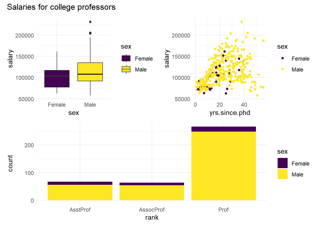
Figure 11.31: Combining graphs using the patchwork package
The plot_annotation function allows you to add a title and subtitle to the entire graph. Note that the & operator applies a function to all graphs in a plot. If we had used + theme_minimal() only the bar chart (the last graph) would have been affected..
The patchwork package allows for exact placement and sizing of graphs, and even supports insets (placing one graph within another). See https://patchwork.data-imaginist.com for details.