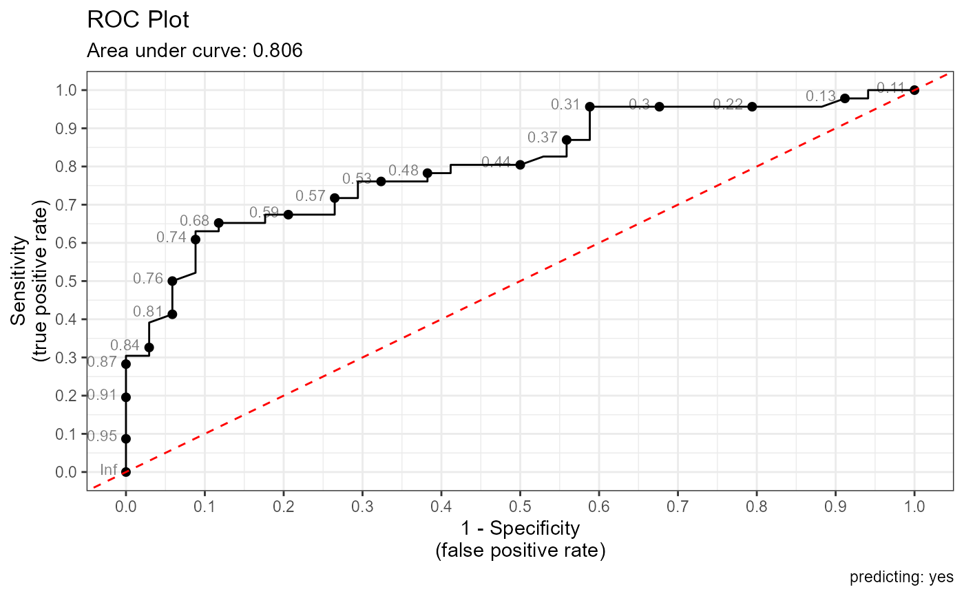
Receiver Operating Characteristic curve
roc_plot.RdPlot a receiver operating characteristic curve for a binary predictive model
roc_plot(actual, prob, positive, n.cuts = 20, labelsize = 3, digits = 2)Arguments
- actual
actual class.
- prob
predicted probability for the target class
- positive
label for the target class
- n.cuts
number of probability cut-points to plot
- labelsize
size of cutpoint labels
- digits
number of decimal digits in the cutpoint labels
Value
a ggplot2 graph
