Regression Influence Plot
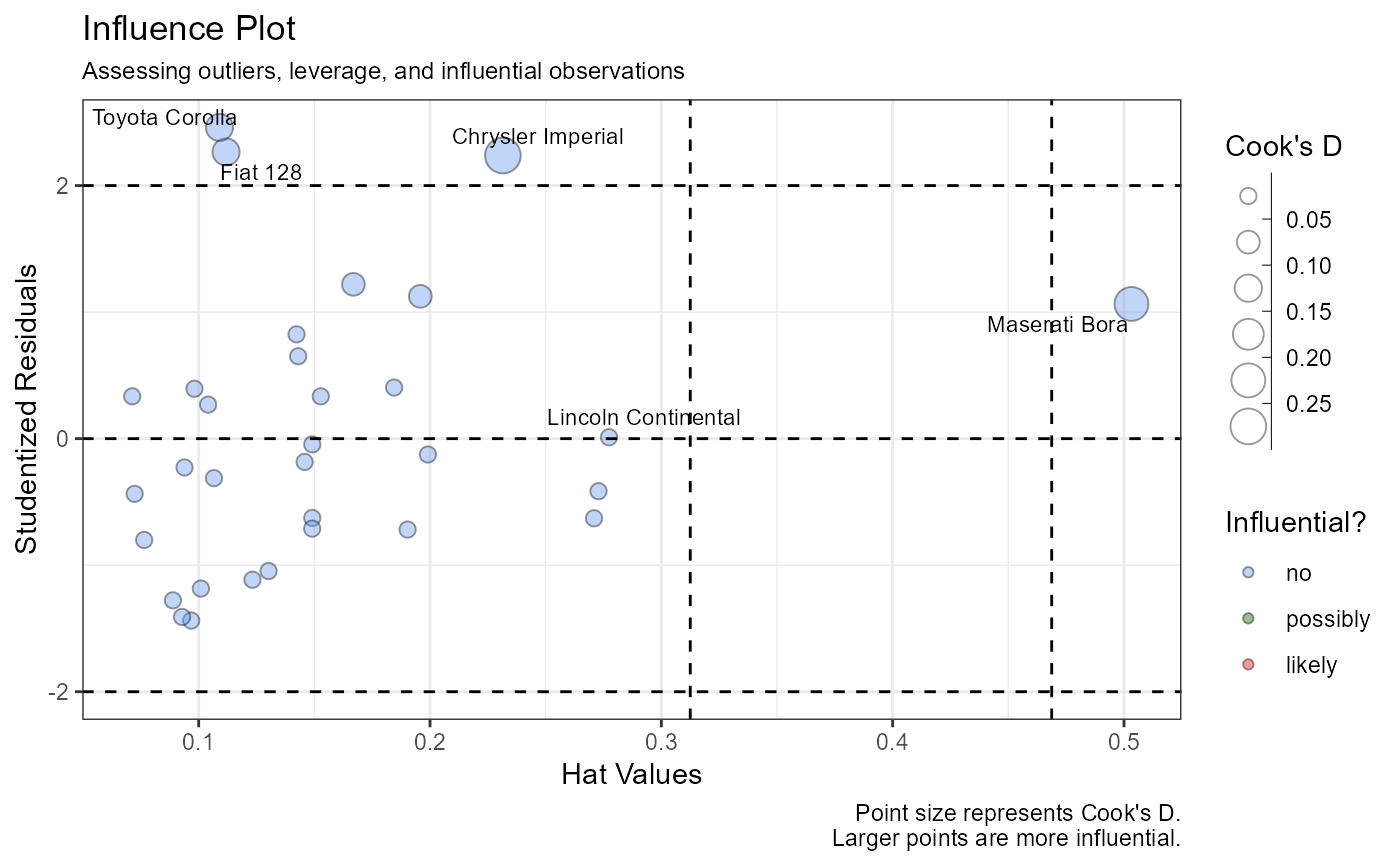
influence_plot.RdThis function creates a “bubble” plot of studentized residuals versus hat values, with size of the points representing Cook's distances.
influence_plot(x, alpha = 0.4, n.labels = 2)Arguments
- x
an object of type
"lm".- alpha
numeric; transparency of points (0 to 1, default=0.4).
- n.labels
integer; the number of points to label (default=2).
Value
a ggplot2 graph
Details
This function is a modification of the influencePlot function
in the car package, using ggplot2 rather than
base graphics.
Note
Vertical reference lines are drawn at twice and three
times the average hat value, horizontal reference lines at
-2, 0, and 2 on the studentized residual scale. The n.label
parameter controls the number of highest residuals, highest
leverage points, and most influential points to label. For
example n.label=2, the default, will identify the two
points meeting each criterion, for a maximum of 6 labeled points.
Points meeting more than one criterion are only labeled once.
Color is used to identify points that are not influential (D < 0.5), possibly influential (0.5 <= D < 1), and likely to be influential (D >= 1).
