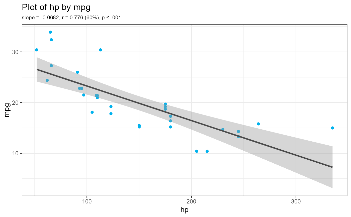
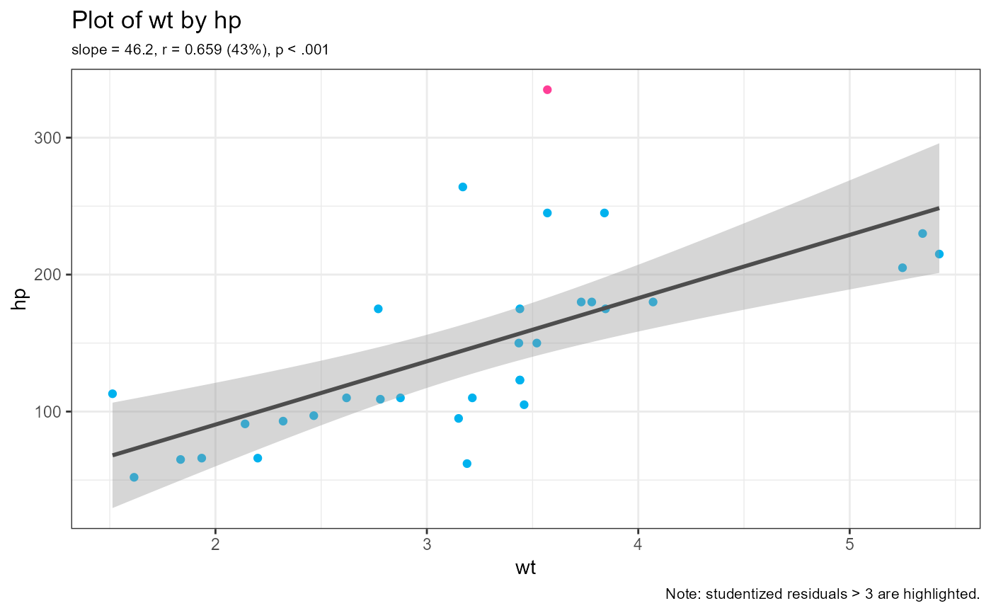
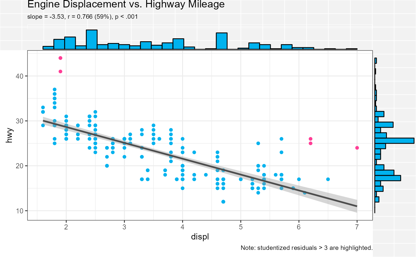
Create a scatter plot between two quantitative variables.
scatter(
  data,
  x,
  y,
  outlier = 3,
  alpha = 1,
  digits = 3,
  title,
  margin = "none",
  stats = TRUE,
  point_color = "deepskyblue2",
  outlier_color = "violetred1",
  line_color = "grey30",
  margin_color = "deepskyblue2"
)
Arguments
- data
data frame
- x
quantitative predictor variable
- y
quantitative response variable
- outlier
number. Observations with studentized residuals larger than this value are flagged. If set to 0, observations are not flagged.
- alpha
Transparency of data points. A numeric value between 0 (completely transparent) and 1 (completely opaque).
- digits
Number of significant digits in displayed statistics.
- title
Optional title.
- margin
Marginal plots. If specified, parameter can be
histogram,boxplot,violin, ordensity. Will add these features to the top and right margin of the graph.- stats
logical. If
TRUE, the slope, correlation, and correlation squared (expressed as a percentage) for the regression line are printed on the subtitle line.- point_color
Color used for points.
- outlier_color
Color used to identify outliers (see the
outlierparameter.- line_color
Color for regression line.
- margin_color
Fill color for margin boxplots, density plots, or histograms.
Value
a ggplot2 graph
Details
The scatter function generates a scatterplot between two quantitative
variables, along with a line of best fit and a 95% confidence interval.
By default, regression statistics (b, r, r2, p) are printed and
outliers (observations with studentized residuals > 3) are flagged.
Optionally, variable distributions (histograms, boxplots, violin plots,
density plots) can be added to the plot margins.
Note
Variable names do not have to be quoted.