Introduction to ggpie
Rob Kabacoff
2019-05-09
ggpie.RmdPie charts are controversial in data science and statistics. Humans are better at judging length than they are volume. For this reason, bar charts are often a more effective method of visualizing differences among percentages.
However, pie charts are ubiquitous in industry, and when one is trying to visual part-whole relationships, rather than compare frequencies, they can be effective.
It bothers me that R has no simple and attractive way to create pie charts - thus this package. The graphs returned are ggplot2 graphs, and can be further manipulated using that system.
A Single Pie Chart
The mpg data frame in the ggplot2 package contains data on the fuel economy of automobiles from 1999 to 2008. We’ll focus on the variables year and class. To create a single pie chart displaying the percentage of car classes, use code like the following:
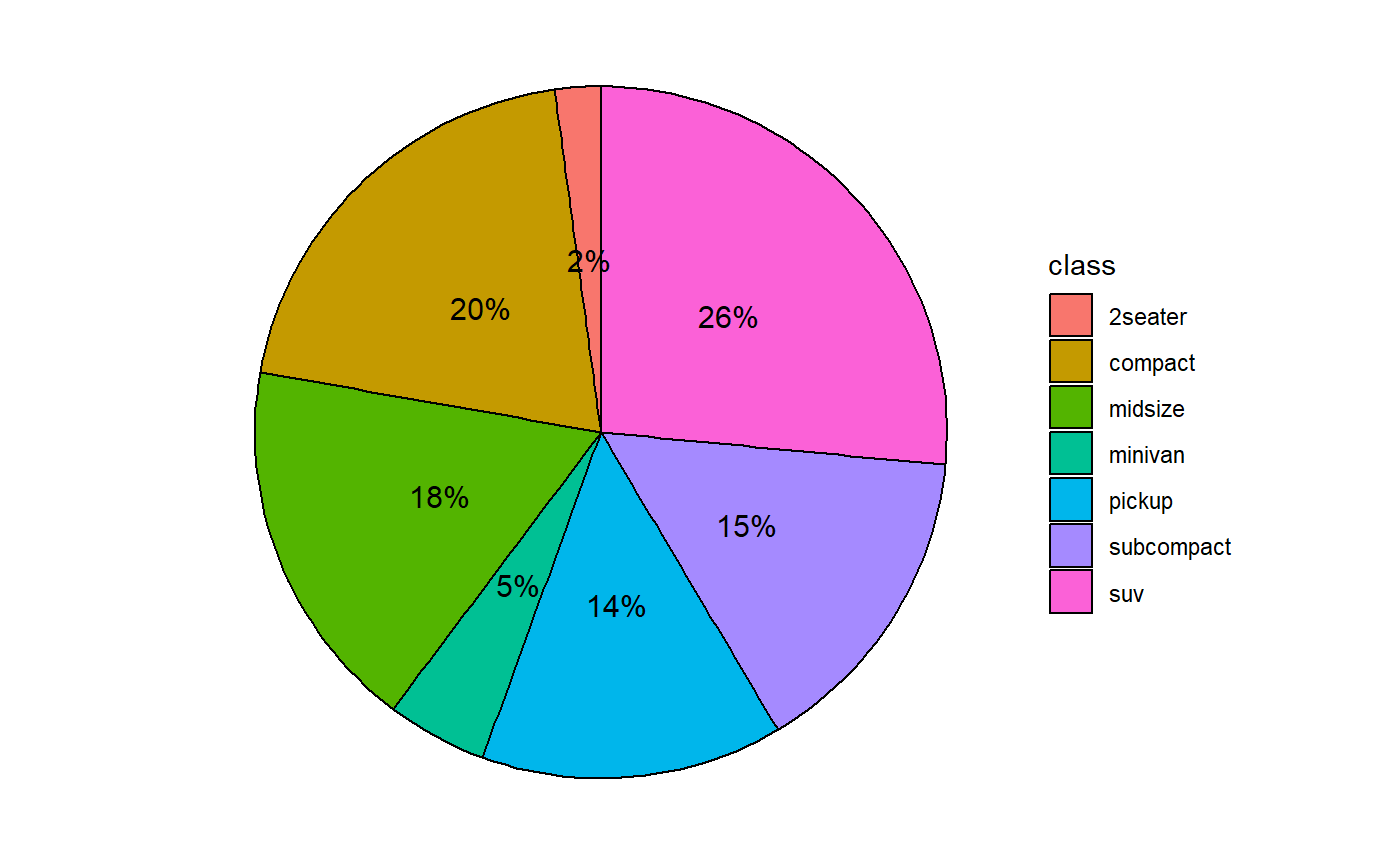
By default, pie slices are labeled with percentages and a legend is created.
The position of the labels is controlled with the offset parameter. It captures the distance of the label from the origin of the pie.
- A value of 0.5 is centered in each slice (see above).
- A value of 1.0 is centered on the radius of the pie.
- A value greater than 1.0 will place the label outside the pie.
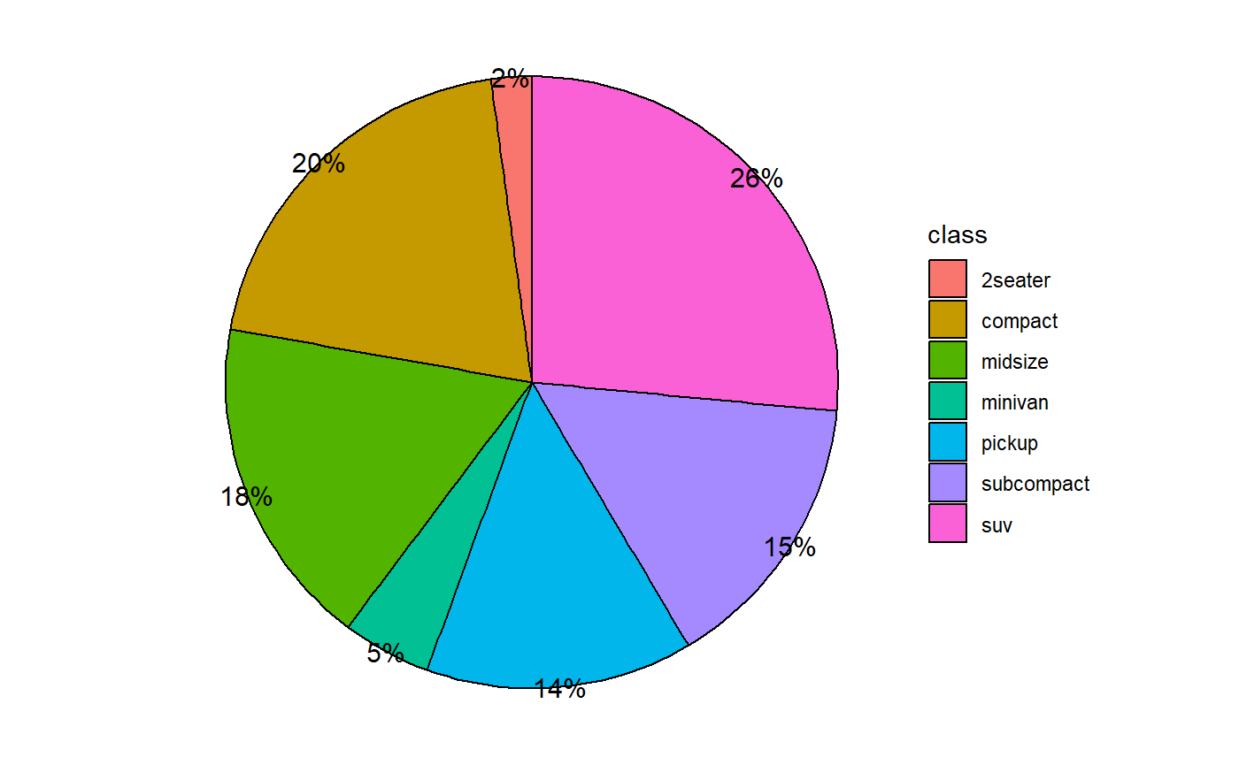
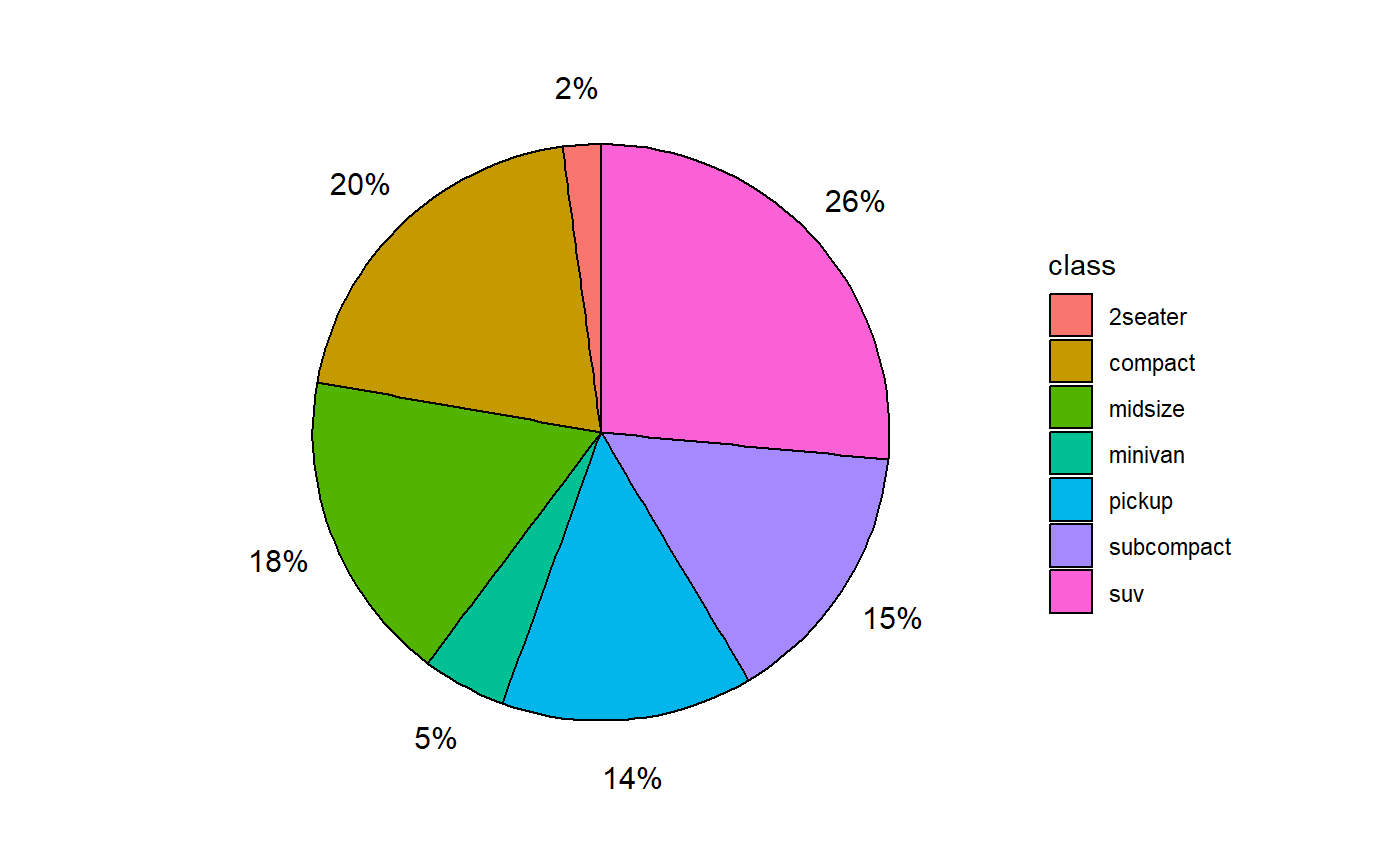
If the option legend = FALSE is included, each slice is labeled directly.
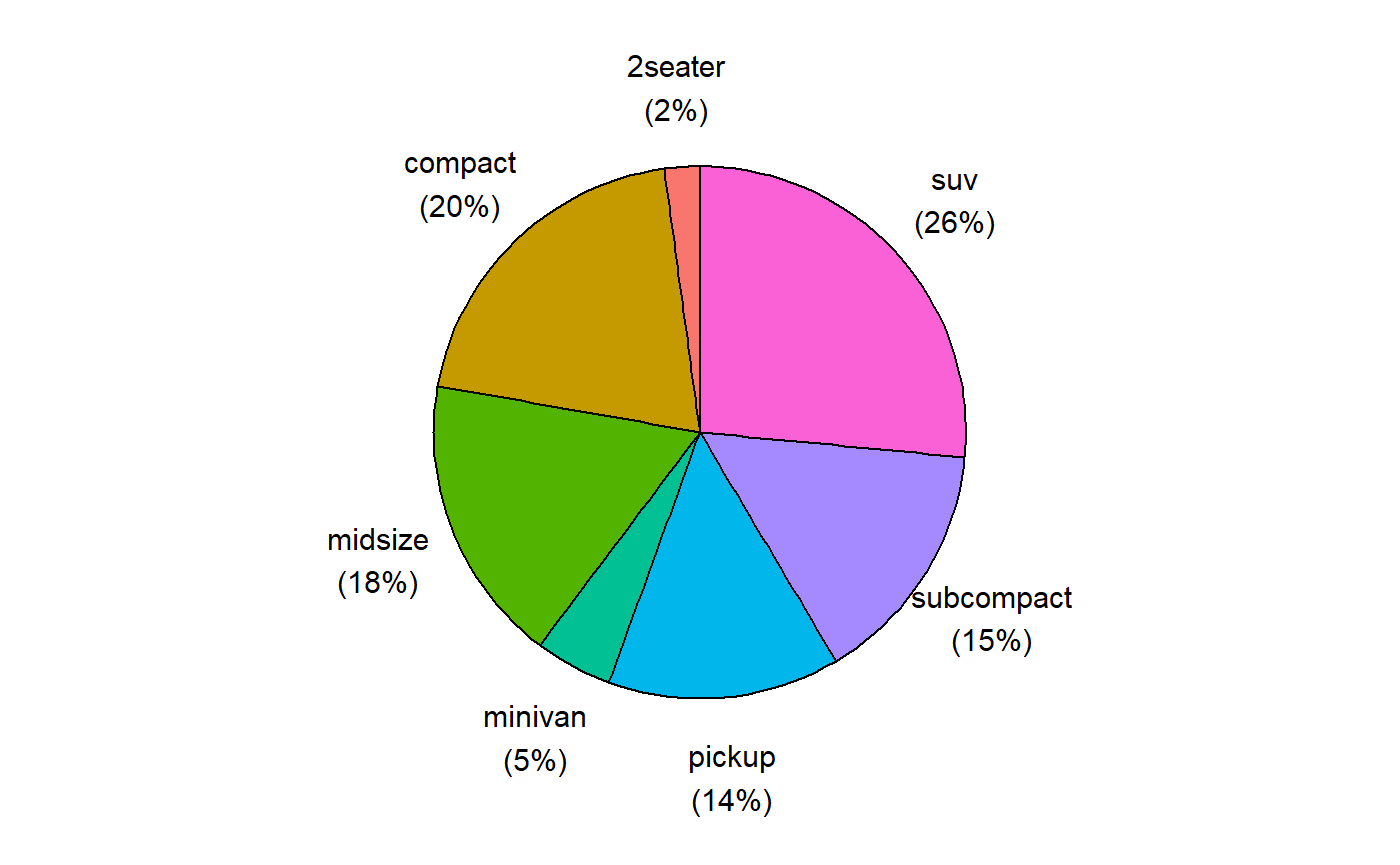
Many addtional options are available. For example
ggpie(mpg, class,
      legend=FALSE,
      border.color="white",
      label.color="white",
      label.size = 5,
      offset = .7,
      percent=FALSE,
      title="Automobile Models by Class") +
  scale_fill_brewer(palette = "Dark2")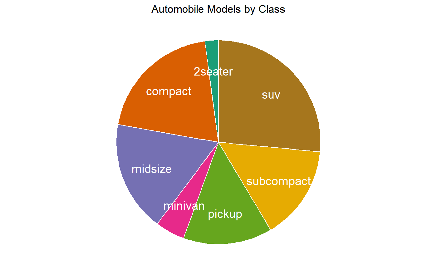
Note the use of the ggplot2 color brewer function to change the color scheme above. See scale_color_brewer for details.
Mulitiple Pie Charts
You can include a by variable in the function. This will create a separate pie chart for each level of the by variable.
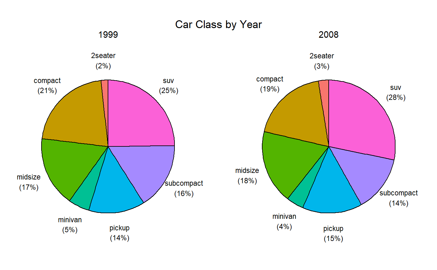
The graph below demonstrates several additional options, and how ggplot2 functions can be added to a graph created by the ggpie function.
ggpie(mpg, drv, trans,
      nrow=3,                    # number of rows
      border.color="white",      # border color
      border.width=1.5,          # border width
      label.color="black",       # label color
      label.size=3,              # label size
      offset=.7,                 # label position
      title="Auto Drive Type by Transmission\n") +

  # place legend in lower right (x=.8, y=.2, where each is on a 0-1 scale)
  theme(legend.position=c(.8, .2)) +
  # specify colors manually
  scale_fill_manual(values=c("yellow", "skyblue", "green"))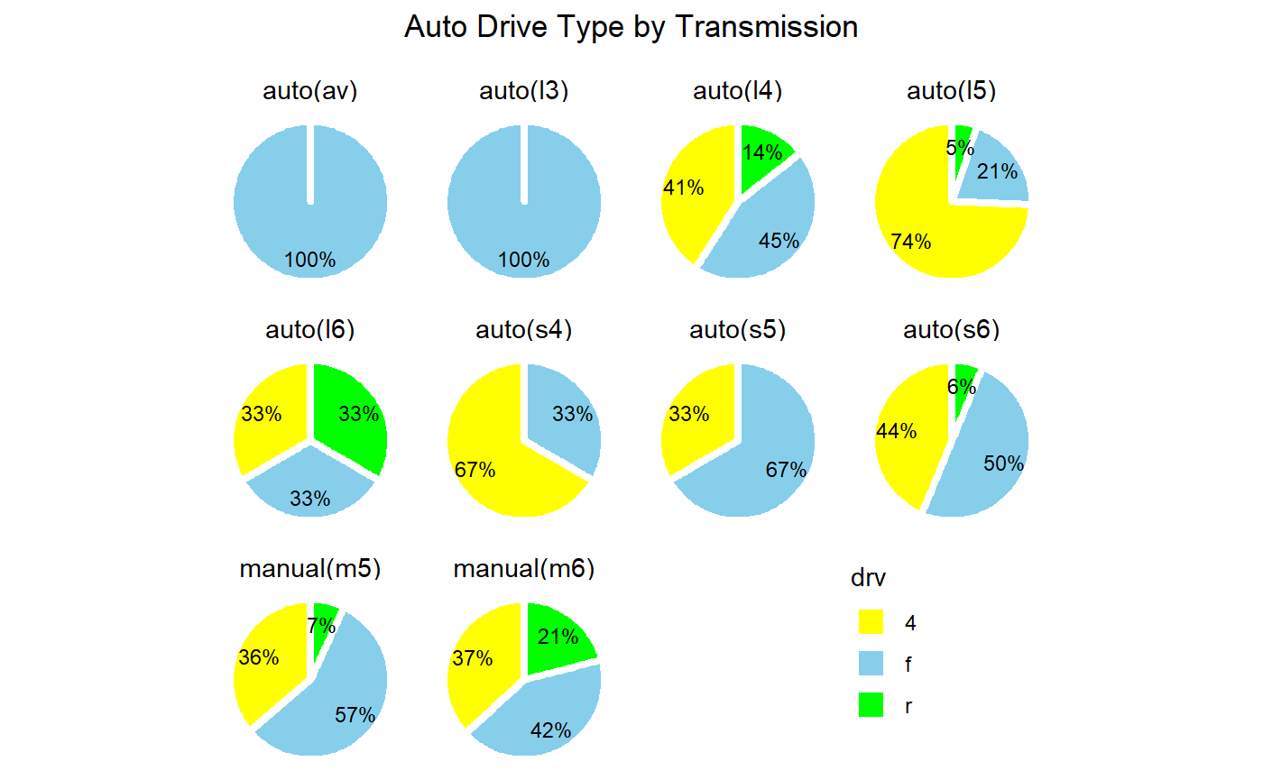
See the ggpie function documentation for more details.