Plot a receiver operating characteristic curve for a binary predictive model
roc_plot(actual, prob, positive, n.cuts = 20, labelsize = 3, labelround = 2)
Arguments
| actual | actual class. |
|---|---|
| prob | predicted probability for the target class |
| positive | label for the target class |
| n.cuts | number of probability cut-points to plot |
| labelsize | size of cutpoint labels |
| labelround | number of decimal digits in the cutpoint labels |
Value
a ggplot2 graph
Examples
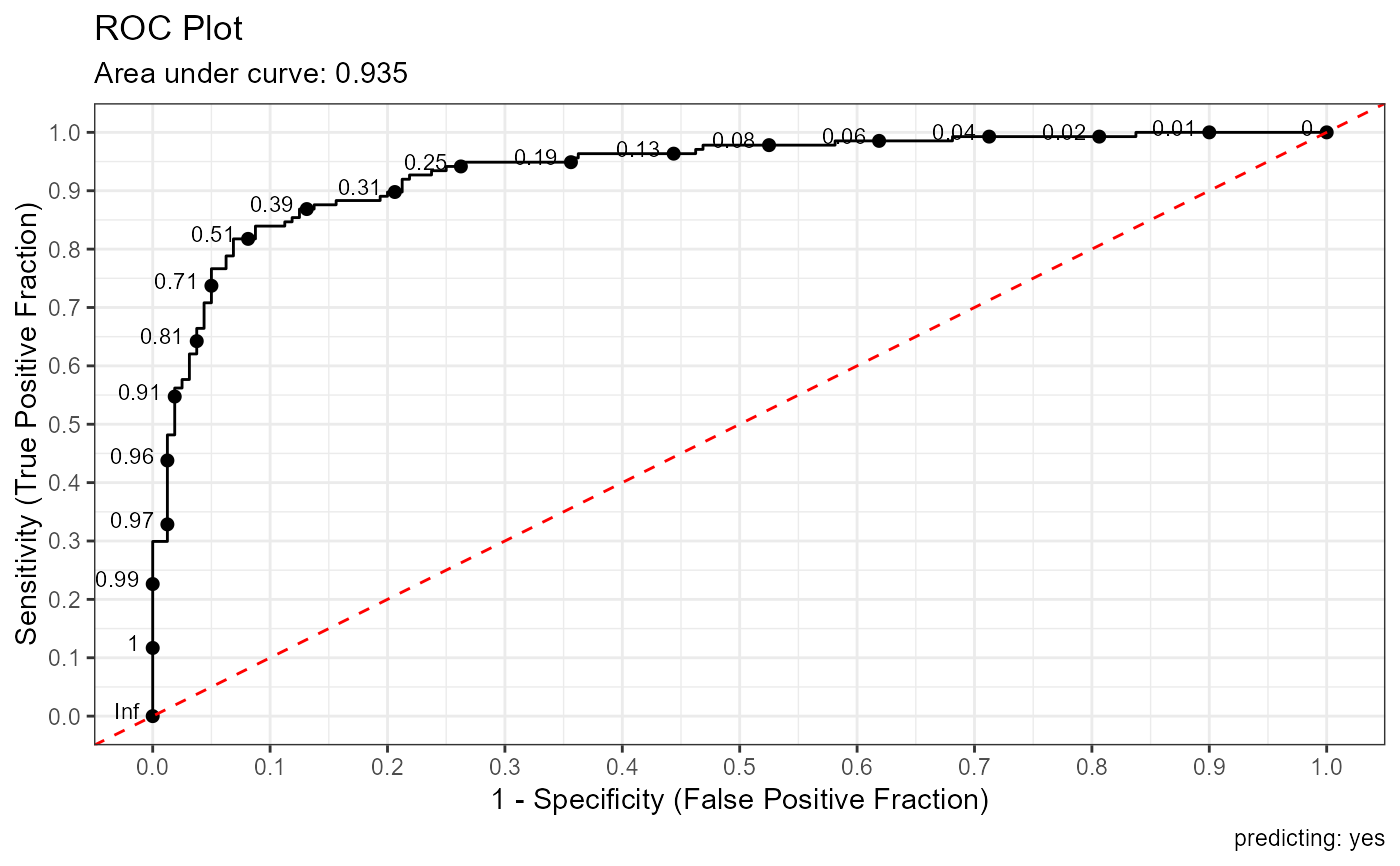
# logistic regression
data(heart)
heart <- na.omit(heart)
fit <- glm(disease ~ . , heart, family=binomial)
prob <- predict(fit, newdata=heart, type="response")
roc_plot(heart$disease, prob, positive="yes")