Create lift and gain charts for binary classification problems
lift_plot(actual, prob, positive = "yes")
Arguments
| actual | actual class. |
|---|---|
| prob | predicted probability of target class. |
| positive | which class is the target class? |
Value
a data frame with lift and gain values for each decile.
Examples
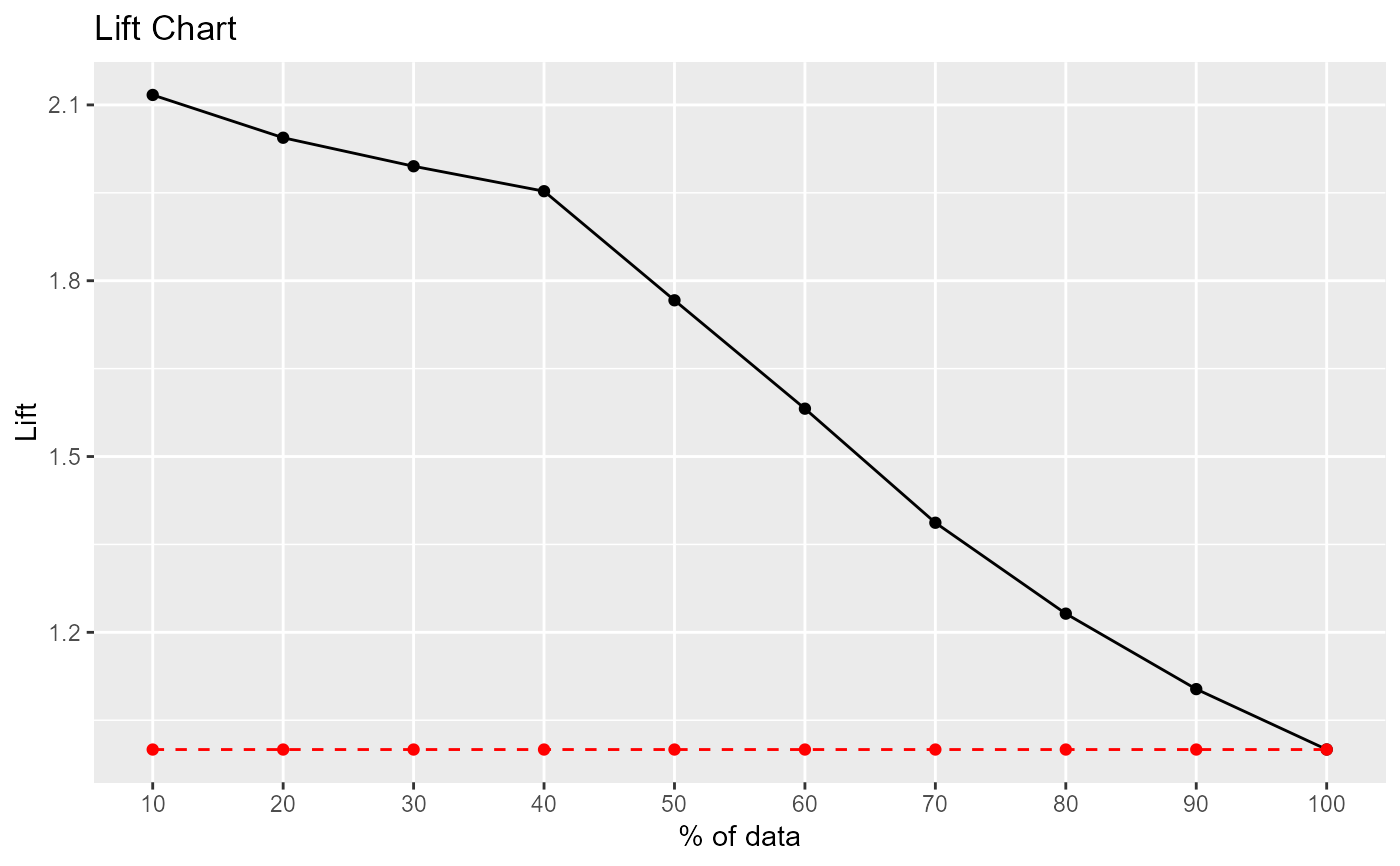
# logistic regression example data(heart) heart <- na.omit(heart) fit <- glm(disease ~ . , heart, family=binomial) pred <- predict(fit, newdata=heart, type="response") results <- lift_plot(heart$disease, pred, positive="yes")#> decile ncases nresp cumresp pctevents gain cumlift #> 1 10 29 29 29 21.17 21.17 2.117000 #> 2 20 29 27 56 19.71 40.88 2.044000 #> 3 30 29 26 82 18.98 59.86 1.995333 #> 4 40 30 25 107 18.25 78.11 1.952750 #> 5 50 30 14 121 10.22 88.33 1.766600 #> 6 60 30 9 130 6.57 94.90 1.581667 #> 7 70 30 3 133 2.19 97.09 1.387000 #> 8 80 30 2 135 1.46 98.55 1.231875 #> 9 90 30 1 136 0.73 99.28 1.103111 #> 10 100 30 1 137 0.73 100.01 1.000100