Generates a descriptive graph for a quantitative variable.
univariate_plot(
  data,
  x,
  bins = 30,
  fill = "deepskyblue",
  pointcolor = "black",
  density = TRUE,
  densitycolor = "grey",
  alpha = 0.2
)
Arguments
| data | a data frame. |
|---|---|
| x | a variable name (without quotes). |
| bins | number of histogram bins. |
| fill | fill color for the histogram and boxplot. |
| pointcolor | point color for the jitter plot. |
| density | logical. Plot a filled density curve over the the histogram. (default=TRUE) |
| densitycolor | fill color for density curve. |
| alpha | Alpha transparency (0-1) for the density curve and jittered points. |
Value
a ggplot2 graph
Details
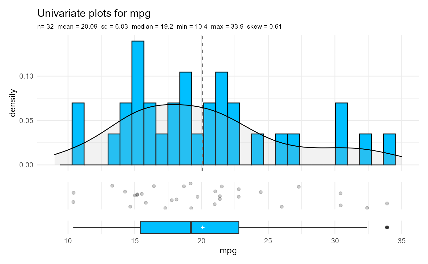
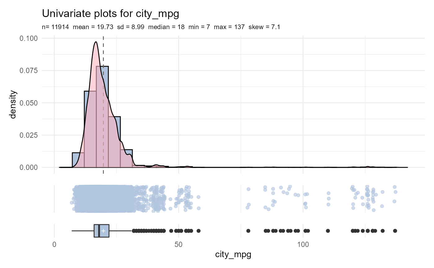
univariate_plot generates a plot containing three graphs:
a histogram (with an optional density curve), a horizontal
jittered point plot, and a horizontal box plot. The subtitle
contains descriptive statistics, including the mean, standard
deviation, median, minimum, maximum, and skew.
Note
The graphs are created with ggplot2 and then assembled into a single plot through the patchwork package. Missing values are deleted.
Examples
univariate_plot(mtcars, mpg)univariate_plot(cardata, city_mpg, fill="lightsteelblue", pointcolor="lightsteelblue", densitycolor="lightpink", alpha=.6)